Introduction
The purpose of this post is to document the generation of a comparative analysis (and plot) of the currently under construction alignment of the San Diego MTS’s MidCoast Trolley light rail expansion into North San Diego. The alignment is being built along the I-5 freeway corridor, through the low-lying canyons from Old Town, just north of downtown San Diego, to University City. This alignment connects UCSD, the VA, and UTC, a major mall in University City, with the Blue Line of San Diego’s trolley system (“trolley” being a misnomer; it’s a light rail system).
In this post, I devise a method of comparing this alignment (for the purposes of this post, called “actual alignment”) against my alignment (“proposed alignment”). My proposed alignment alternative would run along Genesee Avenue, a major arterial street running north from Mission Valley (just east of Old Town) to UTC. Here a link to a ways segment of the road on OpenStreetMap (OSM) for reference.
Data Acquisition
The alignment for the currently under construction alignment is not publicly available. Through a month-long correspondence with SANDAG, San Diego’s regional planning council, I was able to FOIA the data, which was provided in a propriety CAD format, .DGN (Bentley Microstation’s software’s vector CAD data format).
The CAD data was loaded into Rhino3D, from which I (with a great deal of help from Ben Golder), was able to take the alignment shapes and convert the arc data into polylines. The polylines were then exported from Rhino3D as coordinate arrays.
With the coordinate array data in hand, I was able to convert this information to a GeoJSON. For public accessibility, I have put this GeoJSON online as a Gist, here. The proposed alignment is also on that page, as well.
The two are also included, embedded below:
Methodology Overview
I am going to take each shape and load them onto a network graph representation of the street walk network in OSM for North San Diego. I am going to identify any walk paths that are within 150 meters (a generous capture radius of roads that would be “close” to the alignment and thus a possible candidate as a board point, agnostic of any specific stations) of the alignment and identify them as potential “touch points” to the alignments.
From those touch points, I will analyze how much of the network can be reached within increments of 5 minutes, up to 30 minutes, along the route. When calculating distance (impedance), I also take into account street grade. Street grades in excess of 10% (double the ADA curb ramp threshold) are “thrown out” as too steep. This prevents the consideration of steep paths or paths that are on a mesa from being connected to an alignment lying in the middle of a canyon.
Why do I not take into account actual station locations? I see the routes themselves as a right of way (ROW) corridor that has a maximum opportunity capture. Once the ROW is established and the alignment constructed, station positioning itself is relatively modifiable. An example is this year, as St. Louis Metro is moving the Sarah St. metro station east in Central West End. An article covering it is here. Dec. 16, 2017 edit: I’ve been alerted that this is, in fact, not a transit stop being moved but rather an infill station. Either way, the point that station placement can be moved or added along a ROW should remain valid.
Thus, when comparing two alignments, I compare the maximum possible capture of both (assuming individuals could board at every segment of the ROW). By doing so, one can then compare the total opportunity cost of transferring from one alignment to the other.
Initial Results
My alignment has about 80% more coverage than the under construction alignment. The under construction alignment severely limits potential accessibility from all sites to the east of the I-5 corridor due to significant terrain limitations and less-dense land use patterns.
Process
A Gist to view this all, below, as a notebook, is online, here.
Here’s all the libraries we will be using to execute this:
from descartes import PolygonPatch
import geojson
import geopandas as gpd
import networkx as nx
import osmnx as ox
import pandas as pd
import requests
from shapely.geometry import shape, LineString, Point, Polygon, MultiPolygon, MultiPoint
To get the shapes, we can download them from my above Gist and load them as Shapely LineStrings:
def get_shape(url):
    output = requests.get(url).text
    loaded = geojson.loads(output)
    fs = loaded['features']

    paths = []
    for i in range(len(fs)):
        p = fs[i]['geometry']
        paths.append(shape(p))

    return MultiLineString(paths)
This method can be applied to the actual and proposed alignment shapes:
url_actual = 'https://gist.githubusercontent.com/kuanb/68d9d297ad0f206a6e3552f81b738127/raw/a36dc0f7eed5ca8a139f5eb4112fba0ce7809843/sdmtc.geojson'
url_proposed = 'https://gist.githubusercontent.com/kuanb/68d9d297ad0f206a6e3552f81b738127/raw/cc7004fa560fc83ada0f6ec6bb38788abfda7d8c/sdmtc_alt_alignment.geojson'
actual_shape_orig = get_shape(url_actual)
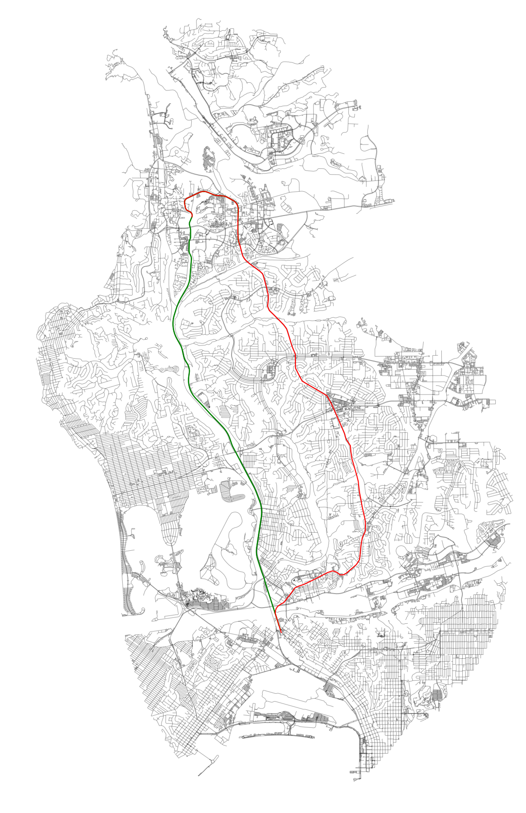
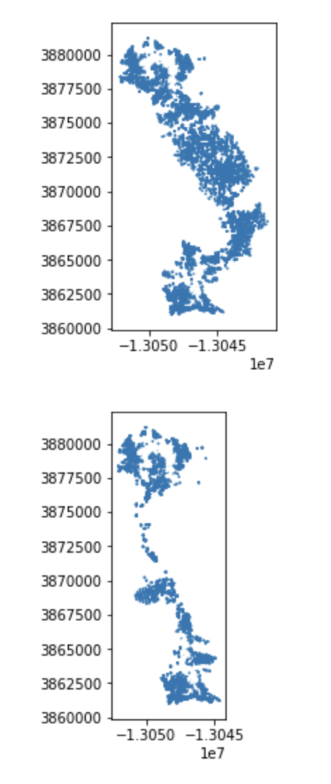
proposed_shape_orig = get_shape(url_proposed)We can load them in as a GeoSeries and visually inspect our results:
both_gs = gpd.GeoSeries([actual_shape_orig, proposed_shape_orig])
temp_gdf = gpd.GeoDataFrame(geometry=both_gs)
temp_gdf.crs = {'init': 'epsg:4326'}
temp_gdf = temp_gdf.to_crs({'init': 'epsg:3857'})
temp_gdf.plot()
Everything looks okay, so let’s proceed. Let’s take the shapes we need out of the GeoSeries, as actual_shape and proposed_shape. Once we have those let’s focus on getting the base OSM data for the walk network. Let’s use OSMnx to do this. We can buffer the shape by a sufficient decimal degree distance (about 5 miles) to get the bounds:
bb = gpd.GeoDataFrame(geometry=both_gs).buffer(0.05).unary_union
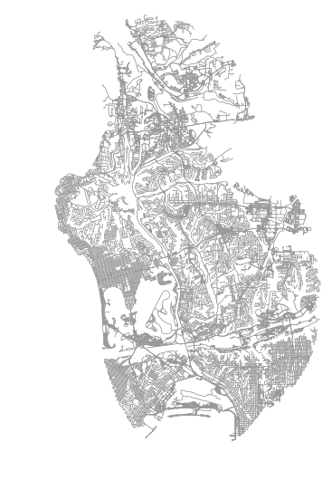
G = ox.graph_from_polygon(bb, network_type=‘walk')Plotting the projected network with OSMnx (ox.plot_graph) should result in the below:
We can also add the alignments and see how this all looks together:
Now, we need to focus on calculating the impedance. This is a factor of distance (meters on the project graph), walk speed, and elevation. OSMnx allows us to add elevation through Google’s API with a series of small batch requests:
# add elevation to each of the nodes, using the google elevation API, then calculate edge grades
google_elevation_api_key = 'foobar'
G = ox.add_node_elevations(G,
                           api_key=google_elevation_api_key,
                           max_locations_per_batch=100,
                           pause_duration=0.1)
G = ox.add_edge_grades(G)
Here’s my method for impedance, below. We toss those points that exceed our grade threshold by making them very expensive. This is similar (albeit far more rudimentary) to the same costing adjustments that is used in Valhalla’s Thor (Mapzen’s routing engine’s costing engine).
def impedance(length, grade):
    travel_speed = 4.5
    meters_per_minute = travel_speed * 1000 / 60 #km per hour to m per minute

    ada_sidewalk_grade_max = 0.1

    if grade >= ada_sidewalk_grade_max:
        return 999999
    else:
        return data['length'] / meters_per_minute

# Run updates to the edges to capture grade aspects in costing
for u, v, k, data in G.edges(keys=True, data=True):
    data['impedance'] = impedance(data['length'], data['grade_abs'])
    data['rise'] = data['length'] * data['grade']
Now we need to run NetworkX’s built in ego_graph algorithm to generate a subgraph of accessible points for each node along the alignment shapes. Both alignment shapes are sufficiently complex that just iterating over the points in them will be sufficient for this analysis. If they weren’t we could just subdivide each linear segment to sub-segments of satisfactory (smaller) distances.
def project_point(pt):
    a = gpd.GeoDataFrame(geometry=[pt])
    a.crs = {'init': 'epsg:4326'}
    a = a.to_crs({'init': 'epsg:3857'})
    return a.geometry.values[0]

trip_times = [5, 10, 15, 20, 25, 30] #in minutes
sorted_tt = sorted(trip_times, reverse=True)

skip_list = []
def generate_iso_node_arrays(shape,
                       sorted_tt=sorted_tt):
    # Cumulative results
    isochrone_polys = {}
    for tt in sorted_tt:
        isochrone_polys[tt] = []

    xys = shape.coords.xy
    xs = xys[0]
    ys = xys[1]
    xys = list(zip(xs, ys))

    count = 0
    for xy in xys:
        count += 1
        ap = Point(*xy)
        pp = project_point(ap)

        nn, dist = ox.get_nearest_node(G,
                                       (pp.y, pp.x),
                                       method='euclidean',
                                       return_dist=True)

        if dist > 150:
            skip_list.append({'node': nn,
                              'xy': xy,
                              'dist': round(dist)})
            continue

        for trip_time in sorted_tt:
            subgraph = nx.ego_graph(G,
                                    nn,
                                    radius=trip_time,
                                    distance='impedance')

            # Note we will be creating many duplicates in this step
            for n in subgraph.node:
                isochrone_polys[trip_time].append(n)

    # Once we finish running through all nodes along spine
    # we can remove duplicates in each of the trip time lists
    for trip_time in sorted_tt:
        deduped = list(set(isochrone_polys[trip_time]))
        isochrone_polys[trip_time] = deduped
    return isochrone_polys
In this process, I toss any nearest nodes on the network that are more than 150 meters away from the alignment. When the ego graph is run, I utilize the precalculated impedance values to understand total accessible nodes within a given time radius (increments of 5 minutes, up to 30 minutes).
We can now run this on both of our alignment shapes.
isochrone_polys_actual = generate_iso_node_arrays(actual_shape_orig[0])
isochrone_polys_prop = generate_iso_node_arrays(proposed_shape_orig[0])
Because the method only extracts subgraph node ids and then removes duplicates, geometry manipulation is kept to a minus. This allows this process to complete quickly.
But, now we need the resulting node ids converted to geometries. We can first get the node points like so:
def convert_to_points(G, isochrone_ids):
    cleaned = {}
    for tt in [5, 10, 15, 20, 25, 30]:
        cleaned[tt] = []
        for n in isochrone_ids[tt]:
            gn = G.node[n]
            p = Point(gn['x'], gn['y'])
            cleaned[tt].append(p)
    return cleaned
Again, because we’ve parsed out duplicates for each time segment along each route, this is fast:
isochrone_polys_act_conv = convert_to_points(G, isochrone_polys_actual)
isochrone_polys_pro_conv = convert_to_points(G, isochrone_polys_prop)
Great, now let’s see what the coverage area is for each time isochrone area. We can add a buffer radius, let’s say 100 meters, which represents the approximate land area accessible from each node (intersection).
def convert_to_gdfs(isochrone_polys,
                    sorted_tt,
                    buffer_r=100):
    # buffer_r is the distance around the node we want to consider
    # that node as representing in terms of access. Defaults to
    # 100 meters
    geoms = []
    for tt in sorted_tt:
        gs = gpd.GeoSeries(isochrone_polys[tt])
        uu = gs.buffer(100).simplify(25).unary_union
        geoms.append(uu)
    return gpd.GeoDataFrame({'time': sorted_tt},
                            geometry=geoms)
Now that we have this method to convert results to actual MultiPolygons, we can convert each layer result to a GeoPandas GeoDataFrame:
ip_act_gdf = convert_to_gdfs(isochrone_polys_act_conv, sorted_tt)
ip_pro_gdf = convert_to_gdfs(isochrone_polys_pro_conv, sorted_tt)
Visually inspecting the results should result in:
From all these points, let’s get the area that is covered by both transit service sheds:
# Pull out the common geometries
ippguu = ip_pro_gdf.unary_union
ipaguu = ip_act_gdf.unary_union
common_zone = ipaguu.intersection(ippguu)
common_zone
Which results in:
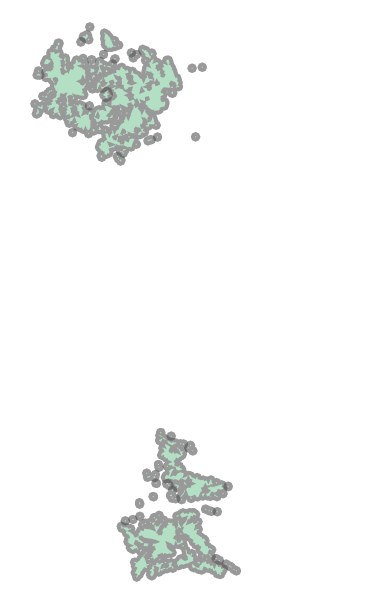
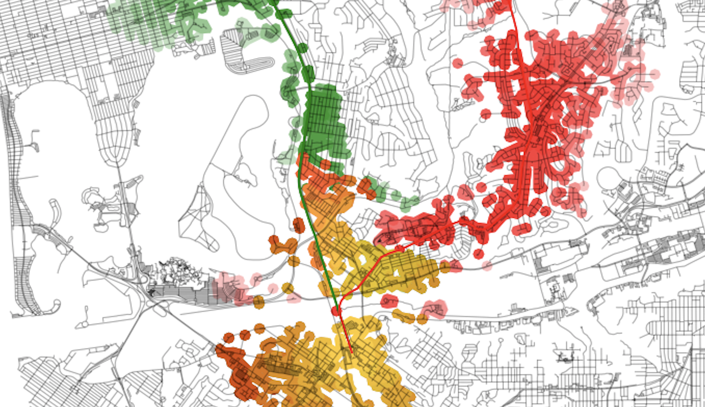
These are the tops and bottoms of the routes, which include UCSD, the VA, and UTC (top) and Old Town (bottom). These are the same as this portion of the alignment is the same for both alternatives.
We can now use symmetric_difference to pull out the portions of the routes that are unique to each alignment for each time threshold.
ipp_sdiff = ip_pro_gdf.symmetric_difference(common_zone)
ipa_sdiff = ip_act_gdf.symmetric_difference(common_zone)
Which results in:
Almost done! Now we just need to create a mechanism to add these alignment transit sheds to a plot of the NetworkX graph. OSMnx already has a convenience function to plot the NetworkX graph, so I just need to add the new isochrone transit sheds to the results. Here’s a method to do that:
def add_isos(isos_gdf, ax, ec='red'):
    for gs in isos_gdf:
        gss = gs.simplify(25)

        if isinstance(gss, Polygon):
            gss = MultiPolygon([gss])

        for poly in gss:
            # Only plot if we actually have an Polygon
            # type (could be that some layers have)
            # no intersections, for example
            is_p = isinstance(poly, Polygon)
            if not is_p:
                continue

            patch = PolygonPatch(poly,
                                 fc=ec,
                                 ec='none',
                                 alpha=0.25,
                                 zorder=-1)
            ax.add_patch(patch)
We will also need to plot the common areas in a different color, so we can see clearly the areas that are different versus those that are the same between the two:
ipp_common = ip_pro_gdf.intersection(common_zone)
ipa_common = ip_act_gdf.intersection(common_zone)
And now, to put it all together and generate the plot:
fig, ax = ox.plot_graph(G,
                        fig_height=30,
                        show=False,
                        close=False,
                        edge_color='k',
                        edge_alpha=0.2,
                        node_color='none')

gpd.GeoSeries(actual_shape).plot(ax=ax, lw=2, color='green')
gpd.GeoSeries(proposed_shape).plot(ax=ax, lw=2, color='red')

add_isos(ipa_sdiff, ax, 'green')
add_isos(ipp_sdiff, ax, 'red')

# We just need to add one, since these two layers are
# the same on both, and just set color to an orange
add_isos(ipp_common, ax, '#ffc300')

plt.show()
The resulting plot will look like this:
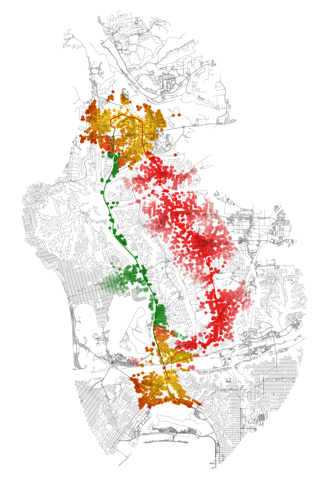
With this final plot, running spatial comparisons is easy. For example, let’s compare performance by area coverage:
ippguu # proposed
ipaguu # actual

# We can compare the areas of coverage between the two
sqkm = 1000**2
a = round(ipaguu.area/sqkm, 2)
p = round(ippguu.area/sqkm, 2)
print('Actual coverage (sq. km):', a)
print('Proposed coverage (sq. km):', p)

# Ratio between the two
print('Proposed vs actual coverage ratio: ', p/a)

# Prints:
# Actual coverage (sq. km): 26.88
# Proposed coverage (sq. km): 48.72
# Proposed vs actual coverage ratio:  1.8125
As you can see, the “opportunity cost” of using the existing alignment over the Genesee Avenue one represents in about an 80% reduction in possible area coverage. If we were to overlay these results in Census data, we could get a head count of individuals that could have had the opportunity to access the alignment in each scenario, as well as the sociodemographic composition of the two scenarios.