
Introduction
The purpose of this post is to document a better method of generating isochrones from a network accessibility operation. OSMnx has a suggested method, outlined here. This method is effective at quickly generating an isochrone, but lacks the ability to effectively render nuanced accessibility patterns as it relies on the generation of a convex hull around the resultant nodes of a given ego graph output.
This is intended to help elaborate on a proposal being submitted under the issues section of the OSMnx examples repo. You can review the proposal here.
Proposal
I propose a more intensive method that uses both the nodes and edges to create a geometry skeleton of the accessible area. I then allow for a parameterized buffer radius that is then applied to the constructed skeleton. Doing so ensures that a single, complex Polygon object is generated. This prevents downstream issues that would otherwise be caused by merely buffering the nodes, while preserving the nuance that is possible with the buffered nodes option (as opposed to the convex hull geometry).
Getting started
Here’s all the libraries we will be using to execute this:
import osmnx as ox, networkx as nx, geopandas as gpd, matplotlib.pyplot as plt
from shapely.geometry import Point, Polygon, LineString
from descartes import PolygonPatch
Note that this is the same dependencies as in the example script from OSMnx. The only change is that we have added to other Shapely classes, Points and Polygons.
Review of existing methods
To preserve the contents of that example notebook, should it ever go away, I will include the components here, as well. First load in the example site and set the bucket parameters we will be using.
# configure the place, network type, trip times, and travel speed
place = 'Berkeley, CA, USA'
network_type = 'walk'
trip_times = [5, 10, 15, 20, 25] #in minutes
travel_speed = 4.5 #walking speed in km/hour

# download the street network
G = ox.graph_from_place(place, network_type=network_type)
Now let’s get a point to analyze accessibility from (the center of the project) and also retroject the graph.
gdf_nodes = ox.graph_to_gdfs(G, edges=False)
x, y = gdf_nodes['geometry'].unary_union.centroid.xy
center_node = ox.get_nearest_node(G, (y[0], x[0]))
G = ox.project_graph(G)
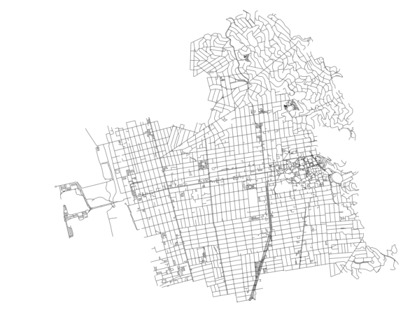
It should result in this basic view of Berkeley:
Next step (and this is all still just from the notebook) is to add the impedance between edges (the cost to walk from one node to another):
# add an edge attribute for time in minutes required to traverse each edge
meters_per_minute = travel_speed * 1000 / 60 #km per hour to m per minute
for u, v, k, data in G.edges(data=True, keys=True):
    data['time'] = data['length'] / meters_per_minute
And now generate the iso colors for when we plot access levels:
# get one color for each isochrone
iso_colors = ox.get_colors(n=len(trip_times), cmap='Reds', start=0.3, return_hex=True)
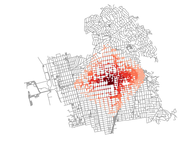
Let’s run the first version from the notebook, which plots each node and buffers them slightly as well as colors them. This is one way to show accessibility from the original center node:
# color the nodes according to isochrone then plot the street network
node_colors = {}
for trip_time, color in zip(sorted(trip_times, reverse=True), iso_colors):
    subgraph = nx.ego_graph(G, center_node, radius=trip_time, distance='time')
    for node in subgraph.nodes():
        node_colors[node] = color
nc = [node_colors[node] if node in node_colors else 'none' for node in G.nodes()]
ns = [20 if node in node_colors else 0 for node in G.nodes()]
fig, ax = ox.plot_graph(G, fig_height=8, node_color=nc, node_size=ns, node_alpha=0.8, node_zorder=2)
This should get us to the original dots plot:
Similarly, we can extract those points as point clouds and generate a convex hull around each:
# make the isochrone polygons
isochrone_polys = []
for trip_time in sorted(trip_times, reverse=True):
    subgraph = nx.ego_graph(G, center_node, radius=trip_time, distance='time')
    node_points = [Point((data['x'], data['y'])) for node, data in subgraph.nodes(data=True)]
    bounding_poly = gpd.GeoSeries(node_points).unary_union.convex_hull
    isochrone_polys.append(bounding_poly)

# plot the network then add isochrones as colored descartes polygon patches
fig, ax = ox.plot_graph(G, fig_height=8, show=False, close=False, edge_color='k', edge_alpha=0.2, node_color='none')
for polygon, fc in zip(isochrone_polys, iso_colors):
    patch = PolygonPatch(polygon, fc=fc, ec='none', alpha=0.6, zorder=-1)
    ax.add_patch(patch)
plt.show()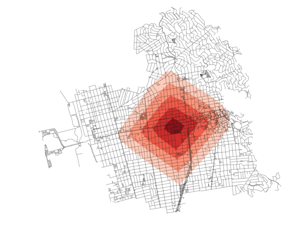
There are downsides to both of the above methods. In the first, the dots can be hard to read. Identifying contiguous areas of coverage is tough. Also, downstream, one will have to keep track of the fact that a single coverage area is a MultiPoint or MultiPolygon object and not a single area of coverage which is not intuitive (I would argue).
For the convex hull geometries, all nuance is lost. Imagine if there was a wedge of inaccessible blocks in that area. It would not be covered in the above method. As a result, we would need to devise something that accounts for that and tries to be more nuanced with how it draws coverage area.
A new method of generating isochrones
I’ll walk through this new method step by step and then wrap it all together at the end. For now, let’s just work with the 25 minute radius. Let’s also set the buffer value to 25 meters (since this is projected in meters). This will be assigned to variable name buffer_val.
trip_time = list(sorted(trip_times, reverse=True))[0]First, let’s just pull out these nodes and generate that point cloud.
subgraph = nx.ego_graph(G, center_node, radius=trip_time, distance='time')

node_points = [Point((data['x'], data['y'])) for node, data in subgraph.nodes(data=True)]
nodes_gdf = gpd.GeoDataFrame({'id': subgraph.nodes()}, geometry=node_points)
nodes_gdf = nodes_gdf.set_index('id')

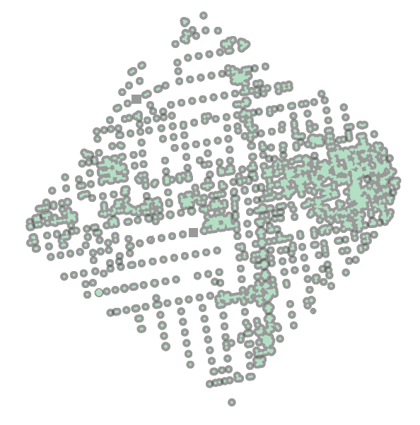
nodes_gdf.buffer(buffer_val).unary_union
This will generate the following result:
Now, let’s do the same for the edges. If we use the edges instead of the nodes, we will get a continuous line set that we can use to plot or, more important, buffer. From this buffer we will achieve on single Polygon representing accessibility at this given time threshold.
edge_lines = []
for n_fr, n_to in subgraph.edges():
    f = nodes_gdf.loc[n_fr].geometry
    t = nodes_gdf.loc[n_to].geometry
    edge_lines.append(LineString([f,t]))

edges_gdf = gpd.GeoDataFrame(geometry=edge_lines)
edges_gdf.buffer(buffer_val).unary_union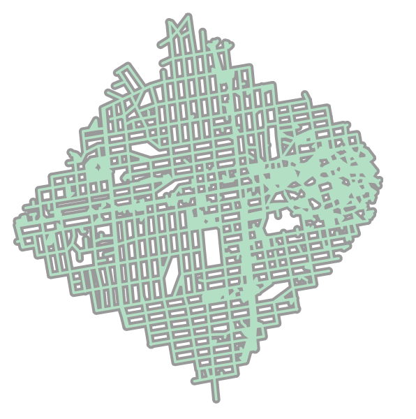
Wrapping this all up into a single function, we can write:
def make_iso_polys(G, edge_buff=25, node_buff=50, infill=False):
    isochrone_polys = []
    for trip_time in sorted(trip_times, reverse=True):
        subgraph = nx.ego_graph(G, center_node, radius=trip_time, distance='time')

        node_points = [Point((data['x'], data['y'])) for node, data in subgraph.nodes(data=True)]
        nodes_gdf = gpd.GeoDataFrame({'id': subgraph.nodes()}, geometry=node_points)
        nodes_gdf = nodes_gdf.set_index('id')

        edge_lines = []
        for n_fr, n_to in subgraph.edges():
            f = nodes_gdf.loc[n_fr].geometry
            t = nodes_gdf.loc[n_to].geometry
            edge_lines.append(LineString([f,t]))

        n = nodes_gdf.buffer(node_buff).geometry
        e = gpd.GeoSeries(edge_lines).buffer(edge_buff).geometry
        all_gs = list(n) + list(e)
        new_iso = gpd.GeoSeries(all_gs).unary_union

        # If desired, try and "fill in" surrounded
        # areas so that shapes will appear solid and blocks
        # won't have white space inside of them
        if infill:
            new_iso = Polygon(new_iso.exterior)
        isochrone_polys.append(new_iso)
    return isochrone_polys
This allows us to iterate through each node and each geometry and buffer them a given amount. We can then merge the two together for each threshold isochrone and append them to the list to plot over the network graph, as had previously been done in the OSMnx examples.
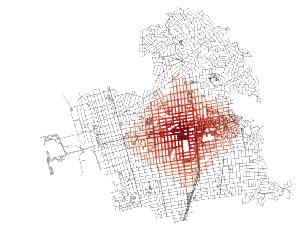
Thinner buffer radii will result in a more skeletal isochrone (as shown below):
Similarly, “thicker” buffers will allow for a more filled in, but also more nuanced, isochrone compared with the convex hull method (as shown below):
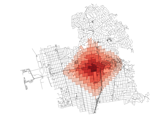
Note that in the above, I set infill to True so that blocks that are surrounded on all sides by edges that are accessible become, themselves, filled in.
And one more, this time with pronounced nodes:
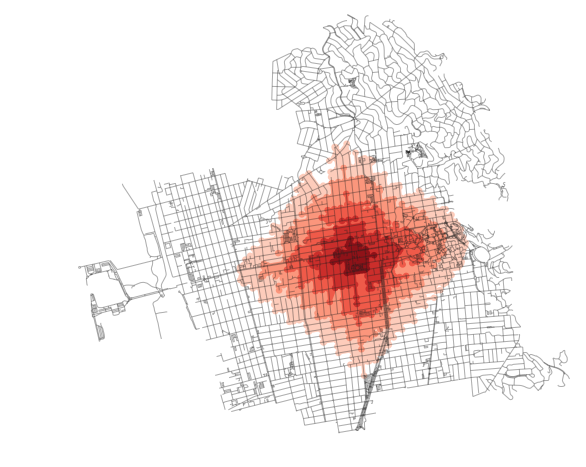
Again, each plot above can be produced by simply tweaking the parameters in the make_iso_polys method and rerun, like so:
# First, run our new method
isochrone_polys = make_iso_polys(G, 50, 50, True)

# And use the results in the plot, just as we were performing these steps originally
fig, ax = ox.plot_graph(G, fig_height=8, show=False, close=False, edge_color='k', edge_alpha=0.2, node_color='none')
for polygon, fc in zip(isochrone_polys, iso_colors):
    patch = PolygonPatch(polygon, fc=fc, ec='none', alpha=0.6, zorder=-1)
    ax.add_patch(patch)
plt.show()