Developing pattern for generating comparative hyperpath plots against network OD pairs with Peartree: pic.twitter.com/u89QrI4Sbt
— Kuan Butts (@buttsmeister) March 15, 2018
Above: The tweet that was the basis for this blog post.
Introduction
I was recently reading about hyperpaths as part of the MTC’s Fast-Trips project.
As I have been curious to begin developing agent-based models that utilize Peartree’s generated network graph, I figured I good first step would be to have the capacity to generate these subnetworks. That is, in given a particular O-D pair, there may be a number of potential reasonable paths to get from the origin to the destination.
From this subset of potential acyclic networks, probabilities can be calculated that would then allow a modeling of route choice. This blog post seeks to only sketch out how different paths could be drawn out from the resultant Peartree graph, given a case study of the AC transit network in the East Bay.
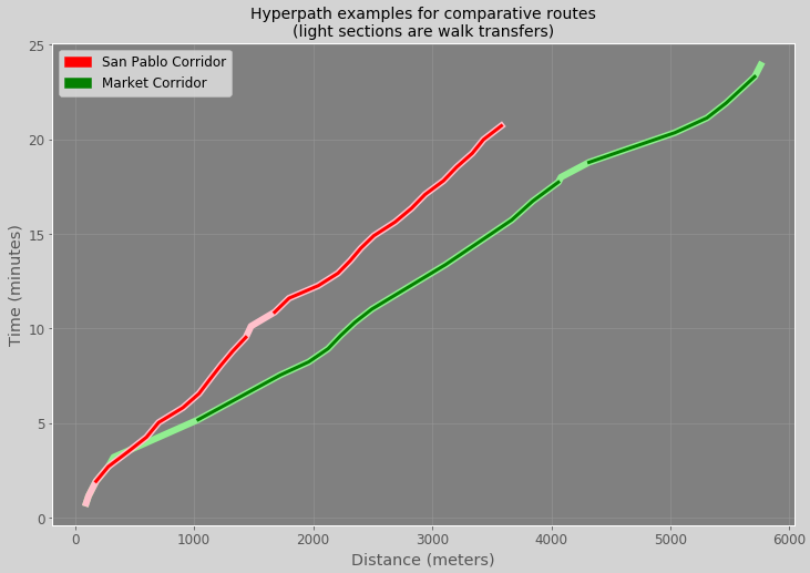
The resulting summary data is then plotted as a graph (as seen in the second image in the tweet). The resulting summary data could also be used in conjunction with various edge and path attributes (such as number of transfers) to calculate the agent’s most likely path option.
Getting started
First, a list of the libraries we will be using:
import geopandas as gpd
import networkx as nx
import numpy as np
import osmnx as ox
import pandas as pd
import peartree as pt
Next, we need to load in the network as a Peartree directed graph:
path = 'ac_transit.zip'
feed = pt.get_representative_feed(path)

# time frame is 7 to 10 AM
G = pt.load_feed_as_graph(feed, 7*60*60, 10*60*60,
                         exempt_internal_edge_imputation=False)
Note that we turned off exempt_internal_edge_imputation. This parameter chooses whether or not to create walk edges between close nodes in a network. So, if there are two bus stops that are close together (the connection_threshold is defaulted to 50 meters), we create a direct link from one to the other. The time cost (set as length currently in the network edge attributes), is set to a function of the rate of the walk_speed_kmph parameter. This is default to 4.5 kilometers per hour. The straight line distance is then divided by the walk speed to determine the amount of time that edge cost is going to represent.
Selecting paths
We now want to pick and origin and destination and some intermediary points. With this data, we can establish two clear paths from an origin and a destination.
# Establish an origin and destination
# format: [y, x]
origin = [37.820748, -122.276476]  # oakland, san pablo & market
destination = [37.870404, -122.281998]  # berkeley, sacramento & university

# Get two midpoints to force two alternate paths
midpoint_a = [37.848789, -122.285524]  # along san pablo
midpoint_b = [37.838936, -122.273907]  # along market
We will need to write a simple method to tether these coordinates to their nearest node on the network graph. I’ve sketched that out with the below function:
from typing import Tuple
from osmnx.utils import great_circle_vec

# Here, we define a method of pulling in the id of the nearest
# node to a given point array
def get_nearest_node_from_graph(G: nx.DiGraph, point: Tuple) -> pd.Series:
    # Extract node data from network graph
    coords = []
    for node, data in G.nodes(data=True):
        coords.append([node, data['x'], data['y']])

    # Convert node coordinate data to a dataframe
    df = pd.DataFrame(coords, columns=['node', 'x', 'y'])
    df['reference_y'] = point[0]
    df['reference_x'] = point[1]

    # Calculate great circle distance
    distances = great_circle_vec(lat1=df['reference_y'],
                                 lng1=df['reference_x'],
                                 lat2=df['y'],
                                 lng2=df['x'])

    # Nearest node has the minimum distance
    nearest = int(distances.idxmin())
    return df.iloc[nearest].node
Now that we have a way to find the nearest node id, let’s get them for all the points we defined:
# Using the prior described method, get the id name of
# each node that is mostly closely located to each point
from_node = get_nearest_node_from_graph(G, origin)
to_node = get_nearest_node_from_graph(G, destination)

mid_a = get_nearest_node_from_graph(G, midpoint_a)
mid_b = get_nearest_node_from_graph(G, midpoint_b)

# Logging them will return the following:
print(from_node, mid_a, mid_b, to_node)
# ('6NZJ4_1018460', '6NZJ4_1018410', '6NZJ4_1015850', '6NZJ4_0304350')
Now, theoretically, there would be a better way of devising what the most likely routes are for the agent to be selecting between (and would comprise other modes and the like), but let’s say that these are the two paths that the model were to spit out that the agent would be picking between. For example, the agent could be attempting to trip chain, and the midpoints are equivalent destinations that the agent would be willing to stop off at one or the other.
Generating paths
With the resulting intermediary points, we can employ NetworkX’s shortest path algorithms to find the shortest path for each of the two alternate routes:
# Each path first goes to the midpoint and then from there to the end point
shortest_path_1a = nx.dijkstra_path(G, from_node, mid_a, weight='length')
shortest_path_1b = nx.dijkstra_path(G, mid_a, to_node, weight='length')

shortest_path_2a = nx.dijkstra_path(G, from_node, mid_b, weight='length')
shortest_path_2b = nx.dijkstra_path(G, mid_b, to_node, weight='length')
We can then assemble the two halves of each path and create two distinct paths:
shortest_path_1 = shortest_path_1a + shortest_path_1b[1:]
shortest_path_2 = shortest_path_2a + shortest_path_2b[1:]

# Each represents the two alternate paths that include
# the two alternate midpoints that need to be hit
paths = [shortest_path_1, shortest_path_2]
Now that we have the paths, we will also need to calculate attributes along it. Specifically, we want to estimate the time it takes to traverse each segment, from node to node, and where transfers occur (or the agent would just be walking and not taking the bus, for example).
Let’s first just write a method to see how the two paths stack up:
# Now we can sum up the cost of each edge in the node
# path for each alternate path
def get_path_cost(path, weight='length'):
    cost = 0
    for a, b in zip(path[:-1], path[1:]):
        edge = G[a][b]
        cost += edge[0][weight]
    return cost
And, the results using that method:
# See how much it costs for each path, in seconds
print(get_path_cost(paths[0]), get_path_cost(paths[1]))
# (1435.8569037263003, 1243.0841501094876)

# ...and in minutes
print(get_path_cost(paths[0])/60, get_path_cost(paths[1])/60)
# (23.93094839543834 20.71806916849146)
From these results, we can see one is 3 minutes slower than the other.
Visualizing the paths
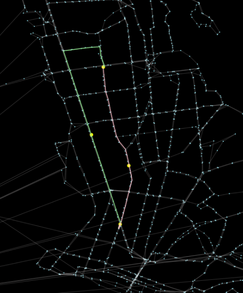
We know the comparative times for the two paths, but let’s see how they stack up. Let’s make a plot of the two paths so we can see how they differ “on a map” of East Bay (cropped to West Oakland and Emeryville, approximately).
We will be using two additional methods from our libraries:
from shapely.geometry import LineString, Point
from peartree.toolkit import great_circle_vec
Now, in addition to plotting the graph, we will also need to plot the two paths and the nodes that are along them. So, we will need first a method to generate a GeoDataFrame of the edges:
def make_edges_df(G, node_list):
    pts = []
    for n in node_list:
        node = G.nodes[n]
        pts.append(Point(node['x'], node['y']))
    edges = []
    for a, b in zip(pts[:-1], pts[1:]):
        edges.append(LineString([a, b]))
    dts = []
    modes = []
    distances = []
    for a, b in zip(node_list[:-1], node_list[1:]):
        dts.append(G[a][b][0]['length'])
        modes.append(G[a][b][0]['type'])

        # This is a hacky attempt to estimate the
        # distance covered by this portion of the route
        # by calculating the great circle distance between
        # two stops. What would be better would be to actually
        # use the shapes from the GTFS to calculate the true
        # distance along the route, but this is good enough
        # for a sketch example
        ds = great_circle_vec(
            G.nodes[a]['x'],
            G.nodes[a]['y'],
            G.nodes[b]['x'],
            G.nodes[b]['y'])
        distances.append(ds)

    return gpd.GeoDataFrame({
        'from': node_list[:-1],
        'to': node_list[1:],
        'distance': distances,
        'mode': modes,
        'time': dts
    }, geometry=edges)
As you can see in the comment inline, I do a quick estimate of the spatial distance that each edge represents using great circle. This will be used to contrast against the time it takes to traverse that edge segment. Better practice would be to use the actual route path length, which we could access in the GTFS for AC Transit, but for our cases right now, let’s call this method good enough for an example.
And also for the nodes, as a GeoDataFrame:
def make_nodes_df(G, node_list):
    pts = []
    for n in node_list:
        node = G.nodes[n]
        pts.append(Point(node['x'], node['y']))
    return gpd.GeoDataFrame(geometry=pts)
Now, we can leverage OSMnx to help us plot the network graph (as we can see, above). We can use the resulting axis object to add our nodes on top of that:
a = make_edges_df(G, shortest_path_1)
b = make_edges_df(G, shortest_path_2)
c = make_nodes_df(G, [from_node, mid_a, mid_b, to_node])

# Use OSMnx as it makes it super easy to plot NetworkX graphs
# of spatial data!
fig, ax = ox.plot_graph(G,
                        fig_height=12,
                        show=False,
                        close=False,
                        bbox=[37.89, 37.80,
                              -122.24, -122.32],
                        node_color='#8aedfc',
                        node_size=5,
                        edge_color='#e2dede',
                        edge_alpha=0.25,
                        bgcolor='black')
a.plot(ax=ax, color='lightgreen')
b.plot(ax=ax, color='pink')
c.plot(ax=ax, color='yellow', markersize=50)
Plotting comparative paths

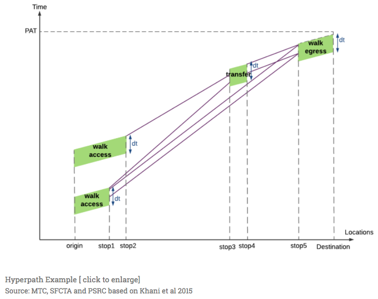
Not only can we plot the spatial paths of the two alternate routes, but with the new edge dataframe, we can also generate comparative plots. In the one I generate here, I will attempt to mimic the hyperpath example from Fast-Trips documentation (also shown above).
I’ll go into the code after the image, but want to just give a high level overview of what I will do. First, I will utilize the .cumsum() Pandas API to estimate the total elapsed time at each node along the route. Then, I will do the same with the edge distance estimates to see how far along the route each segment is. Thus, the x axis will represent cumulative distance while the y axis will represent cumulative time.
Dark portions of the graph lines by color will represent the portions of the route that are on transit while the lighter portions will represent walk segments. X axis (total distance) will be measured in meters while the Y axis (total elapsed time) will be measured in minutes.

Here’s how the plot was generated: First, I generate the cumulative sums mentioned prior that represent elapsed time and total distance. I then set the distance to the index to the distance so that, when I plot a line graph of the elapsed time, the distance values will be represented along the X axis. I utilize the mode tag along the edges to “turn off” edge values for segments that are walk for one set of lines. This will allow us to expose which part of the segment is walk or not, and to easily calculate how many transfers are involved in each path.
df1 = pd.DataFrame(a.copy())
df2 = pd.DataFrame(b.copy())

df1['dist_approx'] = df1['distance'].round().astype(int).cumsum()
df2['dist_approx'] = df2['distance'].round().astype(int).cumsum()

df1 = df1.set_index('dist_approx')
df2 = df2.set_index('dist_approx')

# Make time in minutes
df1['time'] = df1['time']/60
df2['time'] = df2['time']/60

df1['time_t'] = df1[['time']].cumsum()
df1['time_w'] = df1[['time']].cumsum()
df1.loc[(df1['mode'] == 'walk'), 'time_w'] = np.nan

df2['time_t'] = df2[['time']].cumsum()
df2['time_w'] = df2[['time']].cumsum()
df2.loc[(df2['mode'] == 'walk'), 'time_w'] = np.nan
Once we have the data frames modified for each comparative path, we can wrangle some matplotlib and spit something out.
# The plotting
# Wrangle matplotlib and make a plot of the comparative hyperpaths
import matplotlib.pyplot as plt
import matplotlib.patches as mpatches

fig, ax = plt.subplots(
    figsize=(12,8),
    facecolor='lightgrey')

df1[['time_t']].plot(
    ax=ax,
    color='lightgreen',
    lw=6)
df1[['time_w']].plot(ax=ax, lw=3, color='green')

df2[['time_t']].plot(
    ax=ax,
    color='pink',
    lw=6)
df2[['time_w']].plot(ax=ax, lw=3, color='red')

ax.set_facecolor('grey')

red_patch = mpatches.Patch(color='red', label='San Pablo Corridor')
green_patch = mpatches.Patch(color='green', label='Market Corridor')
plt.legend(handles=[red_patch, green_patch], loc=2)

ax.grid(color='#999999', linestyle='-', linewidth=0.5)
plt.gca().xaxis.grid(True)
plt.gca().yaxis.grid(True)

plt.ylabel('Time (minutes)')
plt.xlabel('Distance (meters)')

plt.title('Hyperpath examples for comparative routes\n(light sections are walk transfers)', fontsize=14)
Conclusion
Just some notes on how to get two comparative paths as Pandas series plotted. From these vector arrays, we have the capacity to run some quick calculations to “score” routes and generate probabilities. With these scores and probabilities, we are well situated to estimate or model route selection for a given agent!