Above: Short animation I originally tweeted from last weekend when I started sketching out what an interactive network building tool might look like/feel like.
Introduction
I want to briefly jot down some high level ideas for a network builder tool that would use Peartree, which is directed network analysis toolkit for transit schedule data (in GTFS format) I have been working on for the last year (time has flown by!). The reason I want to create an interface is that I feel the Peartree tool’s utility on its own is hard to convey. I think, with a simple interface, I could “game-ify” it and potentially create a toy version of the tool that would allow people to see how the sorts of graph-based analyses it can perform might help a network designer add new transit lines (for example).
Overview and introduction to the interface concept
The intent of the interface is to enable 2 overall functions: First, we need to be able to view the current system (all lines, separated by color) and their current performance (what this is will be described in detail in a moment). Second, we need to be able to edit the network (e.g. draw a new route) and see how that impacts the aforementioned “performance.”
What I’ve created attempts to roughly model that. It is still very much a (hacky) work in progress, but I want to share it at this point and, hopefully, get some feedback. In particular, I’d like to see if I can get feedback on how to best show graph analysis outputs. I do acknowledge there is a bit of a chicken and egg situation here because you may need to understand these graph analyses first to have an idea of what should be shown. That said, the next section hopes to introduce it enough that the “missing parts” that I have not done a good job surfacing can be at least sort of inferred.
Workflow - Start Up
Upon loading up the interface, you are shown the existing transit network (in this case, AC Transit in Alameda County, the East Bay aka Best Side of the Bay).
At this point, you have 2 options: You can start adding routes by drawing with the draw tool (top right corner) or you can look at how the system performs right now. Let’s do the later. To do so, we can click the top left button and view existing conditions analysis.
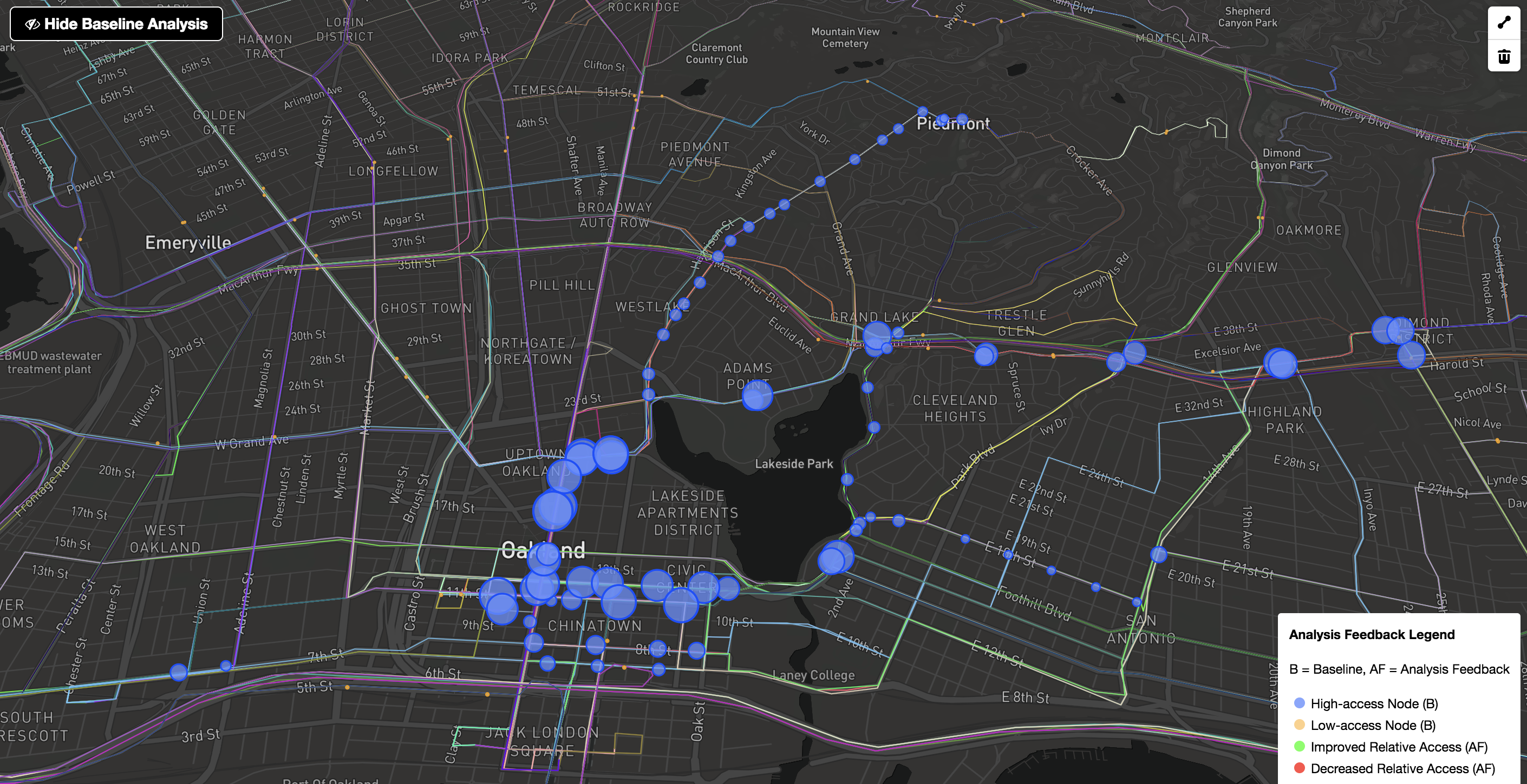
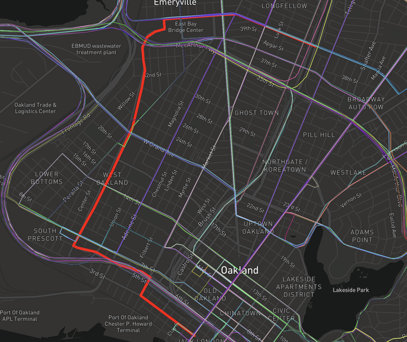
The results are visible in the above image. The size of the blue dot explains the significance of that bus stops. The bigger the blue dot, the more connected that stops is relative the system as a whole. Specifically, that stop represents a critical juncture to the rest of the AC Transit system - those stops are nodes that have a high transfer utility - that is, routes that either transfer at that node or pass through that node have the ability to connect a rider to more of the available transit stops in the system than most other nodes. All blue nodes shown represent the top 10 percent (the top decile) of all nodes in the system (with the biggest being the most important). It should not be surprising that the stretch at 12th and Broadway, around City Center, represents some of the most critical route points and junctures in the whole AC Transit network.
If you look closely at the above map, there are also a number of small orange dots. These represent the bottom decile in terms of the aforementioned centrality measure. These are stops that are significantly less significant as junctures to the rest of the system. If you look closely, you will notice that a lot of these fall along San Pablo. I believe this is the case (without digging deeper) for 2 reasons:
First, I am performing the graph analysis on a subset of the whole system (just around North Oakland to the east side of Lake Merritt. I did this to speed up iteration during development. Running the analysis on the whole system can take 30+ seconds, whereas doing just this subset takes about 1.5 seconds.
Second, San Pablo is more of a threshold in the city than a “corridor.” West Oakland (west of San Pablo) has significantly less transit service than to the east. As a result, the San Pablo and Adeline corridors themselves become feeders into the more connected routes along Broadway in downtown, rather than themselves being arteries that other routes feed into (e.g. from those neighborhoods just west and east of San Pablo).
Workflow - Iteration
At this point, we can see that we could choose to develop a route. Given what we learned about the San Pablo and Adeline north-south streets, let’s develop some more cross town routes that pass through these paths.
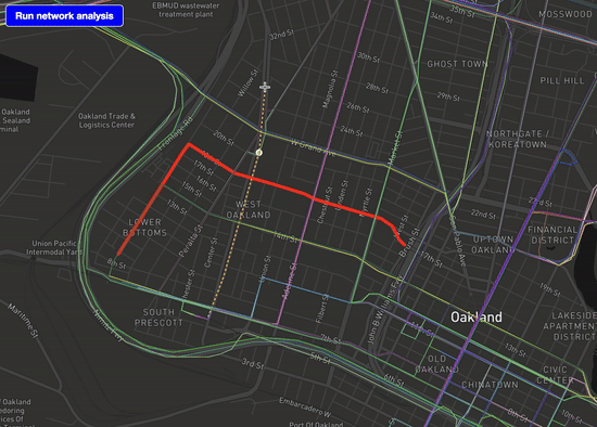
In the above GIF, I am adding a new route that connects from MacArthur, goes down Mandela Parkway, and gets some better access from far west West Oakland neighborhoods to the existing east-west corridors.
We can see the route in the above static shot. Obviously, there are other reasons why this might not be the best route, but let’s just roll with it for the purposes of this post.
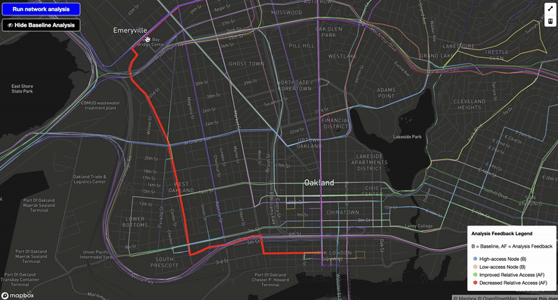
So, what happened? We first triggered the map drawing tool and drew that new route. This auto map-matched to the existing OpenStreetMap network and was rendered in a thick red line.
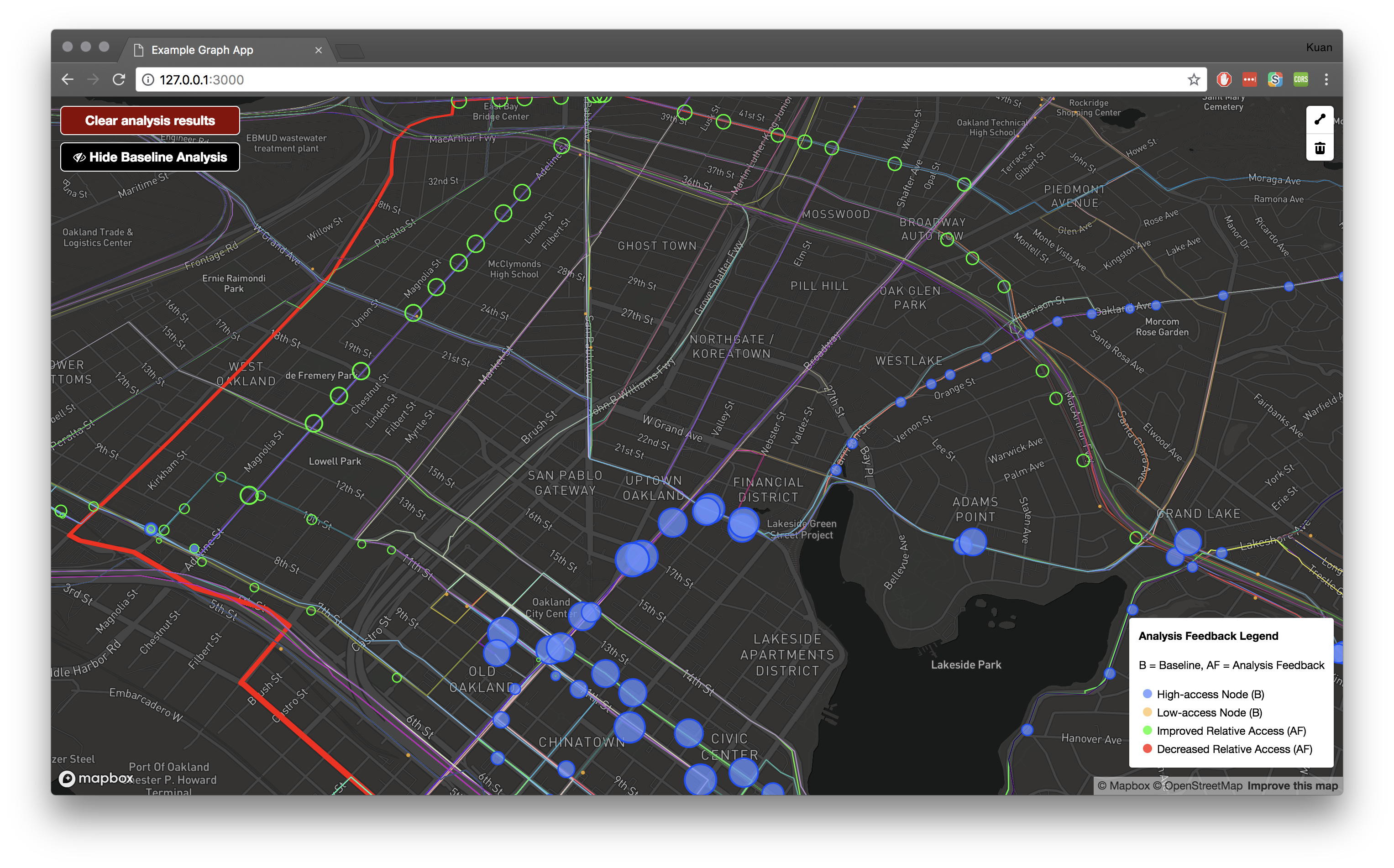
We then were able to click the “Run network analysis” button. This resulted in the above image’s analysis output. As we added a redundancy to the Adeline corridor, and enabled better access for those in the far west of West Oakland better access to cross town (east to west) bus lines, we were able to increase the role of the Adeline corridor’s routes in facilitating higher levels of relative accessibility. As a result, we see green circles all up and down the corridor, representing increased important and relative access of these stops. # What’s next?
Hopefully this helped to show at a high level what one could do with a tool like this. There’s a couple things I can do next:
- I can include more contextual data to better score access in relation to jobs data and population data. This could be done easily with some Census layers.
- I need to think of better and more interactive ways to visualize the analysis. High access nodes, for example, are nodes for which timed transfers are more important. If your systems has timed transfers, maintaining their reliability at these “big circles” is critical to making sure that your system maintains its level of overall accessibility. These are both your “high yield” nodes (a lot of access from one node) but also your risk centers. Thus, when drawing new routes, there is a real tradeoff. Increasing redundancy (as we did with the Mandela Parkway route), actually helped increase the utility of other routes (along Adeline), which potentially can reduce or distribute the risk associated with high access corridors.
Here’s an example: Broadway in the AC Transit system is very critical to overall access. Because Adeline runs fully parallel to it, Broadway could be shutdown without affecting cross town (north to south) bus access, which would allow the system to capitalize on route redundancy and be better suited to accommodating thoroughfare closures (example: major accident or incident on Broadway brings all traffic, including buses, there to a stand still).
Resources
I dumped the code for this project onto Github, here. Please note that it is super hacky, and just intended as a reference for those who would like to look a little more closely at the Peartree implementation (or the frontend components, too).
Final comments
Thanks for reading. If you have any ideas on how to better visualize some of these possibility I mentioned in the “What’s next” section, I am all ears. Also, always happy to have extra eyes on Peartree (or users in general!), which you can take a look at, at its Github repo.