Introduction
This post intends to demonstrate how to identify the key segments of a given road network and model what paths experience the greatest stress when they are removed from the network.
The post focuses on patterns for accomplish this using python-sharedstreets to extract road segment data, peartree to supply a few convenience methods for networkx graph manipulation and export, and graph-tool to do the heavy lifting of running performant network graph algorithms in a lower level data architecture than Python provides (e.g. leverage Boost C++ algorithms on a pure-C data architecture).
Get the road network data
For the purposes of this post we will access the road network from just a single SharedStreets tile. We can use the python client along with mercantile (converts lat/lng data to vector tile coordinates) to assist in pulling it down:
import mercantile
import sharedstreets.tile

# Determine the shapefile for downtown Oakland
oak_lat = 37.8044
oak_lng = -122.2711
z = 12
mt = mercantile.tile(oak_lng, oak_lat, z)
tile = sharedstreets.tile.get_tile(z, mt.x, mt.y)
Once we have the tile, the python client provides a convenience function for extracting the geographic data. From that, and the other information, we can recast this as a meter-based GeoDataFrame:
import geopandas as gpd
import pandas as pd
from shapely.geometry import shape
# Extract the geodata from the tile
geojson = sharedstreets.tile.make_geojson(tile)
# Port all data into a dataframe
geoms = [shape(g['geometry']) for g in geojson['features']]
props = pd.DataFrame([g['properties'] for g in geojson['features']])
gdf = gpd.GeoDataFrame(props, geometry=geoms)
# Reproject to meter based projection
gdf.crs = {'init': 'epsg:4326'}
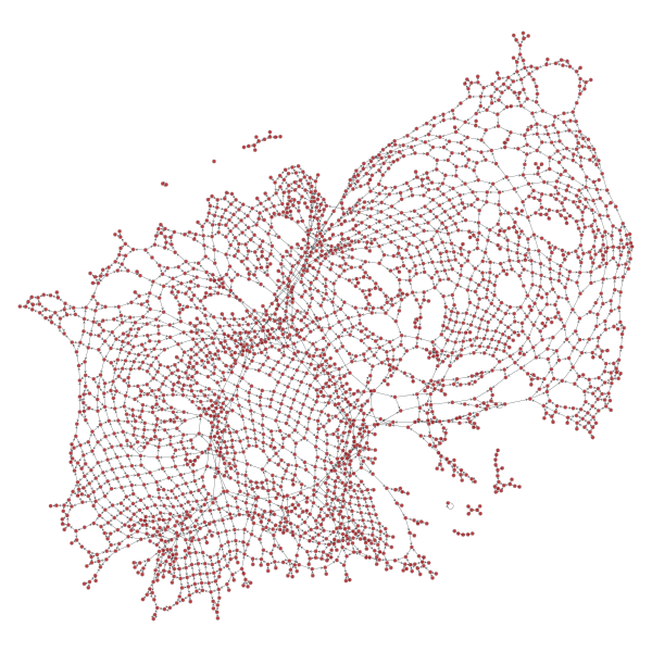
gdf = gdf.to_crs(epsg=2163)This will produce the following results geodata:
From this geodata, we can separate out the nodes and edges as separate tabular datasets:
# The nodes and edges are currently combined in one dataframe
# so break them apart
nodes_gdf = gdf[gdf.roadClass.isnull()].reset_index(drop=True)

# Also only keep edges for which we have both the start and end
# node ids
edges_gdf = gdf[~gdf.roadClass.isnull()].reset_index(drop=True)
str_mask = edges_gdf.startIntersectionId.isin(nodes_gdf.id)
end_mask = edges_gdf.endIntersectionId.isin(nodes_gdf.id)

edges_gdf = edges_gdf[str_mask & end_mask].reset_index(drop=True)
We can then improve the edges dataframe to have attributes related to speed to help us determine the cost of segment traversal (in seconds). We could be a little more sophisticated about this if we wanted, but this is sufficient for the blog post:
# Use these assignment lookups when getting
# metadata related to road segment traversal

# sharedstreets road class lookup
ss_lookup_road_class = {
    0: 'motorway',
    1: 'trunk',
    2: 'primary',
    3: 'secondary',
    4: 'tertiary',
    5: 'residential',
    6: 'unclassified',
    7: 'service',
    8: 'other',
}

ss_set_speeds = {
    'motorway': 65,
    'primary': 45,
    'residential': 25,
    'default': 35
}

# Compute traversal attributes

import numpy as np

def cast_rc(rc):
    if np.isnan(rc):
        return ss_lookup_road_class[6]  # return unclassified
    else:
        return ss_lookup_road_class[int(rc)]

def assign_speed(rc):
    if rc in ss_set_speeds:
        return ss_set_speeds[rc]
    else:
        return ss_set_speeds['default']

edges_gdf['road_class_str'] = [cast_rc(rc) for rc in edges_gdf.roadClass]
edges_gdf['road_speed_kmph'] = [assign_speed(rc) for rc in edges_gdf.road_class_str]

# Calculate the traversal time
edges_gdf['time_secs'] = ((edges_gdf.geometry.length / (edges_gdf.road_speed_kmph * 1000)) * (60 ** 2))
Constructing the graph-tool graph
Now that we have cleaned edge and nodes data and we have edge data with a cost attribute we care about (the time cost), we can convert this into a networkx graph:
from fiona import crs
# Convert dataframes into a network graph
G = pt.graph.generate_empty_md_graph('edges', crs.from_epsg(2163))
for i, row in nodes_gdf.iterrows():
node_id = row.id
geom = row.geometry
geom_x = geom.x
geom_y = geom.y
G.add_node(row.id,
boarding_cost=0,
y=float(geom_y),
x=float(geom_x))
for i, row in edges_gdf.iterrows():
from_id = row.startIntersectionId
to_id = row.endIntersectionId
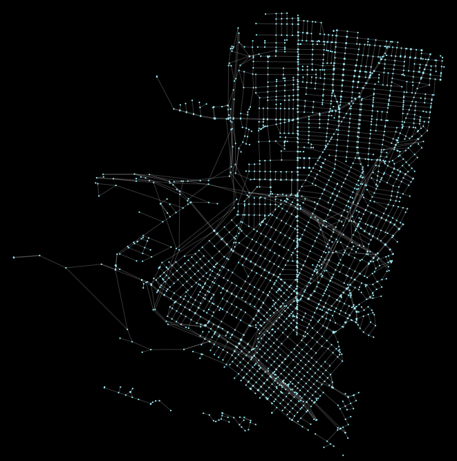
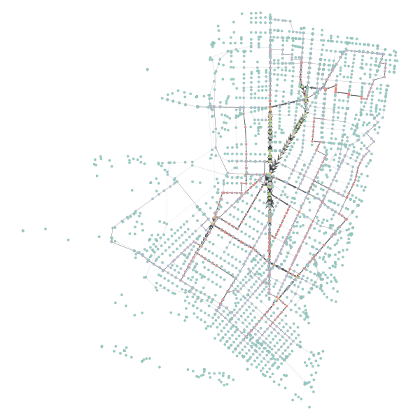
G.add_edge(from_id, to_id, length=row.time_secs, mode='drive') Since this is a peartree style networkx graph, we can use peartree helper methods to examine it. For example, we can plot it and ensure that the conversion looks ok:
Now that we have a peartree style networkx graph, we can use the helper method to convert from a pure python networkx graph to a graph-tool network graph:
from peartree.graph_tool import nx_to_gt
gtG = nx_to_gt(G.copy())

# Plot the graph as a spring diagram and just confirm everything
# got ported over okay
from graph_tool.draw import graph_draw
graph_draw(gtG)
Plotting it will produce a spring graph output that again helps us ensure that the result “looks right”:
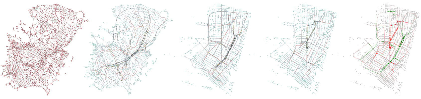
Calculating betweenness centrality is now super cheap. The below calculation takes a fraction of a second on just 2 cores in Docker container on a ‘14 13” MBP:
# Now compute bc values (and note it is super fast)
from graph_tool.centrality import betweenness
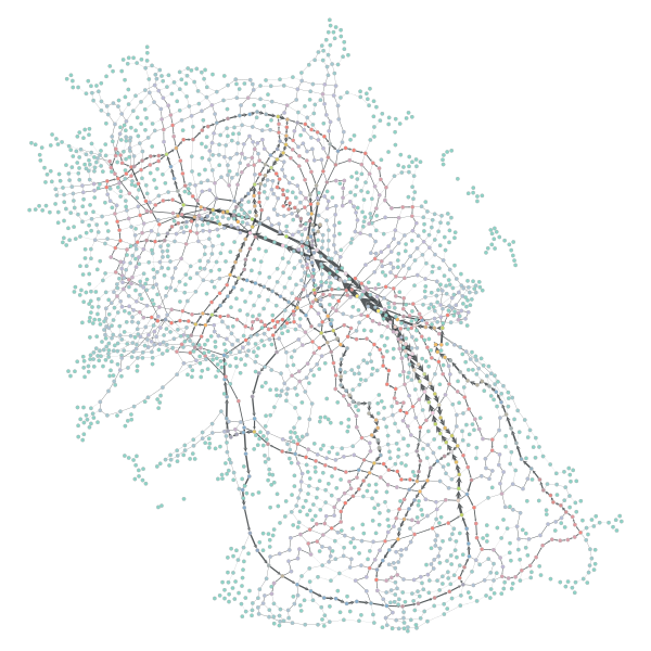
bv, be = betweenness(gtG, weight=gtG.ep['length']We can see the results applied to the spring graph like so:
# Plotted with the following:
be.a /= be.a.max() / 5
graph_draw(gtG, vertex_fill_color=bv, edge_pen_width=be)
Note that the spring diagram does not know “up” from “down” in the spatial since so the arrangement will look correct but may be rotated or inverted compared to what the true spatial distribution is when the coordinate reference system is. We can tether the plot to that using the graph-tool position vector:
# Re-plot with correct x, y values
stop_id = gtG.vp['id']
pos = gtG.new_vertex_property('vector<double>')
for i, xy in enumerate(zip(gtG.vp['x'], gtG.vp['y'])):
    x, y  = xy
    pos[i] = [x, y * -1]

graph_draw(gtG, pos, vertex_fill_color=bv, edge_pen_width=be)
Identifying critical segments
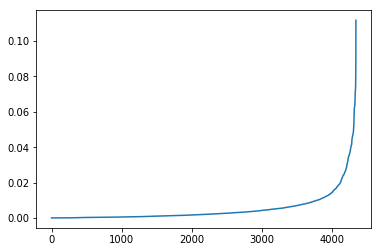
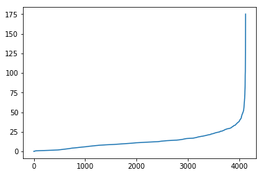
We can view the distribution of the results and see that a few key segments hold most of the shortest path assignments:
# View the distribution of results
bv, be = betweenness(gtG, weight=gtG.ep['length'])
pd.Series(list(be)).sort_values().reset_index(drop=True).plot()
Now we can take the top 5% of the edges and toss them:
# Take the top 5% and identify them
val_thresh = np.percentile(list(be), 95)
drop_edges = [(val.real >= val_thresh) for val in be]
eids = [e[2] for e in gtG.get_edges()]

for drop_check, edge in zip(drop_edges, gtG.get_edges()):
    if drop_check:
        e = gtG.edge(*edge[:2])

        # Let's just keep the edges but give them an unreasonably
        # high cost
        gtG.ep['length'][e] = 999
We can see how this impacts the distribution:
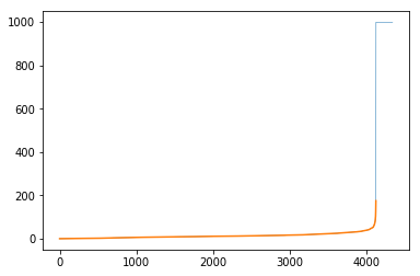
The code to generate the plot looks like:
# Ensure we've created these toss values
pd.Series(list(gtG.ep['length'])).sort_values().reset_index(drop=True).plot(lw=0.5)

# And then also look at the distribution of the remainder
# which is highlighted in orange
temp_ps = pd.Series(list(gtG.ep['length']))
temp_ps = temp_ps[temp_ps < 999]
temp_ps.sort_values().reset_index(drop=True).plot()
And the subset that is just the “not-adjusted” portion:
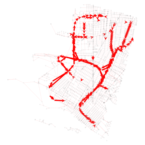
Let’s visualize what the dropped portions of the network are:
The code to generate that looks like this:
# Visualize segments we want to drop
be_dropped = np.array(list(gtG.ep['length']))
m1 = be_dropped >= 999
m2 = be_dropped < 999
be_dropped[m1] = 4.9
be_dropped[m2] = 0.1

be_removed = gtG.new_edge_property('double')a
be_removed.set_2d_array(be_dropped)

graph_draw(gtG, pos, vertex_fill_color='none', edge_pen_width=be_removed, edge_color='red')
Modeling the handicapped network
Now that the “primary” edges have been severely handicapped, we can see where all that impacted routing has been adjusted to by recalculating the betweenness values. Before we do, we should preserve the original values for comparison:
# preserve original be calculations
be_orig = [e for e in be]
At this point, we can recalculate and plot the new, impeded network the same way:
# Now we can rerun bc operation and re-plot result
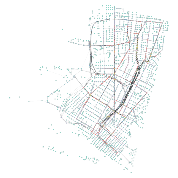
bv, be = betweenness(gtG, weight=gtG.ep['length'])
be.a /= be.a.max() / 5
graph_draw(gtG, pos, vertex_fill_color=bv, edge_pen_width=be)This will result in the same network, but with 2 new core axes:
Evaluating the modified networks path allocations
Let’s take the previous betweenness results and compare them with the new ones. Let’s plot to see where the new edges experienced significant gains over the old network:
be_new = [e for e in be]
be_change = np.array(be_new) - np.array(be_orig)

# Here, we can see the adjustment primarily occuring in the
# negative, a reflection of the adjusted edge strength of that
# 5% of the graph we dampened
pd.Series(be_change).sort_values().reset_index(drop=True).plot()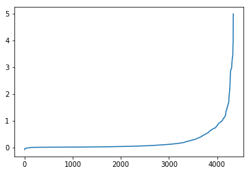
As we can see the adjusted network has a larger high-betweenness spread than the original. This is likely because the paths that were removed were major boulevards and freeways - they had the greatest performance in terms of speed (of course we were modeling without traffic, but it’s likely true either way). At any rate, removing them meant that other thoroughfares were less powerful in terms of time efficiency and, thus, routes were less likely to aggressively tack towards a single set few paths. Thus, more, smaller routes experienced increases in route placement.
We can plot the subset that showed an increase:
# Did we increase centrality anywhere? Did any edges gain strength as
# a result of the modification?
be_inc = be_change.copy()
be_inc[be_inc <= 0.0] = 0.0
be_inc = be_inc / be_inc.max()
be_inc = be_inc * 5

be_adj = gtG.new_edge_property('double')
be_adj.set_2d_array(be_inc)

graph_draw(gtG, pos, vertex_fill_color='lightgrey', edge_pen_width=be_adj, edge_color='green')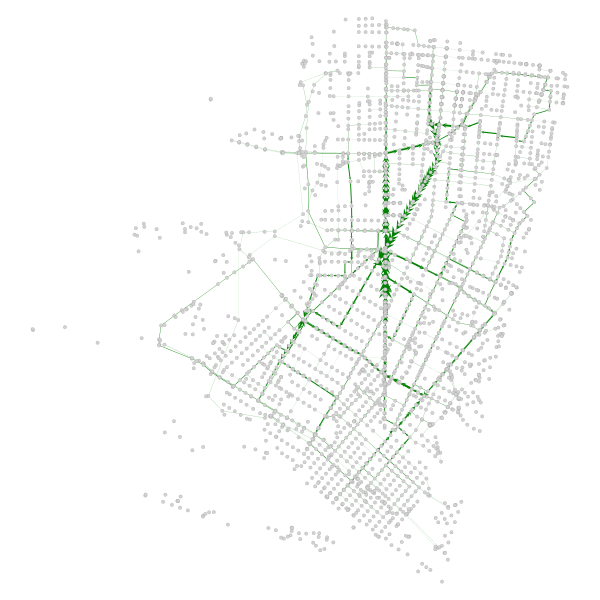
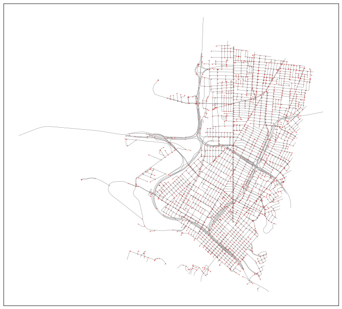
There are 2 clear paths that took the brunt of the network path re-assignment - San Pablo and Adeline. I have highlighted them in the below map (sorry for using Google Maps, OSM community):
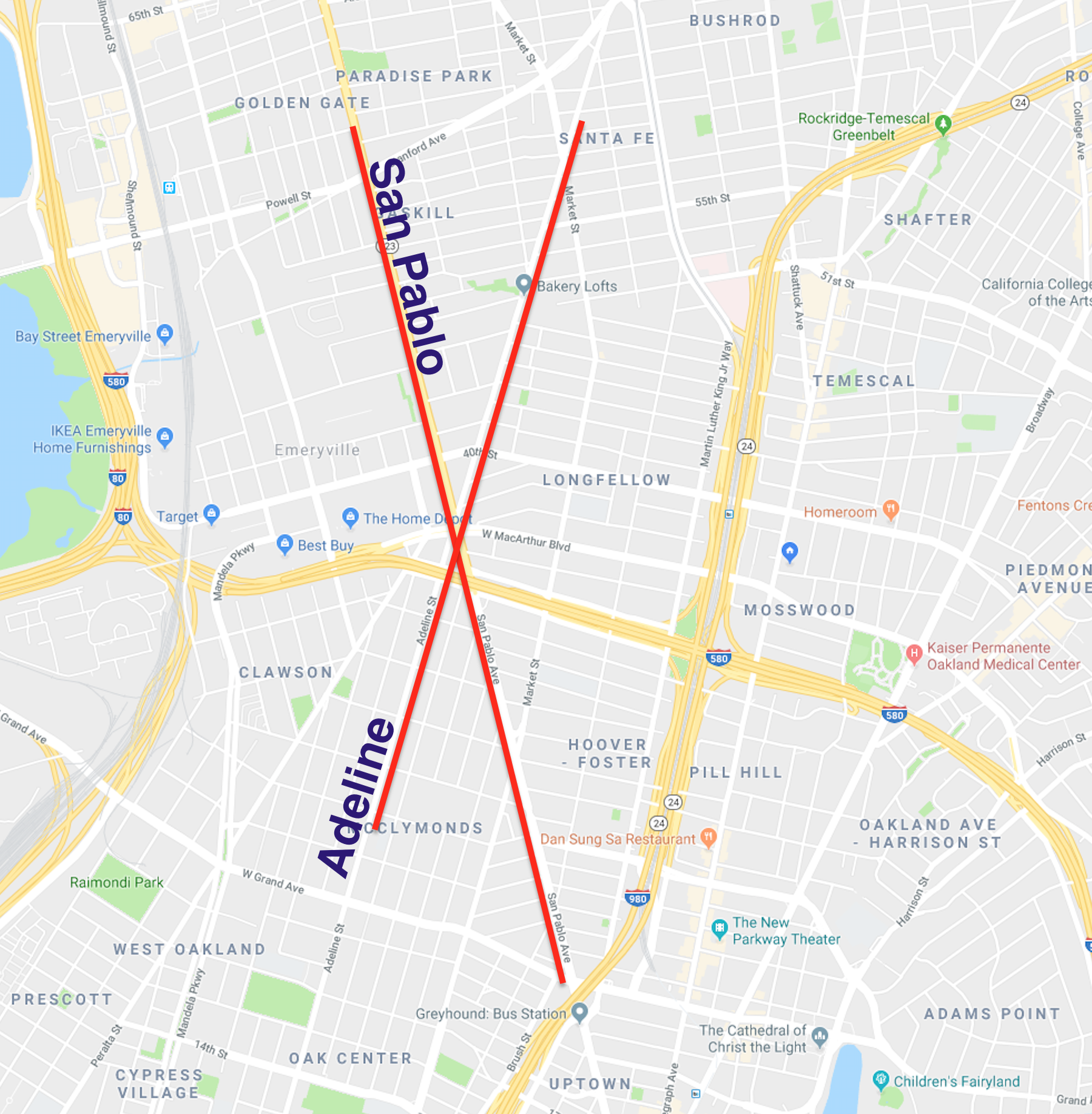
Anecdotally, I happen to know that this result is correct - these are the two secondary corridors that experience heavy traffic, and act as local alternatives to the major freeway auto corridors.
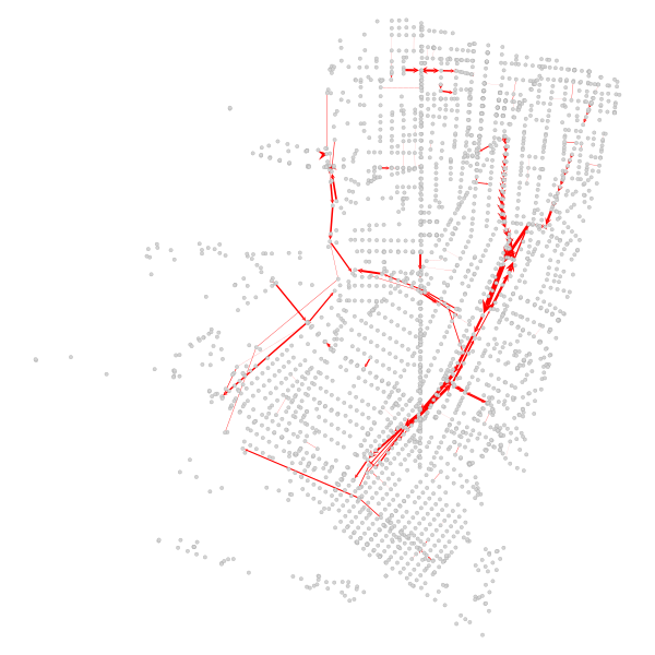
Finally, we can also confirm that the major corridors that prior were the spine of the betweenness results experience the greatest drop in relative centrality:
Conclusion
Hope this demonstrates how lightweight python tools can be chained together to quickly model infrastructure network modification without the need for heavy backend architecture thanks to free services such as SharedStreets and OpenStreetMap.
Additionally, this should demonstrate how it would be easy and quick to establish an iterative (perhaps, recursive) model that repeatedly identifies the “next most important” route segments and tosses them, each time re-running betweenness to identify those “next in line.” With such a pattern, you could create a tiered ordinal classification system for all road networks, taking, say, the top 5% each time and placing them in a group and then tossing them.
Through such a system, you could identify you traffic dispersal patterns may occur and identify touch points for intervention.
Another path to improving this model would be introducing node weights (which graph-tool fully supports). Using that, you could assign population figures, for example, to nodes to correctly weight areas with higher population and areas with lower population. Right now, in the example, all nodes are weighted equally (this was done to keep things simple purely for demonstration purposes).