Today, I gave a presentaton to the Bus Worked Group at NYU with Nathan on our work with the MTA Bustime Monitor application we have been working on over the past three months or so. This post is being written quickly to provide some additional background for those from the meeting as well as others interested on what was presented and what the intended message/point was.
The purpose was to introduce those at the meeting to the power of the well indexed database Nathan has been developing over the past 14+ months and to demonstrate how our work recently was needed to expand the capacity of the database to support more broad queries that could generate powerful visualizations or other analysis, for example. First a presentation was shown (embedded below, as well).
The primary point here was that, using and example interface developed for the talk today, one could run two simple queries to generate visualization that showed where in the city most late busses were occuring. A previous project I had started in the Github Bus Working Group had also begun to dive into this a few months ago using the (shoddy, in my opinion) Socrata open data portal (held in the repository nyc-bus) and focused on crash data over the last two years or so. As an aside, at Transport Camp 2015 two weeks ago I met a guy from the NYC DOT IT departemnt who pointed me to the DOT Vision Zero data feeds which really run laps around what Socrata is offering through their portal. The only downside is you need to batch download and preprocess all the data rather than querying on the fly.
SELECT rds.stop_id, route_id, direction_id,
	fulfilled, early_5, early_2, early,
	on_time, late, late_10, late_15, late_20, late_30
		FROM stops
	INNER JOIN rds ON stops.stop_id = rds.stop_id
	INNER JOIN adherence ON adherence.rds = rds.rds
	WHERE feed_index >= 26
		AND date = date +
		AND hour = hour;
Back to the interface, the above query was used, allowing date and hour to be modified by the user through the interface to allow them to see results for different days and different hours over the past year and a half. The query returns the count of late, ontime, and early buses by stop and route and direction. Each is broken into categories which you can see in the screen shot of the interface. Early categories are early, 2+ minutes, and 5+ minutes. Late categories are segmented by late, 10+ minutes, 15+ minutes, 20+ minutes, and 30+ minutes. As you can see in the below screen capture of the interface, you can toggle which segments to include in the overall measures that are visualized.
The result was fairly powerful in terms of demonstrating the robustness of the data and, I hope, got folks thinking about how usefule the results could be once they could aggregate by week, month, or average by, say, time of day over the entire history. Such capabilities could add a chrononological aspect to the analysis that would allow users to see how perforamnce fluctuates over time or observer spatial or temporal aspects to performance measures at a scale beyond just a week or a day.
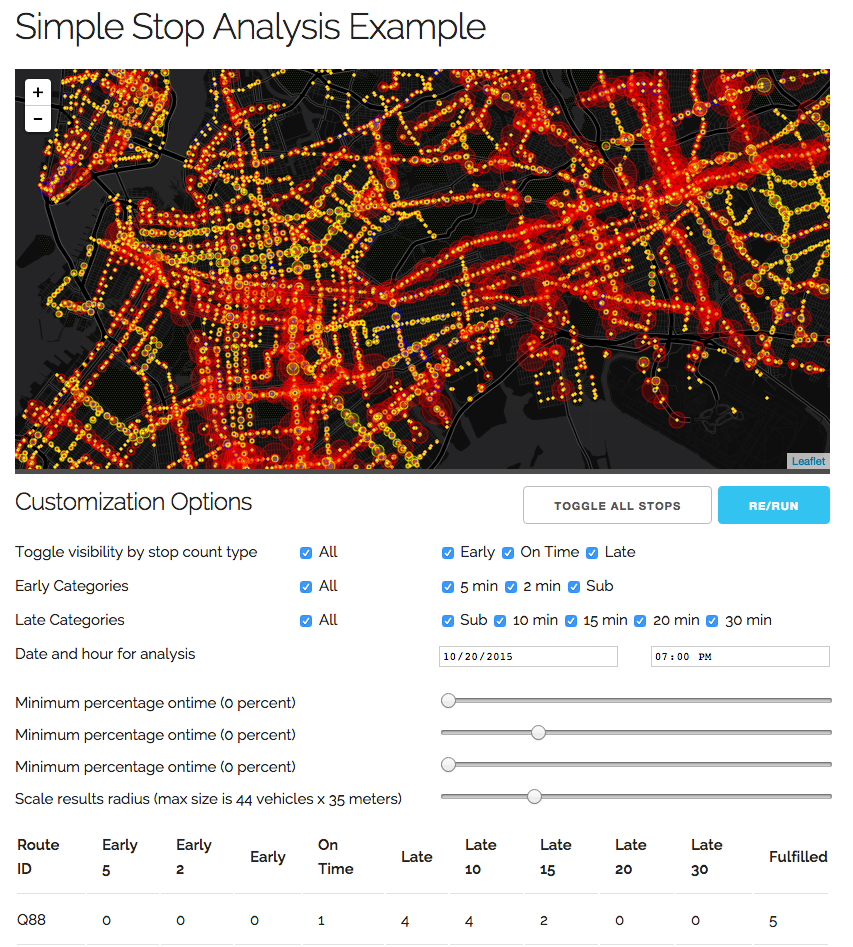
An example interface, screenshot shown above, was presented along with the presentation. The link provided in the presentation will remain functional for the next few days, then I will spin down the virtual machine and it will no longer be usable. If you want to “check it out yourself,” the example interface is sitting in its own repository within the Github group online.
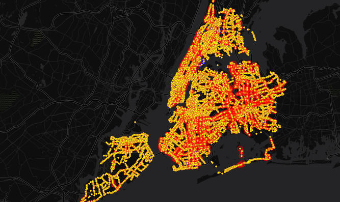
One of the immediate observations that was visible over the days I queried at random was the tendency for the most late buses to cluster in the southeastern portion of Brooklyn, running north-south and east-west south of Forest Park in Queens, as well as just south of Flushing. These late buses dwarf the counts of those on Manhattan or elsewhere in the city.
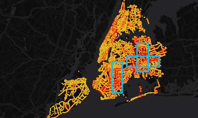
Above are those areas I noted, highlighted in blue.