Background
Isochrones are all the rage these days; they are quite handy for visualizing the area that a given individual can cover in a certain amount of time, given a set of networks s/he can traverse.
Most often, such measure of accessibility are performed on a static network, typically taken from a resource such as OSM (Open Street Map). This provides a base layer which can be subset for a given urban area. On top of this, schedule data such as transit data (GTFS) might be overlaid for enhanced accessibility analysis to, say, determine the efficacy of a transit system. There are a number of tools online, today, that let you play with a precompute OSM network and GTFS transit schedule data. Mapzen has a great resource online that will let you play with even removing a certain road segment to observe the impact of that.
Other work, such as Conveyal’s Transport Analyst, take an extremely detailed approach to analyzing the dynamic nature of schedules and an agent’s utilization of that schedule’s representative network. For an amazing rundown of how this works, be sure to check out this paper (Evidence-Based Transit and Land Use Sketch Planning Using Interactive Accessibility Methods on Combined Schedule and Headway-Based Networks, by Matt Conway, et al), which dives into how a system might account for variation in what actually is in reach for a given agent at each minute of a day to understand how accessibility is dynamic and heavily reliant on the agent’s own schedule - irrespective of that scheduled within the GTFS feed.
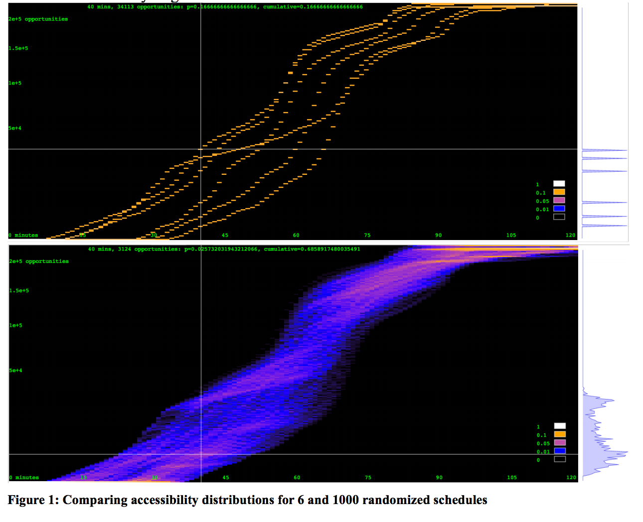
In the above image from page 9 of the paper, the authors demonstrate how departure times at different minutes during a given hour can produce different levels of accessibility for a user over a given amount of travel time.
Make a simple accessibility diagram
The purpose of this blog post is to cover how to make a very simple accessibility diagram, using only a few common OS tools and no outside data. The purpose will be to understand the fundamentals behind how such an accessibility measure is produced as well as to identify opportunity for how one can easily model the introduction of new paths to a network and observe their impact. This may be of value as it is not something that current tools such as Mapzen’s isochrone service currently support.
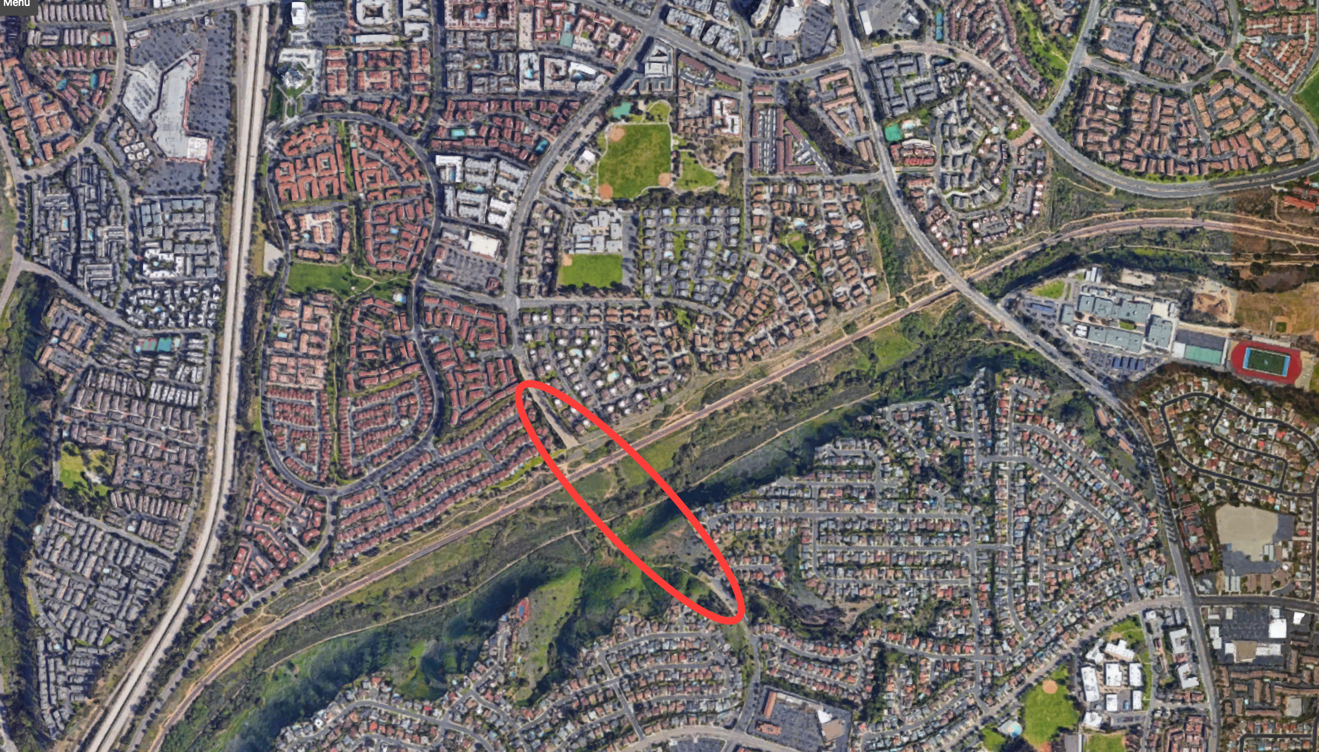
To begin with, we need some context. In the above image, we have a location (32.857879, -117.220896) in San Diego, CA that I happen to know some history on. If you look at the image, you’ll notice that the red oval highlights a road that should have had a bridge spanning the canyon there. It was scheduled to be built in the 80s but has been blocked for decades by NIMBYs, who have aggressively blocked all development of the bridge under thinly veiled excuses fueled by an unfounded belief that the completion of the bridge would negatively affect their home values. Ignoring the details of the situation for now, I think this would be a great starting location as it provides us with:
- An opportunity to introduce a new path to a network and observe its impact.
- A site with a clear barrier across which there is currently limited access (one bridge).
In order to observe what the impact is of creating the new bridge, we will need to obtain the following information:
- A representation of the existing network as 2 data frames: one for nodes, one for edges.
- Identify nodes that are at the end points of the two landing points for the bridge.
- The generation of new edges to the existing edges data frame.
- Instantiation of the network into a graph.
- Creating some measure of accessibility and applying that on the extant nodes in the graph.
- Producing results with and without the new edges (the bridge).
Getting the network
Using any tool you would like, get the bounding box of this area. We’ll hold it like so: bbox = (-117.270899,32.829765,-117.149191,32.912378). Once we have the bounding box, we can use a handy tool from the Urban Data Science Toolkit, called OSMnet. We’ll be using a few of these in this post.
OSMnet is just a wrapper over the Overpass API. There are a number of tools that can do this for you, such as OSMnx. The Overpass API basically let’s you query for the network in a given area.
nodes, edges = osmnet.load.network_from_bbox(bbox=bbox, network_type='drive')The following single line will return two data frames. The first is holds the lat/lon values for the nodes in the network within the bounds provided. The second, edges, holds all single-direction paths between each node in the network.
drive_speed = 40 # in km, basically 25 mph
edges['weight'] = edges['distance']/(drive_speed * 1000)
For this example, we’re going to keep things really simple. We’ll just assume a free flowing speed of 25 mph (40 kmh) everywhere and create a new column in the edges data frame that holds the time it takes to traverse a given segment.
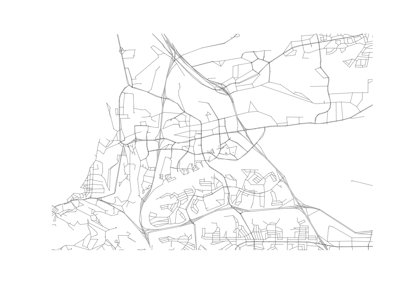
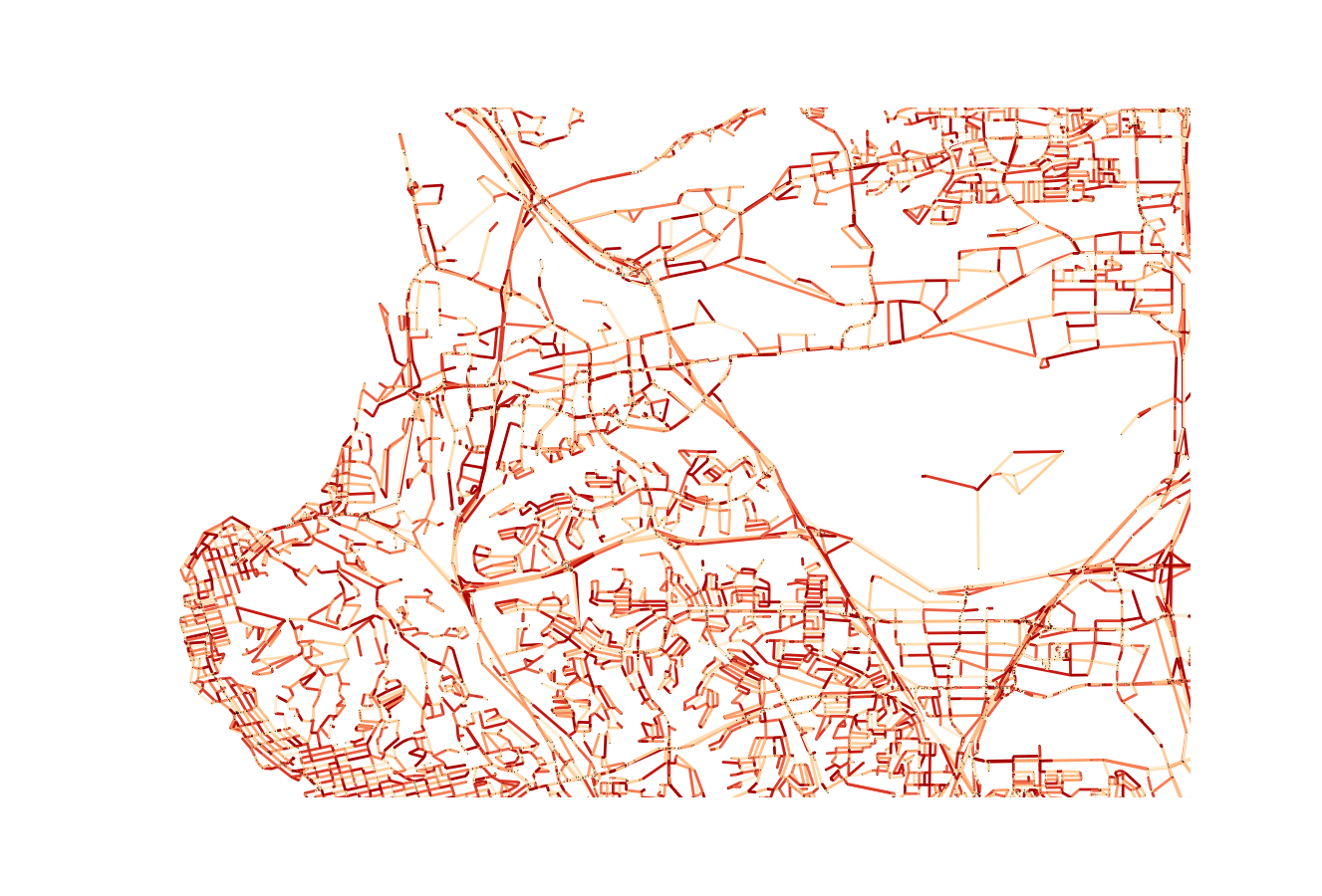
If you want, at this time, you can use another UDST tool, UrbanAccess, to plot the network based off of the nodes and edges (it’s drawing lines between all the nodes that have edges in the system in Matplotlib under the hood). The results would look like the above.
Identify the new bridge
The new bridge needs to connect to the existing network. The ends of the road on the north and south side of the canyon have nodes, and the new bridge should connect the two.
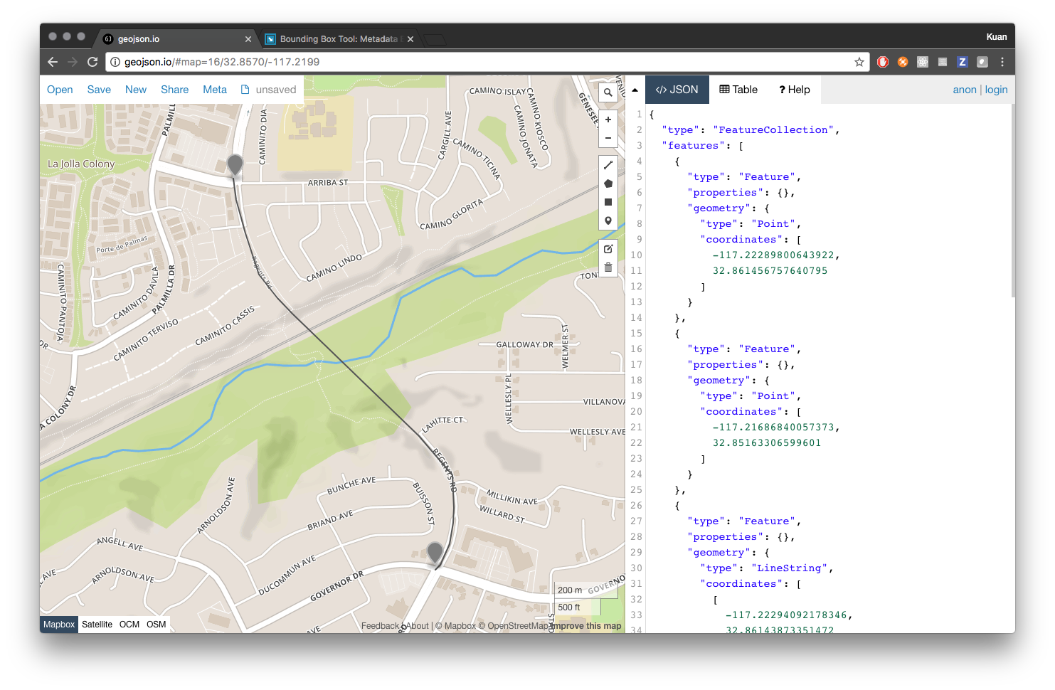
We can see a rough example of what path this bridge is following in the above image. This was created using the site GeoJSON.io, which always comes in handy (so bookmark that if you don’t have it already saved). From the two markers we dropped, we can extract the coordinated of the terminus points of the bridge.
# bridge landing points
northern_terminus = (-117.22289800643922, 32.861456757640795)
southern_terminus = (-117.21721172332762, 32.85505796274407)
There are a number of ways to identify the nearest nodes. In our case, loading the network into a graph and utilizing a nearest neighbor algorithm might be the fastest and easiest solution. To do that, let’s create a Pandana network. Pandanda is another UDST tool that takes those node and edge data frames and converts them into a network graph. It has packaged in it a number of accessibility measurement tools that will make the rest of this work quite easy!
# instantiate a Pandana network
net = pdna.Network(nodes['x'], nodes['y'],
                   edges['from'], edges['to'], edges[['weight']])

# now, given these values, we need to know the nearest nodes for each
nearests = net.get_node_ids(x_vals, y_vals)

# which, in this example, should return the following series
# >>> nearests
# 0      48909913
# 1      49121291
Now that we have those IDs, we can just get the node rows themselves from the original node data frame.
# get the coordinates of these two nodes
# we can use .loc() because the nodes df is indexed with the node ids
northern_node = nodes.loc[nearests[0]]
southern_node = nodes.loc[nearests[1]]
Generate new edges
Now that we have the nodes we need to connect, we need to create new edges for that edge data frame. Before we do that, let’s calculate the distance of this new edge. Again, to be lazy, let’s just assume this bridge is a straight line and use a common method such as Pythagorean Theorem of Haversine to calculate the distance between two points.
# result of this calculation should be 1224 meters
bridge_dist = haversine(northern_node.x, northern_node.y,
                        southern_node.x, southern_node.y)
Once that’s done, we can create two new edge rows that will be ready to be appended to the edges data frame.
# we need to create a new edge to introduce to the network
# it will be appended by first creating a Pandas Series object
from copy import copy
import numpy as np
import pandas as pd

# we will need one for each direction
new_edge_dir1 = pd.Series({
            'access': np.nan,
            'bridge': np.nan,
            'distance': bridge_dist,
            'from': nearests[0],
            'hgv': np.nan,
            'highway': 'residential', # just preserve this, doesn't matter
            'hov': np.nan,
            'lanes': np.nan,
            'maxspeed': np.nan,
            'name': np.nan,
            'oneway': np.nan,
            'ref': np.nan,
            'service': np.nan,
            'to': nearests[1],
            'weight': bridge_dist/(avg_walk_speed * 1000),
            'to_int': nearests[1],
            'from_int': nearests[0]})

# make a copy and just update the from and to values to be flipped
new_edge_dir2 = new_edge_dir1.copy()
new_edge_dir2['from'] = nearests[1]
new_edge_dir2['from_int'] = nearests[1]
new_edge_dir2['to'] = nearests[0]
new_edge_dir2['to_int'] = nearests[0]

# convert both to dataframes and name them
# the name is used as the index label when added
new_edge_dir1.name = (nearests[0], nearests[1])
new_edge_dir2.name = (nearests[1], nearests[0])
Do not append them just yet as we will want to perform an accessibility analysis both with and without the edges.
Create the network
We actually created the network earlier, to take advantage of the nearest neighbor method to identify the bridge end points.
# instantiate a Pandana network
net = pdna.Network(nodes['x'], nodes['y'],
                   edges['from'], edges['to'], edges[['weight']])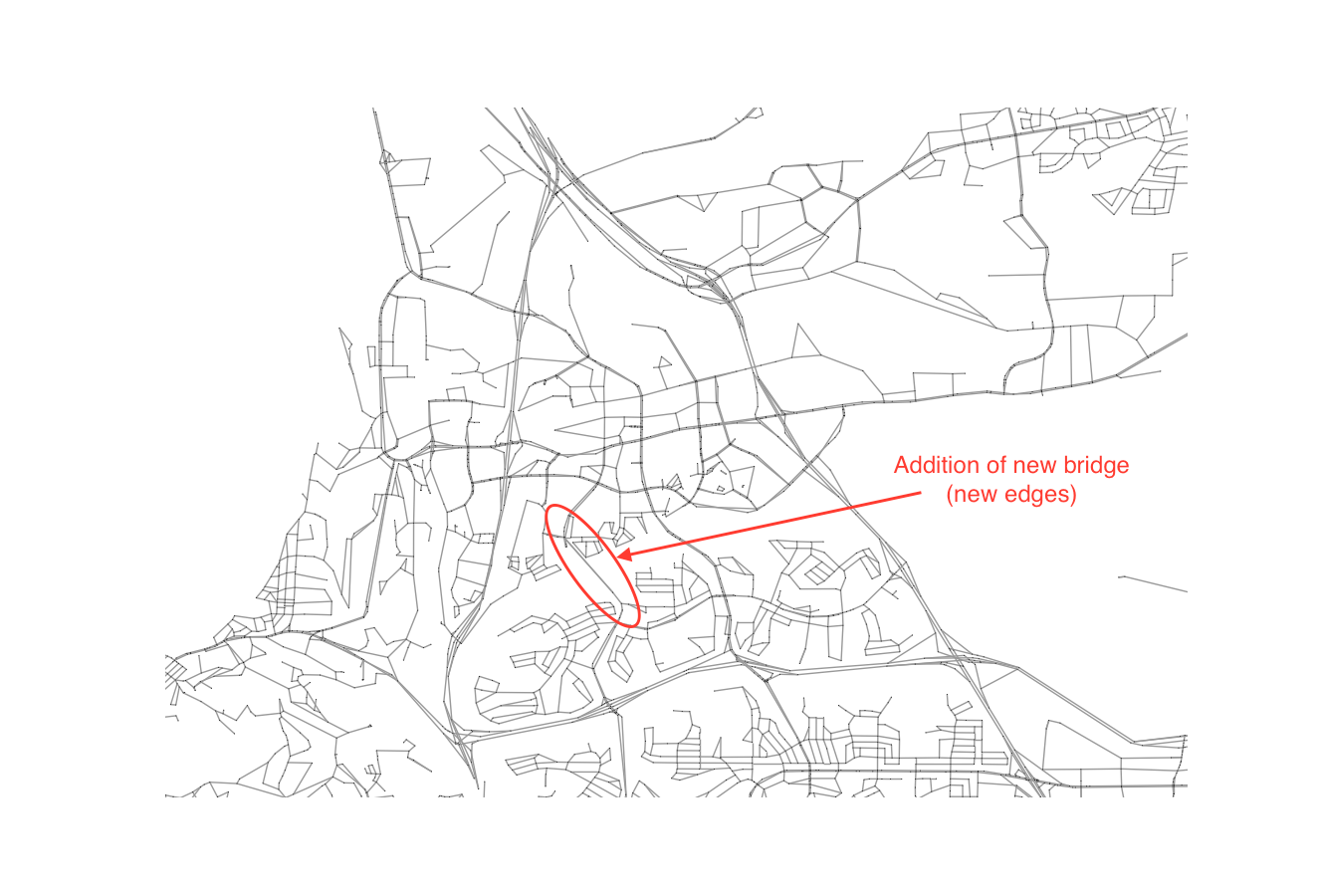
When the bridge is added, the edges will be visible when plotted, along with the rest of the network, as seen in the above image.
We will need to instantiate two networks - one with the new edges and one without. This will allow us to create two different output measures.
Create an arbitrary measure
At this point, we have the ability to work with two graphs, both of which have a measure of impedance (which in this case is free flowing vehicular traffic since we are in the suburbs). We can visualize the cost between nodes by plotting the graph.
The result (above) is not particularly useful, save for its ability to visualize the components that make up the graph, reflecting the varying lengths of given segments. Note, this plot is from a zoomed out view (read, larger bounding box) of the area, to provide some context.
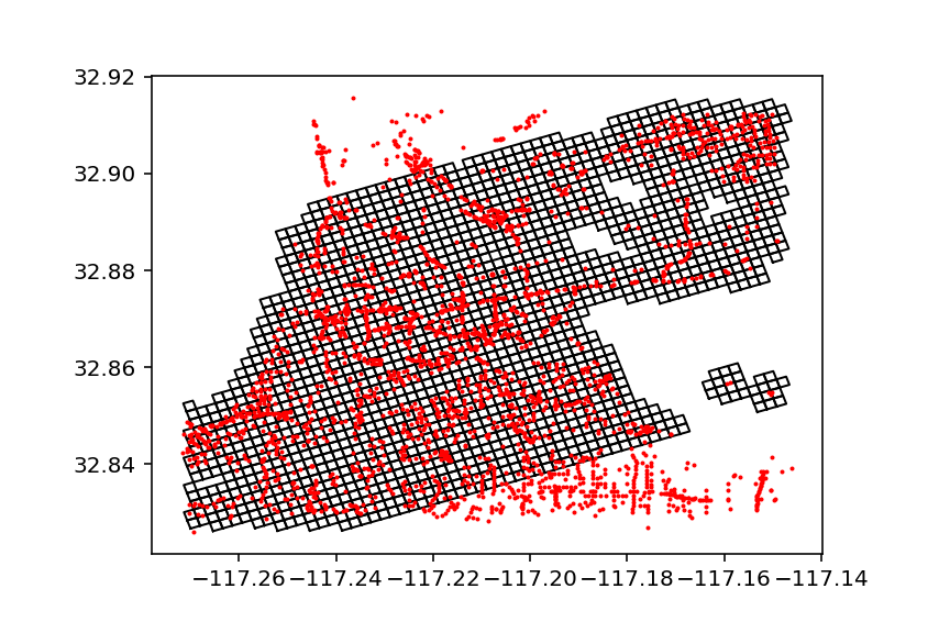
For the purposes of this tutorial, let’s just assume our measure will be access to areas within this neighborhood. I’ve developed a process to chunk the area up into a 200-meter grid and then to project that grid over the network. It’s a bit sloppy for now, but should get the job done in terms of exploration. You can see the result of the grid in the above image. Below, I’ve included a script that will create this GeoDataFrame.
# now we need to recast in a meter projection from lat/lon
# src: http://epsg.io/32154-1750 and transform logic from
import pyproj as proj

# setup your projections
crs_wgs = proj.Proj(init='epsg:4326')
crs_bng = proj.Proj(init='epsg:32154')

x1, y1 = proj.transform(crs_wgs, crs_bng, bbox[0], bbox[1])
x2, y2 = proj.transform(crs_wgs, crs_bng, bbox[2], bbox[3])

# create one giant square for the area being dealt with
from shapely import geometry

poly = geometry.Polygon([[x1, y1], [x2, y1], [x2, y1], [x2, y2]])

# and now calculate the number of squares we are going to use
# assuming 200 meter grid
import math
width = math.ceil(abs(x1 - x2)/200)
height = math.ceil(abs(y1 - y2)/200)

# create a grid of polygons
def generate_grid(x1, y1, width, height):
    all_grid = []
    for iw in range(height):
        for ih in range(width):
            # generate left or western min points
            x1_curr = x1 + (iw * 200)
            y1_curr = y1 + (ih * 200)
            # generate eastern max points
            x2_curr = x1 + ((iw + 1) * 200)
            y2_curr = y1 + ((ih + 1) * 200)
            # append results to the list
            all_grid.append(geometry.Polygon([[x1_curr, y1_curr],
                                              [x2_curr, y1_curr],
                                              [x2_curr, y2_curr],
                                              [x1_curr, y2_curr],
                                              [x1_curr, y1_curr]]))
    return all_grid

# cast the resulting array of Shapely objects as
grid_gdf = gpd.GeoDataFrame(geometry=generate_grid(x1, y1, width, height))

# only keep the cells near nodes
buffered_nodes = nodes_gdf.buffer(0.0025)
unioned_nodes = buffered_nodes.unary_union
grid_gdf = grid_gdf[grid_gdf.intersects(unioned_nodes)]
Once we have this GeoDataFrame, save it to a csv and use it for both networks that are being created (the one with and without a bridge). You can pull it in to each and then add it to the network by attributing nodes to each cell.
import pandas as pd
import geopandas as gpd
from shapely.wkt import loads

# trimmed_grid_gdf_v2.to_csv('grid_gdf.csv')
trimmed_grid_gdf_v2 = pd.read_csv('grid_gdf.csv')
geoms = map(loads, trimmed_grid_gdf_v2.geometry.values)
trimmed_grid_gdf_v2 = gpd.GeoDataFrame(trimmed_grid_gdf_v2, geometry=list(geoms))

centroids = trimmed_grid_gdf_v2.centroid
trimmed_xs = [c.x for c in centroids]
trimmed_ys = [c.y for c in centroids]

trimmed_grid_gdf_v2['centroid_x'] = trimmed_xs
trimmed_grid_gdf_v2['centroid_y'] = trimmed_ys

# get the nearest nodes for each
trimmed_grid_gdf_v2["node_ids"] = net.get_node_ids(trimmed_xs, trimmed_ys)

# for now all locations are weighted equally
trimmed_grid_gdf_v2['val'] = 1

# update the network with the new weighting for each node
net.set(trimmed_grid_gdf_v2["node_ids"], variable=trimmed_grid_gdf_v2['val'], name="simple_value")
Producing results
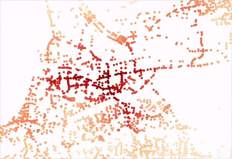
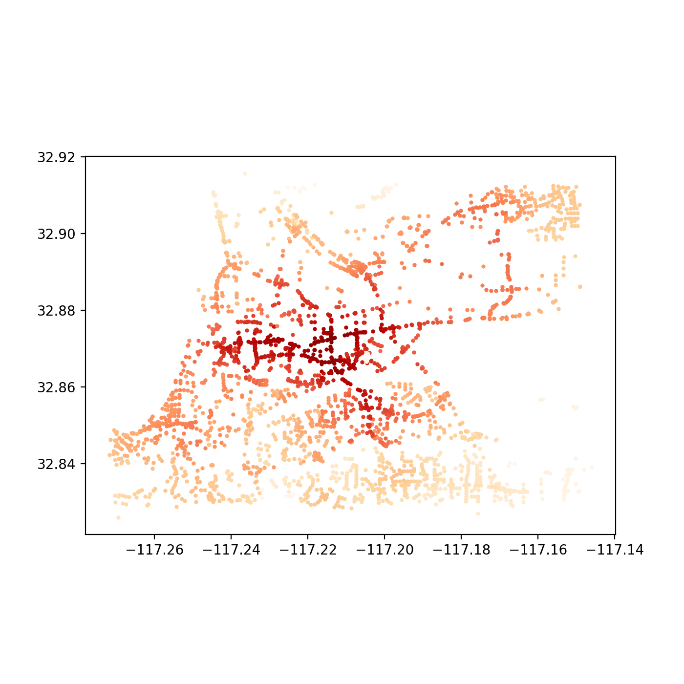
Now for the fun part. At this point, we are free to explore as deep as we would like into the two the network has changed. For example, we could visualizing the original network’s accessibility levels:
…and then the improvements, with the new bridge:
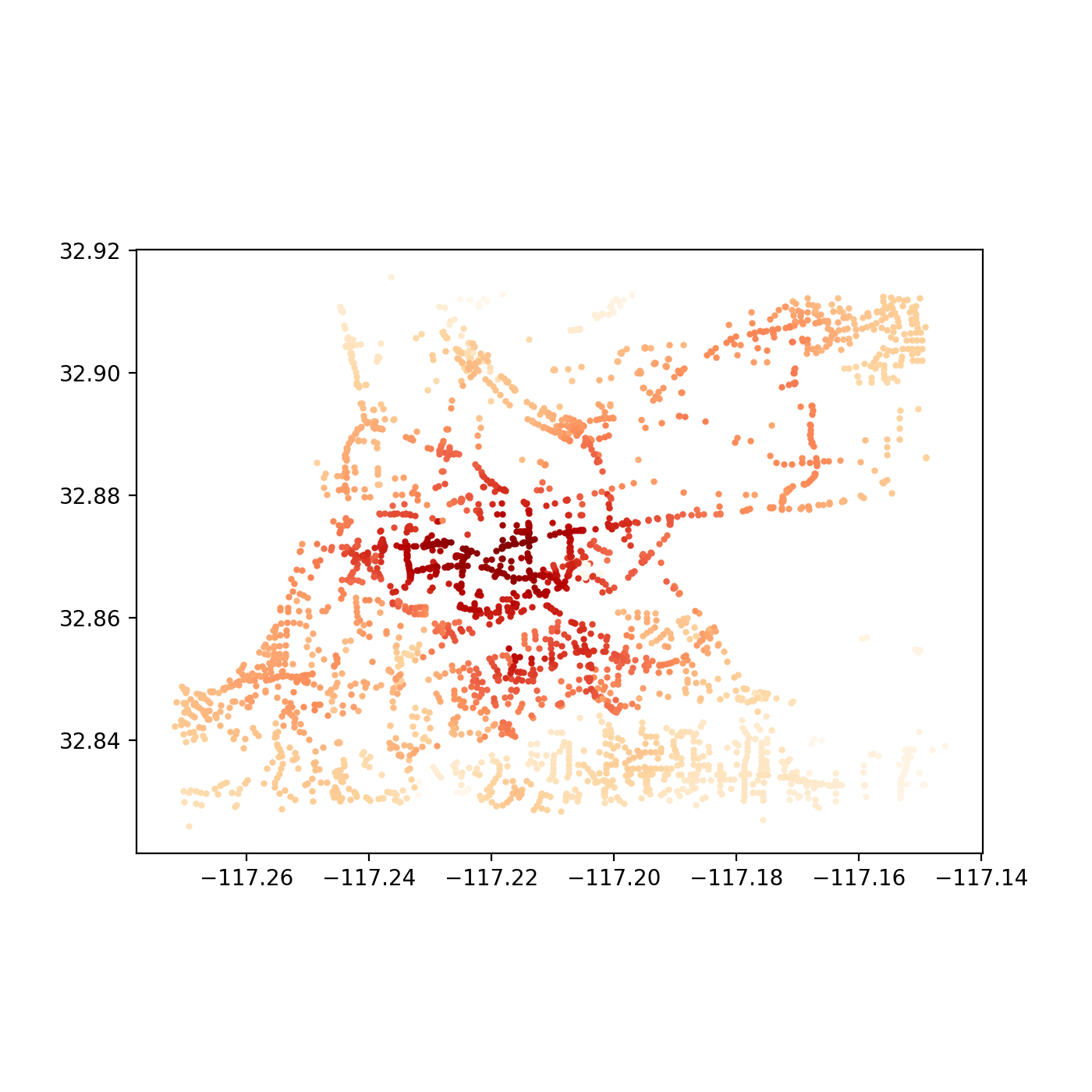
These outputs were generated by observing what was accessible (that is, all other nodes in the network) within 5 minutes in a vehicle from a single given node. The resulting sum value is alculated for each node in the system and plotted. The API for Pandana makes such a query quite simple:
all_cells_in_1_mile = net.aggregate(5/60.0, type="sum", decay="flat", name="simple_value")With the results, we need only update the nodes data frame and convert it to a plottable GeoDataFrame that contains the resulting access level “scores.” Here’s a quick script to accomplish just that:
joined = nodes_gdf.join(all_cells_in_1_mile.to_frame())
joined = joined.rename(columns={0:'access_level'})
joined.plot(column='access_level', cmap='OrRd', figsize=(7, 7))
Another interesting next step might be to take the difference between the two resulting data frames’ “access_level” column values and plot the improved level of access for the nodes affected. In a later post, we can also dive into a more in depth analysis of a single point to generate the tradtional isochone seen in, say, Mapzen or Mapbox’s isochrone service or any traditional network analysis. An iPython Notebook script has also been uploaded here for reference.
Conclusion
Now, these results may appear a little bland, but that just hast to do with that fact that we aren’t account for other measures, such as how traffic on the eastern bridge might create greater levels of accessibility for those utilizing the western bridge. Or, we could image new transit lines that provide improved service to the western neighborhoods. All of these could be added with new edges.
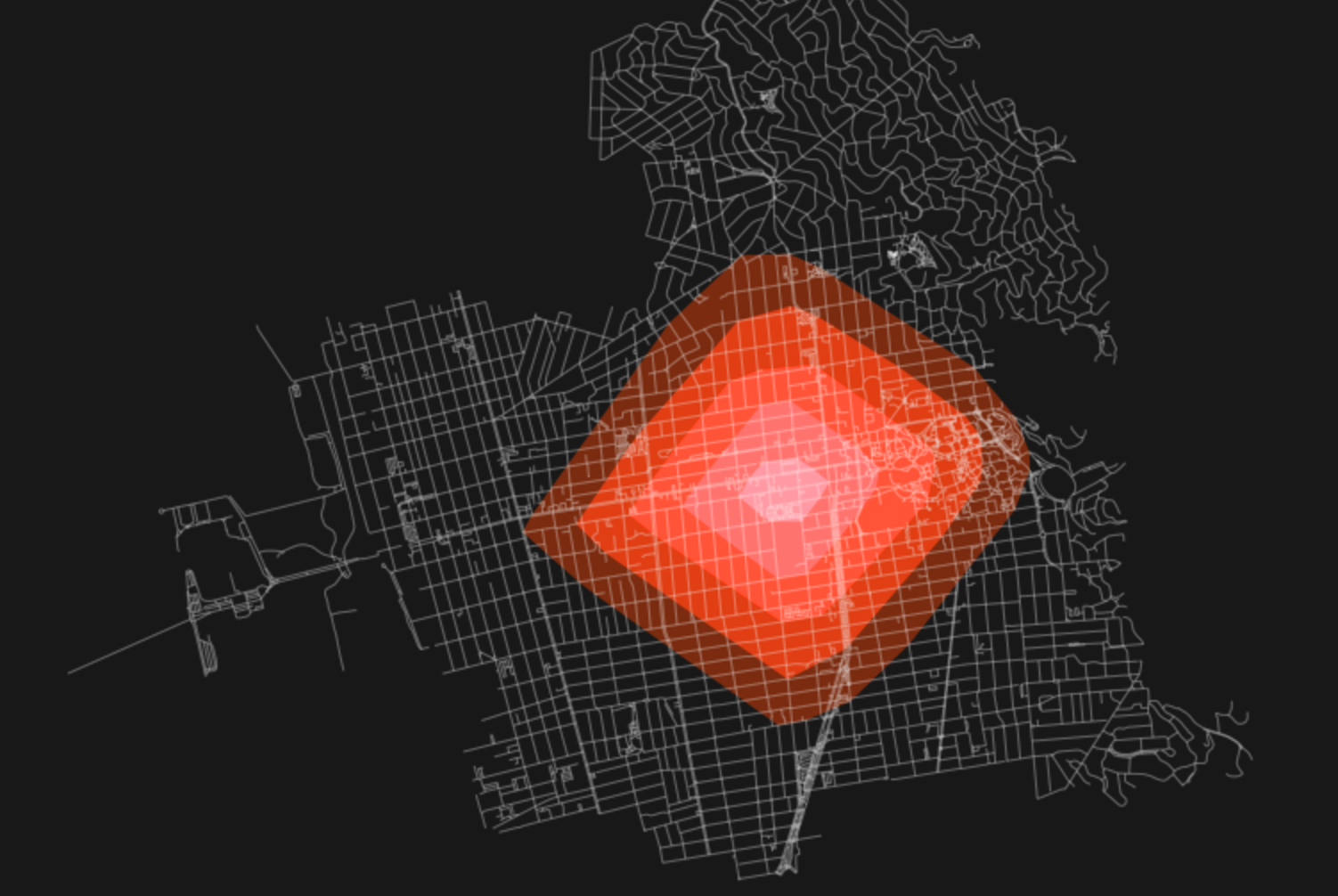
In addition, tools such as OSMnx have already dabbled in converting these nodes to MultiPolygons (see above image) to generate your own more traditional isochrones, which could be saved as GeoJSONs and made web-ready for inclusion in, say, a dynamic Leaflet or Mapbox map.
Here's an animated version of previous tweet (5 - 80 mins) accessibility time. pic.twitter.com/qJs4W3pvsP
— Benjamin Eckel (@bhelx) June 10, 2017
Update: I also wanted to add a really cool visualization made by another user of this same OS toolchain, Ben Eckel. He developed a terrific visualization of accessibility from a single point over time in his hometown of New Orleans. Checkout out the above linked tweet and read the thread to view his notebook on how he developed those outputs.