In this blog post I will outline a methodology for calculating the straightness of a transit systems routes. The method outlined here will also allow for the ranking of routes by their straightness, as defined by a method that is compartmentalized and could be easily tweaked and updated with improvements later on.
Importance of Straightness
Transit Center blogged and tweeted last year the phrase “Straighter is Greater.” It was in response to the presence of convoluted (and thus ineffective and potentially wasteful routes) routes in transit system all across the US and internationally. Citylab did a nice piece on it in the Fall of 2016. The article references a 2013 Transportation Research Board (TRB) paper that noted that three-quarters of the studied transit agencies in the report tried adjusting their bus routes in response to scheduled and performance related issues.
In light of the “Straighter is Greater” push, I thought it might be helpful to make a tool that ranks routes by straightness. This same tool could also be used to compare across systems and cities, too.
Background
The example shown in this blog post allows for the analysis of a single GTFS feed. This script could easily be employed to, say, create a ranking of straightness amongst all operators who publish GTFS feeds. That said, the intent here is to outline how to utilize open source tools to extract, clean, and load GTFS schedule data into a NetworkX network graph to enable per-route and per-route-shape level straightness analysis.
For the purposes of this exercise, you can use any GTFS zip feed available. TransitLand has a great API that allows you to easily discover the latest valid feed from operators all over the world. For this post, I’ll use San Diego’s transit feed since I grew up there. The below script will pull down San Diego’s GTFS feed and convert it into a series of Pandas dataframes.
sdmts_gtfs_zip_loc = 'http://www.sdmts.com/google_transit_files/google_transit.zip'
url = urllib.request.urlopen(sdmts_gtfs_zip_loc)

gtfs_dfs = {
    'stops': None,
    'routes': None,
    'trips': None,
    'shapes': None}

with ZipFile(BytesIO(url.read())) as zipfile:
    for contained_file in zipfile.namelist():
        name = contained_file.split('.')[0]
        if name in gtfs_dfs.keys():
            gtfs_dfs[name] = pd.read_csv(zipfile.open(contained_file))
Great, now that we have a Pandas representation of the schedule data, we can infer nodes and edges from that data and create a network graph. Because we are dealing purely with locational data (that is, the shape of the route) data such as schedule times will not be relevant for this exercise.
Creating the Network Graph
First, let’s generate a sorted list of unique route ids.
# let's get a unique list of values
def filter_by_int(seq):
    for el in seq:
        res = None
        try:
            res = int(el)
        except ValueError:
            pass
        if res: yield res

rts = gtfs_dfs['routes']
unique_routes = set(rts[~rts['route_short_name'].isnull()]['route_short_name'].values)
sorted_unique = sorted(filter_by_int(unique_routes))
Just in case you do choose to use San Diego’s feed, your output should match the above if you print the contents of sorted_unique. This information is valid as of July 30, 2017.
Routes in feed: [1, 2, 3, 4, 5, 6, 7, 8, 9, 10, 11, 13, 14, 18, 20, 25, 27, 28, 30, 31, 35, 41, 44, 50, 60, 83, 84, 88, 105, 110, 115, 120, 150, 201, 202, 204, 215, 235, 237, 280, 290, 701, 703, 704, 705, 707, 709, 712, 815, 816, 832, 833, 834, 848, 851, 854, 855, 856, 864, 870, 871, 872, 874, 875, 888, 891, 892, 894, 901, 904, 905, 906, 907, 916, 917, 921, 923, 928, 929, 932, 933, 934, 936, 944, 945, 950, 955, 961, 962, 963, 964, 965, 967, 968, 972, 973, 978, 979, 992]Now that we have each route, we will need to separately extract each shape related to that route. Routes in GTFS can have multiple shapes. For example, there could be a separate inbound and outbound path for a given line.
trips = gtfs_dfs['trips']

all_rts_shapes = {}
for rte_id in set(gtfs_dfs['routes']['route_id'].values):
    rte_trips = trips[trips['route_id'] == rte_id]
    rte_shapes = set(rte_trips['shape_id'].values)

    shapes = gtfs_dfs['shapes']
    rte_sh_table = shapes[shapes['shape_id'].isin(rte_shapes)]

    sh_dict = {}
    for shid in rte_shapes:
        one_shid = rte_sh_table[rte_sh_table['shape_id'] == shid]
        sorted_shid_table = one_shid.sort_values(by='shape_pt_sequence', ascending=True)
        shid_list = []
        for id, row in sorted_shid_table.iterrows():
            shid_list.append({
                'id': id,
                'lon': row.shape_pt_lon,
                'lat': row.shape_pt_lat,
                'seq': row.shape_pt_sequence,
                'dist': row.shape_dist_traveled
            })
        sh_dict[shid] = shid_list

    # now update the reference list
    all_rts_shapes[rte_id] = sh_dict
The dictionary all_rts_shapes now has keys for each route id, each of which is a dictionary itself holding the keys for each shape id within each route. Each of these is associated with an array of points along the shape of the route path holding associated metadata. This information will be used to create both the nodes in the transit system, as well as the edges between these nodes for each route.
We can now create a directed graph representing the transit network. The resulting network is simply created, with nodes being applied by a per-shape basis. That is, if there are spatially identical nodes between shapes or routes, we do not account for that in this method. These operations could all absolutely be refactored for a more performant and contextually aware network. That said, for the purposes of generating transit straightness rankings, this should do for now.
import hashlib
def _make_id(shape_id, item):
    s = ''.join([shape_id, str(item['seq'])]).replace('_', '')
    s = s.encode('utf-8')
    s_int = abs(int(hashlib.sha1(s).hexdigest(), 16) % (10 ** 12))
    return str(s_int)


def add_new_route_shape(route, shape_id, pot_nodes, G):
    # first add nodes to network
    kept_nodes = []
    for item in pot_nodes:
        node_id = _make_id(shape_id, item)

        # if we can, check last node appended
        if len(kept_nodes):
            last_node = kept_nodes[-1]
            # make sure it isn't at same distance along
            # the route
            if last_node['dist'] == item['dist']:
                continue

        # add to the graph
        G.add_node(node_id, route=route,
                            shape_id=shape_id,
                            osmid=node_id,
                            x=item['lon'],
                            y=item['lat'])

        # and update list for tracking
        kept_nodes.append(item)

    # now add edges
    for a, b in zip(kept_nodes[:-1], kept_nodes[1:]):
        a_id = _make_id(shape_id, a)
        b_id = _make_id(shape_id, b)
        length = ox.utils.great_circle_vec(a['lat'],
                                           a['lon'],
                                           b['lat'],
                                           b['lon'])
        G.add_edge(a_id, b_id, attr_dict={'length': length,
                                          'route': route,
                                          'shape_id': shape_id})


G_rts = nx.MultiDiGraph(name='all_rts', crs={'init':'epsg:4326'})

all_rts_shapes_keys = list(all_rts_shapes.keys())
for rte_key in all_rts_shapes_keys:
    rte_shapes_dict = all_rts_shapes[rte_key]
    for rte_shape_id in rte_shapes_dict.keys():
        add_new_route_shape(rte_key, rte_shape_id, rte_shapes_dict[rte_shape_id], G_rts)
Running Bearings Analysis
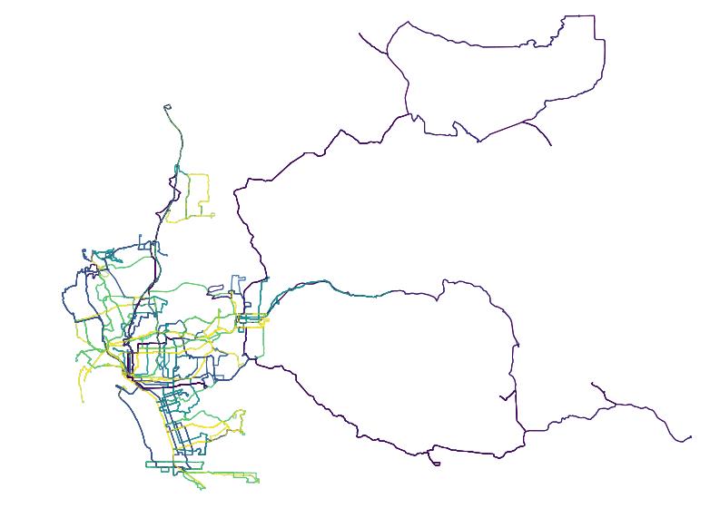
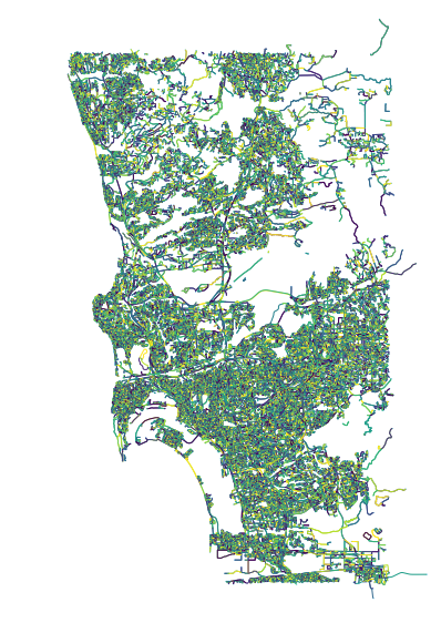
Now that we have a network graph in memory, we can plot it and sanity check our work so far. I decided to use OSMnx to do the plotting as it’s styles are nice and it makes handling reproductions and other styling issues we will be encountering downstream a breeze.
fig, ax = ox.plot_graph(ox.project_graph(G_rts), node_size=1, dpi=600)With just the above line, the below image will be generated. This is an unstyled plot of the transit network in San Diego. You can see how the city hugs the coast, with inland service fanning out widely the farther east into San Diego the routes go.
Once we have the entire network available, we also open up other analyses to be performed easily. Again, I recommend OSMnx for some really fast, effective exploration of the network representation of the GTFS feed. Although it was designed original to really with Open Street Map data, GTFS lends itself to an almost identical use case.
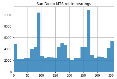
The below operation allows you to visualize the distributions of bearings for each route. I think this is particularly interesting because, in a more strictly grid environment (like, say, Midtown Manhattan), 4 sharp peaks would emerge as the road network tends to be quite consistent. On San Diego’s transit network, however, the north-south tendencies remain sharp (the two steep peaks) while east-west distributions are muddied and less discrete. The below script will generate the above histogram.
# calculate edge bearings and visualize their frequency
G_rts = ox.add_edge_bearings(G_rts)
bearings = pd.Series([data['bearing'] for u, v, k, data in G_rts.edges(keys=True, data=True)])
ax = bearings.hist(bins=30, zorder=2, alpha=0.8)
xlim = ax.set_xlim(0, 360)
ax.set_title('San Diego MTS route bearings')
plt.show()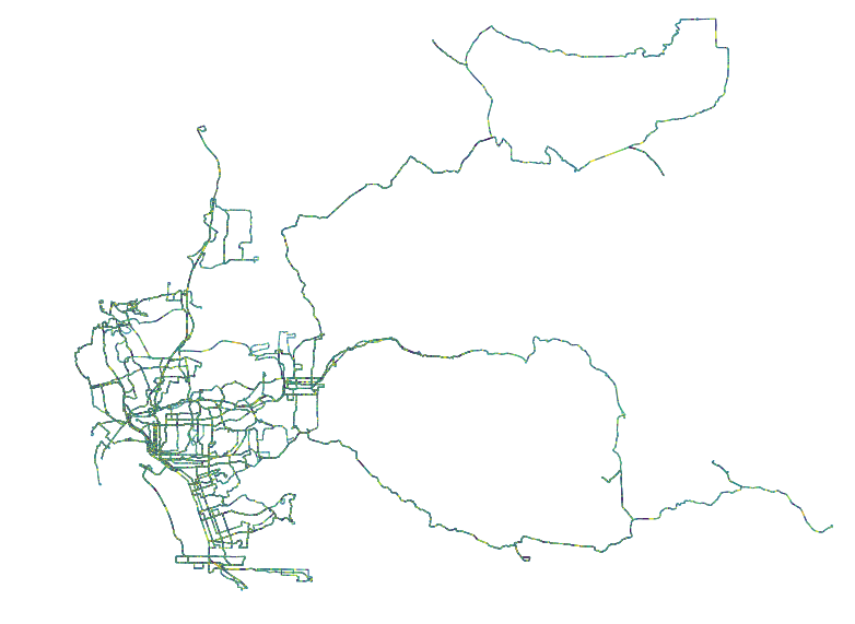
Just like we generated the histogram, we can add this metadata to each edge in the network and plot the data accordingly.
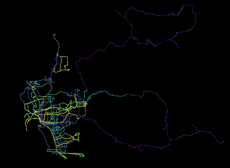
# playing with plotting the bearing of each segment of each route
edge_colors = ox.get_edge_colors_by_attr(G_rts, 'bearing', num_bins=10, cmap='viridis', start=0, stop=1)
fig, ax = ox.plot_graph(ox.project_graph(G_rts), fig_height=10, node_size=1, edge_color=edge_colors, dpi=600)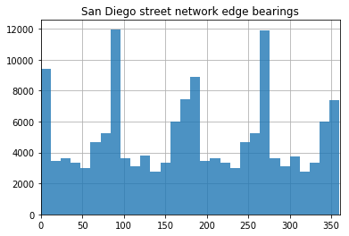
In the above image, we see a histogram of San Diego’s overall network bearings distribution. As you can see, the peaks are a bit more pronounced running east-west than when compared with the transit networks. Anecdotally, this is reflected in what I have observed over my life riding on San Diego bus and light rail system - effective east-west bound commutes are a rarity at best.
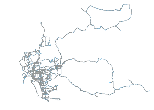
Above, a less-useful plot of the bearings for all edges in the road network for San Diego. At this scale, this plot loses much/any usefulness.
Generating Straightness Scores
Below is the output we are headed for with this section:
Top 5 straightest routes (name, score):
   Rte 510: 0.45 (1.25 primary segments/trip path)
   Rte 530: 0.31 (3.53 primary segments/trip path)
   Rte 520: 0.31 (3.0 primary segments/trip path)
   Rte AIR: 0.27 (3.0 primary segments/trip path)
   Rte 5: 0.21 (3.5 primary segments/trip path)

Bottom 5 straightest routes (name, score):
   Rte 891: 0.01 (55.0 primary segments/trip path)
   Rte 892: 0.01 (50.5 primary segments/trip path)
   Rte 888: 0.01 (61.5 primary segments/trip path)
   Rte 894: 0.01 (37.75 primary segments/trip path)
   Rte 11: 0.02 (25.94 primary segments/trip path)
What does the above mean? Each section is a list of the most straight and least straight transit routes in San Diego’s GTFS feed, respectively. The second value next to each route id is a score that is calculated. How this is calculated will be explained in the below. The final item represents the average number of discrete “runs” that each route has for each of its shapes (each path it can take for a given complete trip for that route). Each discrete run represents a period of uninterrupted “straightness.” As you might expect, less straight routes have more segments because sharp turns in the route break up the straight segments into (more) smaller ones.
In order to begin assessing straightness we will first need to organize the edges outside the graph. There’s definitely better ways to do this, but this is again a prototype and performance was not a concern (nor was type safety, testing, error handling, or DRY code). That said, I still believe this does an acceptable job of demonstrating the proposed methodology encapsulated in a script that is actually functional.
relevant_edges_by_route_shape = {}
unique_rte_ids = []

for edge_start in list(G_rts.edge.keys()):
    for edge_end in G_rts[edge_start].keys():
        one_edge = G_rts.edge[edge_start][edge_end][0]
        oe_route = one_edge['route']

        if not oe_route in unique_rte_ids:
            unique_rte_ids.append(oe_route)

        rte_id = relevant_edges_by_route_shape.get(oe_route, None)
        # add the key if it does not exist
        if rte_id is None:
            relevant_edges_by_route_shape[oe_route] = {}

        shp_id = relevant_edges_by_route_shape[oe_route].get(one_edge['shape_id'], None)
        # add the key if it does not exist
        if shp_id is None:
            relevant_edges_by_route_shape[oe_route][one_edge['shape_id']] = []

        data = {'bearing': one_edge['bearing'], 'length': one_edge['length']}
        relevant_edges_by_route_shape[oe_route][one_edge['shape_id']].append(data)
Now that we have the relevant edges with shape ids nested, in a reference dictionary, we can set a global TURN_DEGREES_THRESHOLD value. With this value, we can make an argument for what we define to be a turn that triggers a new segment, in terms of degrees. For today, we will set that threshold at 30 degrees. So, TURN_DEGREES_THRESHOLD = 30.
With this information, we can now execute a loop through all routes and shapes to generate a straightness by route score. The score will be calculated by first capturing the bearings for each edge in the path, ordered by event sequence along the route.
# first update reference lists
for segment in rte_shapes_dict[rte_shape_id]:
    bearings_in_shape.append(segment['bearing'])
    seg_dist.append(segment['length'])
Next, a boolean array is generated to reference whether a sharp turn has occurred between each segment.
# ...so we can populate turn_degrees data
for a, b in zip(bearings_in_shape[0:-1], bearings_in_shape[1:]):
    turn_deg = (360 - abs(b)) - (360 - abs(a))
    if turn_deg > (-1 * TURN_DEGREES_THRESHOLD) and turn_deg < TURN_DEGREES_THRESHOLD:
        turn_degrees.append(0)
    else:
        turn_degrees.append(1)
This is probably the grossest part of this script, right below. Either way, the gist of this segment is that it breaks up the shape into discrete straight segments and counts up the number of turns.
# score will be determined as the reciprocal of
# the number of contiguous segments of the bus route
score_vals = [turn_degrees[0]]
straight_segs = []
curr_seg = []
for d, d_val in enumerate(turn_degrees):
    if not score_vals[-1] == d_val:
        score_vals.append(d_val)

        # also keep track of each straight run length
        if len(curr_seg) > 0:
            straight_segs.append(sum(curr_seg))
            curr_seg = []

    else:
        # since turns are "one step" ahead of segments
        if d > 0:
            curr_seg.append(seg_dist[d])

    # catch all, this is all quite hacky
    if d == (len(turn_degrees) - 1):
        if len(curr_seg) > 0:
            straight_segs.append(sum(curr_seg))
            curr_seg = []
At this point we can create some shape level summary values. These are then appended to the overall cumulative_lengths and segments_counts arrays for the route under review. Each shape gets a straightness score which is the reciprocal of the count of segments in that shape. Typically all shapes are roughly the same and will result in the same score, but this is intended to account for any variation that may occur on a route going, say, one direction or the other.
sum_segments = np.array(score_vals).sum()

if sum_segments > 0:
    reciprocal = 1.0/(sum_segments)
    straightness_scores.append(reciprocal)
else:
    straightness_scores.append(1)

segments_counts.append(sum_segments)
cumulative_lengths = cumulative_lengths + straight_segs
Once this is done, we can create some route level scores based on the data we extracted from its underlying shapes. The below method demonstrates the (pretty lame) algorithm being used. All we do is take the mean of all the shapes’ independent scores and allow for the squared proportion of the longest continuous straight run in the route to the length of the route, cumulatively. The resulting score is between 0 and 1 but is valuable only in its relative standing to other routes or systems.
# once we have analyzed all shapes for a route
s_arr = np.array(straightness_scores)
l_arr = np.array(cumulative_lengths)

# the higher the score, the less number of turns
mean_straightness = s_arr.mean()

# give a bump to having long runs
longest_run = l_arr.max()
all_runs_max = l_arr.sum()
longest_run_proportion = (longest_run/all_runs_max)
long_run_factor = (longest_run_proportion * longest_run_proportion)

calculated_score = (long_run_factor * 0.5 * mean_straightness) + (mean_straightness * 0.5)

avg_segments_per_shape = round(sum(segments_counts)/len(list(rte_shapes_dict.keys())), 2)
straightness_by_route[rte_key] = (round(calculated_score, 2), avg_segments_per_shape)
Let’s take the top five elements and the bottom five and print them, like we did at the top of this section. By simply performing a list sort on the dictionary items, we can order the results from highest to lowest score for the routes in San Diego.
import operator
straightness_by_route_sorted = list(straightness_by_route.items())
straightness_by_route_sorted = list(sorted(straightness_by_route_sorted, key=lambda x: x[1][0], reverse=True))

print('\nTop 5 straightest routes (name, score):')
for r in straightness_by_route_sorted[:5]:
    print('   Rte {}: {} ({} primary segments/trip path)'.format(r[0], r[1][0], r[1][1]))

print('\nBottom 5 straightest routes (name, score):')
for r in list(reversed(straightness_by_route_sorted))[:5]:
    print('   Rte {}: {} ({} primary segments/trip path)'.format(r[0], r[1][0], r[1][1]))
Visualizing Results
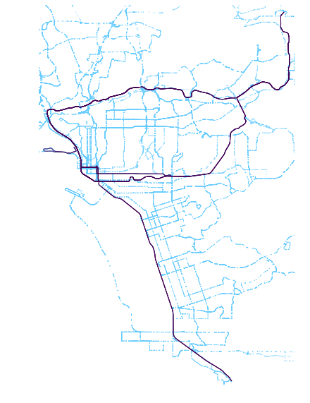
The rankings are cute and all, but we did a bit of work to get here. So, let’s plot these results and get something visual we can show off our work with!
The above image is generated using the “viridis” color scheme. This scheme shows brighter routes as those higher scoring and darker routes as those with lower scores.

The viridis color scheme runs purple to yellow and, as can be seen the plot, yellow correlates with more straight routes (those with the higher scores).
In order to create this image, a new graph must created. In the new graph, edges include an rs_score attribute which is the route score that the edge is associated with. Using this attribute, OSMnx has a wrapper around Matplotlib that will generate the above plot nicely. Below is the script to do so.
# add new bearing analysis results so we can color accordingly
G_rts_scored = None
G_rts_scored = nx.MultiDiGraph(name='all_rts_scored_1', crs={'init':'epsg:4326'})

kept_nodes_in_scored = []

for e in G_rts.edges():
    first = str(int(e[0]))
    second = str(int(e[1]))

    kept_nodes_in_scored.append(first)
    kept_nodes_in_scored.append(second)

    # only proceed if we have these nodes
    # get same edge from old graph
    edge = G_rts.edge[first][second][0]

    # get route straightness score from edges route id
    rs_score = straightness_by_route[edge['route']][0]
    G_rts_scored.add_edge(first, second, attr_dict={'rs_score': rs_score})

for n in list(set(kept_nodes_in_scored)):
    n_type = str(int(n))
    node_dict = G_rts.node[n]
    if node_dict:
        G_rts_scored.add_node(n_type, **node_dict)
        kept_nodes_in_scored.append(n_type)

print('reprojecting...')
G_rts_scored = ox.project_graph(G_rts_scored)
print('reprojecting done')
Evaluating Results
The primary point of this blog post is to demonstrate a methodology. The scoring mechanics need to be refined but, at this point, that is easily achieved by just updating the scoring logic. By that point, we have much of the information we may need for any adjustments to how we evaluate the shape of the routes.
One quick way to review the results, beyond the scores list, is to plot the head and tail of the leaderboard for route straightness as I calculated it.
Top 5 routes: Routes 510, 530, 520, AIR, 5
Bottom 5 routes: 891, 892, 888, 894, 11
Results seem to make sense from just looking at the above. Longer routes that provide extended service rather than ones that slip around corners in downtown seem to fair better through these metrics. But, downtown routes do not fall too far behind. Rather, it is the far flung east San Diego rural service routes that result in the poorest scores as a result of these metrics.
Want a notebook profiling all these steps in order? Available here.
Updates from the Twitter-sphere
Thanks to all those who read this article and made comments online. In particular, I wanted to highlight this response which pointed to an academic journal on urban network circuity. I’d suggest clicking on this tweet to view the whole thread, which includes a direct link to the article.
@buttsmeister See Huang, Jie and David Levinson (2015) Circuity in Urban Transit Networks. JTG https://t.co/Dov0e0N0XB
— David M. Levinson (@trnsprtst) July 31, 2017
The article dives far deeper into the observation I made in the above post with regards to how San Diego’s road network demonstrated greater consolidation of bearing directionality along east-west cooridors than did the transit network. In the paper, circuity is analyzed for both trip and transit routes and their relative disparity is then scored against other cities in the US. My favorite takeaway from the article was the observation that Houston has a relatively circuity relationship between autos and transit compared to other American cities.
Looking Forward
Next, I’d like to set this up to run for all feeds in all cities in at least the US. This isn’t so easily done as there are tons of edge cases when it comes to consuming GTFS feeds and I’ll need to update the script accordingly. I spent some time to do so for New York. The results for Brooklyn are shown below:
Swapped out SD > Brooklyn. In BK, routes down the borough core fare better than inter-borough routes.
— Kuan Butts (@buttsmeister) July 30, 2017
Next (time permitting): all US feeds! pic.twitter.com/0jYOVysmfG