When performing transit accessibility analyses, it’s important to understand the implications of how you summarize schedule information. In particular, getting headways right is critical to ensuring that your accessibility model does not over or undersell the coverage of transit. Understanding the give-and-takes of varying methods of headways summary - even when performing less intensive sketch analyses - is important.
Calculating travel costs
Let’s talk about buses transit systems for now. One quick way to determine the cost in time for commuting from your home to work via bus is to calculate the following:
- The cost in time to walk from your house to the nearest bus stop.
- The cost in time to wait for the bus.
- The cost in time to ride the bus to the nearest stop to your work.
- The cost in time to walk from that stop to your work.
For this blog post, let’s look at item number 2. How should we calculate the cost in time for waiting for a bus. There are a number of ways to do this, and they all center around headway, or the time between the last departure of a bus on a given bus route at a given stop and the arrival of the next. There’s a nice post here about the nuances of headway and I will aim to dive into just one aspect of it in the below.
Types of headway analysis
Analysis of headways goes from very rough to very robust. On the less accurate end of the spectrum, one would typically just get the average headway over a period of time (say, a morning rush hour from 6:30 AM to 9:00 AM). On the most computationally intensive end of the spectrum, departure times might be assessed at every minute of every hour from a given origin to a given destination, so as to capture accessibility increases that account for timed transfers between routes, as well as periods of high service given certain timing.
While those analyses are impressive, they are much harder for someone just playing around with some schedule data to perform quickly. So, let’s go back to the other end of the spectrum. The intent of this post is to understand the costs of using mean vs. median methods to summarize headways when sketching transit accessibility.
Issues with Median vs Mean
If you went and took a look at the blog post I linked to earlier, you’ll notice that there is discussion about the intractability of properly calculating headways - with mean or with median. For example: a bus arrives 4 times in 4 minutes per hour. In this situation, the headways might look like this: 1, 1, 1, and 56 minutes. The mean would be 12 minutes and the median would be 1 minute. Neither would accurately model what the headway was at that location.
While these are particularly difficult cases, an accessibility model for a given area is usually seeking more broad assessments. That is, smaller irregularities may become obscured by overall trends in an area. Thus, the traditional method of taking the average may be acceptable. That said, the median is often pointed to as being more appropriate, in particular, at dealing with some of the inaccuracies of taking the average of headways.
That may be true, but how? Across a given transit network, what do the differences between mean and median look like, in aggregate, when segmenting by route, direction, and trip? Would the differences normalize? Would a dominant pattern emerge?
Measuring Mean vs Median Divergence
In order to calculate summary statistics (as shown above) for mean and median headways, compiled by each route in a network (in this example, using MTA’s Brooklyn feed), I need to do the following:
- Convert arrival and departure times into seconds from midnight
- Loop through each route and sub-loop through the following, in order nested:
- Route direction
- Route service id
- Route stop id
- At the stop id level, get the time, in seconds, between each arrival time and the previous departure time
- Results are sorted into buckets by hour
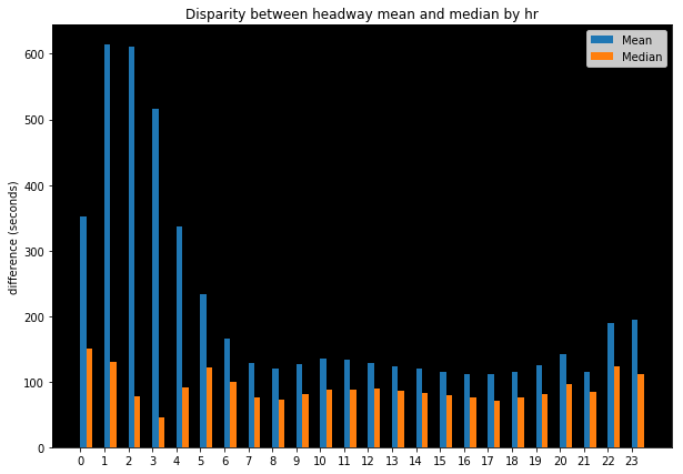
The results from this process (see above image) demonstrate what one might expect. Late evening and early morning results for mean and median differ more significantly than daytime headways. These are also, naturally, times of day where frequencies are far lower and situations where limited bus service exists is more able to exacerbate discrepancies between the two methods.
During the daytime, there is a consistent gap wherein mean values for headways are consistently calculated as 50-75 seconds greater than median values. This is a not insignificant difference. When performing accessibility analysis, if one were to halve these results and call that impedance for utilizing a transit route, then a 40 second greater cost for accessing a given route would have an outsized impact on generating isochrones at, for example, the 15 minute and 30 minute access sheds, where it represents a 4.4% and 2.2% of the total time in consideration, respectively.
Thus, it is important to both be aware of these assumptions as well as to understand their impact as this decision represents significant impact on resulting accessibility metrics produced.
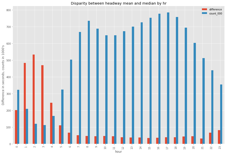
As expected, the discrepencies (shown above in red, measured in seconds) between mean and median are also exacerbated by lower observation counts (shown above in blue, measured in the 1,000’s of observations). Because these late night and early morning hours have less scheduled trips, non-standard timing distributions are both more common and represent a greater portion of the total available headways to analyze because there are simple less trips (and thus less data points) to measure. The above graph shows just that.
Comparing Unimodal and Bimodal Peaks
In the comments of the linked “What is a Headway?” post, a comment caught my eye by a user “Woolie.” It’s the first comment in the responses at the bottom of the blog post. In it, the user points out the trouble with properly summarizing headway cost when there is bimodal distribution in hourly arrivals. This got me thinking about the dataset I was working with (the one in this blog post, MTA NYC bus schedule data for Brooklyn). I acknowledged the limitation of the following problem: Let’s say 5 buses come per hour; 2 around the fifteen minute mark and 3 around the 45 minute mark. In this situation, let’s say they came at the following minute marks: :13, :15, :43, :45, :47. The headways would look like this: 26 minutes, 2 minutes, 28 minutes, 2 minutes, and 2 minutes. The median would be 2 minutes and the mean would be 12 minutes. Neither would be accurate.
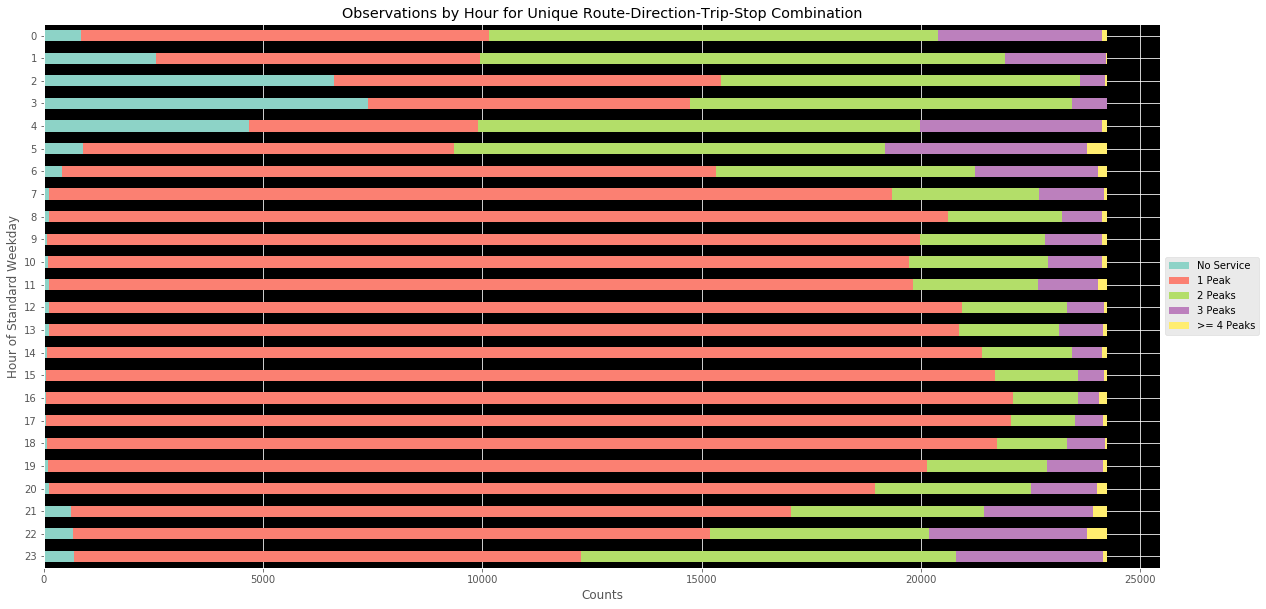
So, I wondered, how often does this happen? I decided to create a method to help me assess how often this occurs. The cumulative results for all unique route-direction-trip-stop id’s in the dataset were summed. For hours where there was no service by a given bus, the “No Peak” flag was instead set. The results are as visible in the above. As with mean-median divergences, differences are exacerbated late at night and in the early morning.
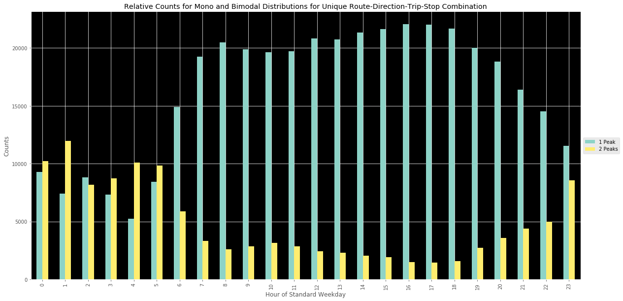
Focusing on the main peak types of interest - uni and bimodal distributions - we can see in the above images that not only are bimodal peaks more dominant in the early morning periods, but they are also more common than single peak/evenly distributed transit service. This is particularly interesting. One could infer that the buses are designed to, perhaps, double up during certain target time windows where (again just guessing) larger number of individuals tend to need transit service. On the other hand, these might be opportunities to “smooth the curve” and create more evenly distributed bus service during these early AM time periods.
Curious how peaks are calculated? The below code shows the methodology I implemented. It’s fairly crude and uses a simple floating point analysis to cumulate all headways landing within a moving ten minute window that shifts in increments of 5 to identify clusters. A more refined method could absolutely be designed - in particular, one that takes into account the preceding and following hour, rather than wrapping the end of the hour back to the beginning when determining headway for the first arrival/departure of that hour window.
def unique_justseen(iterable, key=None):
    return map(next, map(itemgetter(1), groupby(iterable, key)))


def get_peaks_count(headways, block_size=5):
    # arrange in order
    np_hwy = np.array(sorted(headways))
    # let's work in terms of minutes, headways originally in seconds
    np_hwy = np_hwy/60 # convert seconds to minutes

    # these could be dynamic but for now
    # we will work in 60 minute blocks
    min_hw = 0
    max_hw = 59
    time_frame = 60

    floating_counts = []
    for tb in range(round(time_frame/5)):
        m = tb * 5 + min_hw
        start_time = m - block_size
        end_time = m + block_size

        if start_time <= min_hw:
            start_time = min_hw

        if end_time >= max_hw:
            end_time = max_hw

        s = np_hwy[(np_hwy >= start_time) & (np_hwy <= end_time)].size
        floating_counts.append((m, s))

    counts = list(map(lambda x: x[1], floating_counts))
    booleaned = list(map(lambda x: 1 if x >= 1 else 0, counts))

    unique_peaks = np.array(list(unique_justseen(booleaned))).sum()

    return unique_peaks
Examining Bimodal Clustering Attributes
The next step in this exploration, for me, was to determine when, in hours exhibiting bimodal distribution, the arrival/departures tended to cluster. That is, when bimodal distribution occurred, did the first peak tend to occur around the, say, 15 minute mark, and the second around the 45 minute mark? Understanding this would be valuable to creating a replacement headway impedance value that could be swapped out for median headway when assessing costs for utilizing transit (waiting for a given route’s bus to arrive) in an accessibility analysis.
In order to do this, I wrote more spaghetti code and riffed off the main route-direction-trip-stop id level analysis in the original analysis to update it to consider - at the stop level per route - when peak times occurred. In order to do this, I created a function get_peak_times that returned the observed arrival/departure times segmented into 6 10-minute buckets per hour. The was only done for when there was more than one peak per hour. If that constraint was not satisfied, null values were passed for all 10 minute periods. This allowed for only the 2+ peak hour segments to be considered.
Below is a mess of a function that accomplishes that - I only include it for reference to make clear how I modified the floating 10 minute analysis window to instead check for what time bucket (0-10 minutes, 10-20 minutes, etc.) that the arrival/departure occurred in. The resulting data frame could then be used to check for when 2 + peak trips fell into this category. I do acknowledge a better method would have been to insert an additional column stating the peak count, which I could have filtered by to allow to inclusion of single and no peak times as well.
def get_peak_times(headways, block_size=5):
    # arrange in order
    np_hwy = np.array(sorted(headways))
    # let's work in terms of minutes, headways originally in seconds
    np_hwy = np_hwy/60

    # these could be dynamic but for now
    # we will work in 60 minute blocks
    min_hw = 0
    max_hw = 59
    time_frame = 60

    floating_counts = []
    for tb in range(round(time_frame/5)):
        m = tb * 5 + min_hw
        start_time = m - block_size
        end_time = m + block_size

        if start_time <= min_hw:
            start_time = min_hw

        if end_time >= max_hw:
            end_time = max_hw

        s = np_hwy[(np_hwy >= start_time) & (np_hwy <= end_time)].size
        floating_counts.append((m, s))

    min_marks = list(map(lambda x: x[0], floating_counts))
    counts = list(map(lambda x: x[1], floating_counts))
    booleaned = list(map(lambda x: 1 if x >= 1 else 0, counts))

    unique_peaks = np.array(list(unique_justseen(booleaned))).sum()

    if unique_peaks > 1:
        # get sub lists for approx peak times
        list_of_tblocks = []
        curr_b = []
        for i, b in enumerate(booleaned):
            if b == 0:
                if len(curr_b) > 0:
                    list_of_tblocks.append(curr_b)
                    curr_b = []
            else:
                curr_b.append(min_marks[i])

        avg_times = []
        for tblock in list_of_tblocks:
            avg_times.append(np.array(tblock).mean())

    else:
        avg_times = []

    final_avgs = [np.nan] * 6
    for at in avg_times:
        if at >= 0 and at < 10:
            final_avgs[0] = at
        elif at >= 10 and at < 20:
            final_avgs[1] = at
        elif at >= 20 and at < 30:
            final_avgs[2] = at
        elif at >= 30 and at < 40:
            final_avgs[3] = at
        elif at >= 40 and at < 50:
            final_avgs[4] = at
        elif at >= 50 and at < 60:
            final_avgs[5] = at

    return final_avgs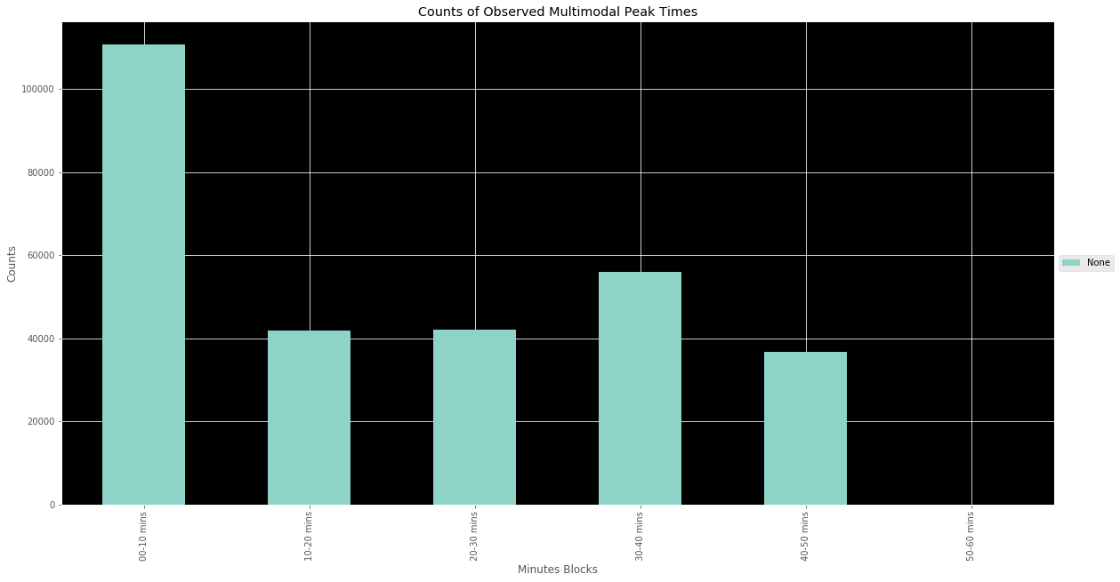
The results from this analysis are visible in the above graph. Mutli-peak hours tend to cluster at the top of the hour and then once more somewhat evenly later in the hour, more about 30 minutes later. This makes sense intuitively. Since the clustering method worked on a floating 10 minute window, the later cluster would likely occur about 20 minutes later and since these are simply hour windows, you can easily break up the hour into 3 segments of 20 minutes, with one window occurring during the first window and the second during the later.
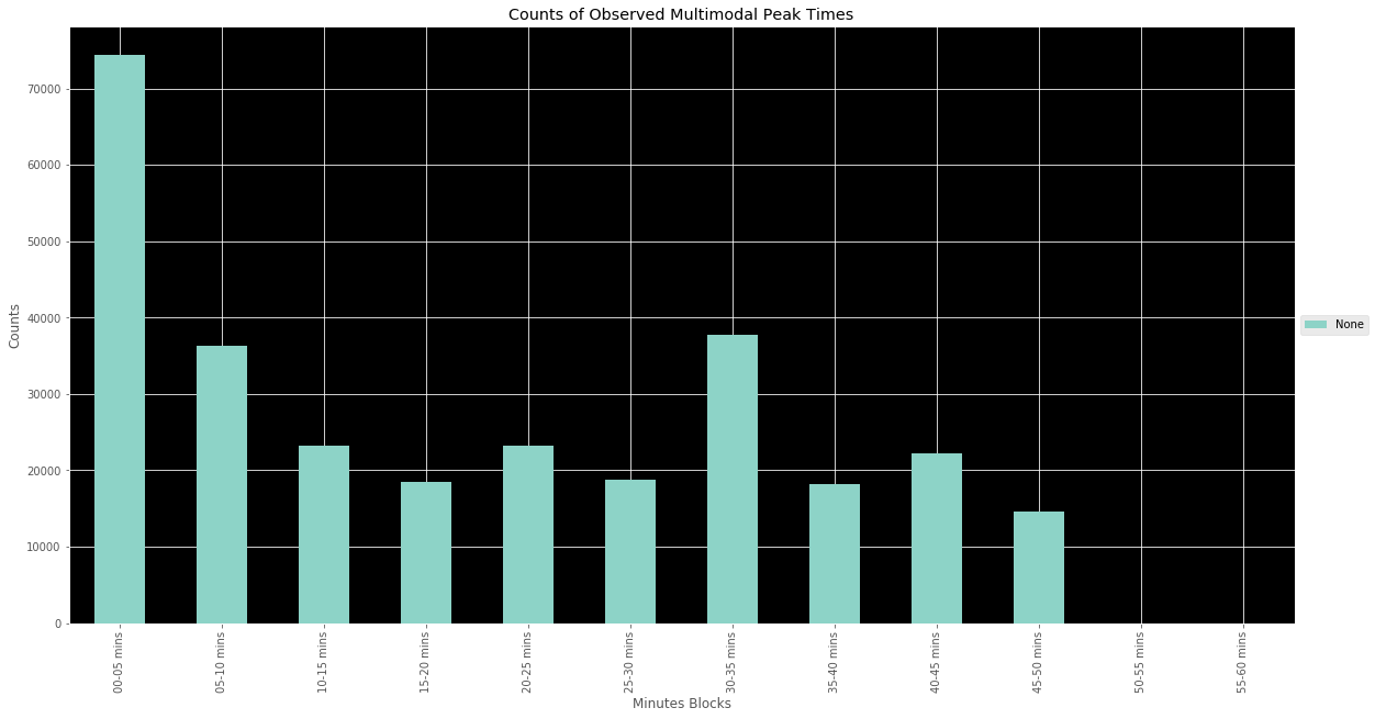
The results seen in the above graph were a little less than explicit. This led me to go back and make 5 minute windows instead of 10 minute windows to see if more nuance could be derived from the situation. The results are as seen in the above. The results help shed more light on that notion of their tending to be clustering within two 20 minute time frames. In the second graph, at 5 minute intervals, we see a strong peak at the top of the hour followed by two trends: The first is a tendency for their to be a single second peak at the bottom of the hour and the second is the presence of two smaller peaks - one at the 20 and the other at the 40 minute marks, roughly. Again, this helps to validate the 20 minute blocks that were intuited from the first graph.
Next Steps
Understanding these distribution tendencies in multi-peak situations, a better costing strategy ought to be proposed to account for variation that would render an accessibility model excessively inaccurate. Many reasonable methods could be defensibly proposed, given the results of this analysis. For example, if a 3 peak period is observed, impedance could be set as though there were 20 minute headways. Similarly, in a 2 peak situation, impedance could be set as though headways were 30 minutes. A fractional reduction in headways might also be legitimately applied to account for and acknowledge the clustering and the impact that the periods of significantly improved service periods represent. Another alternative may be to simply present reasoning that supports either the use of the best or worst case scenario - that is, when performing accessibility analyses, expose to the end-user that assumptions were made that cluster-period averages of headways were used to perform accessibility analyses. Or the inverse could be assumed, and weaknesses could be targeted in the network by accounting only for headways between cluster-peaks.
What is important is to be transparent about the path decided on and used, and to explicitly describe it when performing analyses. What is also clear is that it is insufficient to simple take the mean - or even the median - of headways, particularly in cases of schedule clusterings. Methods that identify multi-peak hours and implement a method to account for such deviation from a more consistent bus schedule distribution, will fair better in producing more accurate accessibility analyses.
Resources
The methods described in the above post have been recorded as a notebook, here.