In the following post, I outline how to use open source tools to pull down an Open Street Map network (OSM) and convert it into a network graph. Once converted, I demonstrate how one can add points of interest (POI) to the graph and measure access to each along the Open Street Map walk, bike, and drive paths.
Introduction
The method shown in this post will use the following key libraries: OSMnx and Pandana. In addition, a number of supporting libraries will be used, primarily for converting data into geometric objects (Descartes, Shapely), as well as holding data in structure data formats (Pandas, GeoPandas). Plotting will be performed with Matplotlib.
OSMnx will be used primarily to assist in the plotting of the network, as well as the initial step of pulling down the OSM network for a given area. This latter portion is done via the library’s wrapper over the OSM Overpass API, which is queried to get point and path data for the requested part of OSM’s known, worldwide network.
Pandana is a handy graph library that allows for Pandas data frames to be passed through into a network graph that maps graph-level analyses to underlying C operations. All of this is to say, it’s much faster than traditional Python-based graphs, such as NetworkX.
In certain situations, such as the performance of accessibility analyses, this makes in-memory performance and iterative development based on this library possible - as opposed to what would be a cumbersome development process with tools that fail to leverage the same degree of C-level operations utilization.
One of the goals of this post is to provide a more detailed walkthrough of using Pandana 0.4.x. The reason for this is that Pandana has undergone significant changes with each update and documentation for it remains quite slim, as it is still largely an academic project with some private support from the UrbanSim project.
Getting OSM Network Data and Generating POI
First, let’s pull down some relevant network information for a small practice area. For now, let’s work with a small area in North Oakland and Emeryville, where I happen to live.
# Bounding box for a small area in East Emeryville, South Berkeley and North Oakland
west, south, east, north = (-122.285535, 37.832531, -122.269571, 37.844596)

# Create a network from that bounding box
G = ox.graph_from_bbox(north, south, east, west, network_type='walk')
Plotting G via G.plot() should allow you to see that area’s road network. But, before we do that, let’s populate the area with a 100 random points. We can imagine these as restaurants, or points of employment, or hospitals, or whatever points of interest one would be interested in measuring access to.
In order to produce these random points, I’ve written the below method. We simple take the bounds of the area that we pulled down from OSM’s Overpass API via OSMnx and we create n points inside of it, randomly distributed.
# Let's create n arbitrary points of interest (POI)
poi_count = 100

# this function makes those POI into Shapely points
def make_n_pois(north, south, east, west, poi_count):
    for poi in range(poi_count):
        x = (east - west) * random.random() + west
        y = (north - south) * random.random() + south
        yield Point(x, y)

pois = list(make_n_pois(north, south, east, west, poi_count))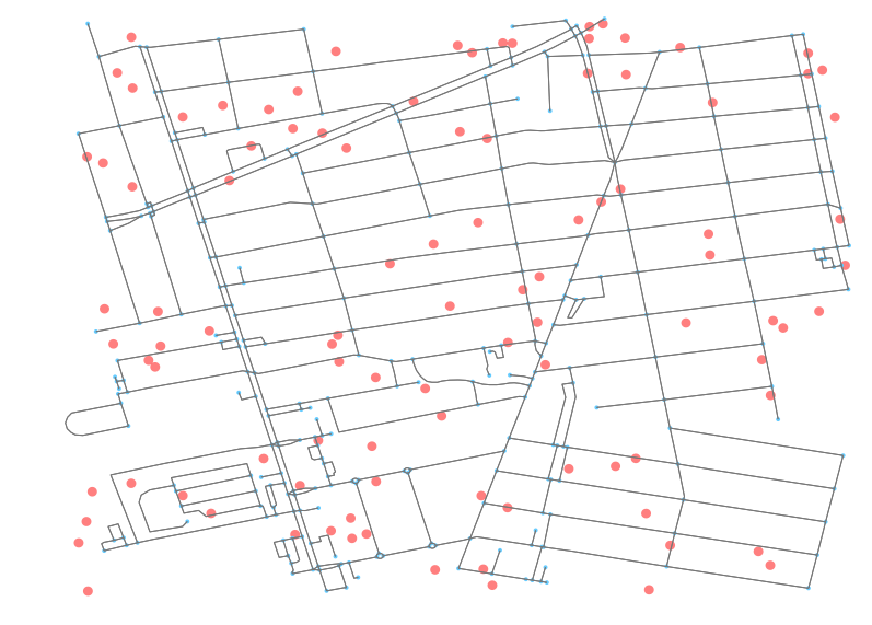
Great, now that we have those points, let’s plot them so we can see the above results. Note that your random points will not be the same as mine, as they are randomly created each time. We’ll just take advantage of the show and close parameters in OSMnx to prevent it from finishing the Matplotlib operation and instead returning the unclosed fix and ax objects.
# Create the plot fig and ax objects but prevent Matplotlib
# from plotting and closing out the plot operation
fig, ax = ox.plot_graph(G, fig_height=10,
                        show=False, close=False,
                        edge_color='#777777')

# Instead, let's first update the network with these new random POI
for point in pois:
    patch = PolygonPatch(point.buffer(0.0001), fc='#ff0000', ec='k', linewidth=0, alpha=0.5, zorder=-1)
    ax.add_patch(patch)
As you can see, with ax.add_patch we are able to add additional polygons to the plot outputs. The updates can be seen when examining the fig output with each update.
Converting OSM data to Network Graph-Ready Inputs
Pandana is designed to interface easily with Pandas data frames. Even better, OSMnx is built on top of NetworkX, and actively uses Pandas under the hood. What does this mean for us? It means that we easily pass the nodes and edges of the OSM data that are held in the returned Overpass API results to OSMnx and then, with minimal modification, pass them to Pandana.
First, let’s create a nodes data frame. The below method is commented so as to explain how the NetworkX graph representation of the nodes, as produced by the OSMnx query, can be converted into a Pandas dataframe.
# Given a graph, generate a dataframe (df)
# representing all graph nodes
def create_nodes_df(G):
    # first make a df from the nodes
    # and pivot the results so that the
    # individual node ids are listed as
    # row indices
    nodes_df = pd.DataFrame(G.node).T

    # preserve these indices as a column values, too
    nodes_df['id'] = nodes_df.index
    # and cast it as an integer
    nodes_df['id'] = nodes_df['id'].astype(int)

    return nodes_df

nodes_df = create_nodes_df(G)
Now, let’s do this again, but with the edges. Edges will be slightly more involved as the way NetworkX holds edges is to nest dictionaries inside of dictionaries, where the top level key represents the “from” node, and the “to” node is held by the key at the second, nested, level.
# Given a graph, generate a dataframe (df)
# representing all graph edges
def create_edges_df(G):
    # First, we must move the nested objects
    # to a signle top level dictionary
    # that can be consumed by a Pandas df
    edges_ref = {}

    # move through first key (origin node)
    for e1 in G.edge.keys():
        e1_dict = G.edge[e1]

        # and then get second key (destination node)
        for e2 in e1_dict.keys():
            # always use the first key here
            e2_dict = e1_dict[e2][0]

            # update the sub-dict to include
            # the origin and destination nodes
            e2_dict['st_node'] = e1
            e2_dict['en_node'] = e2

            # ugly, and unnecessary but might as
            # well name the index something useful
            name = '{}_{}'.format(e1, e2)

            # udpate the top level reference dict
            # with this new, prepared sub-dict
            edges_ref[name] = e2_dict

    # let's take the resulting dict and convert it
    # to a Pandas df, and pivot it as with the nodes
    # method to get unique edges as rows
    edges_df = pd.DataFrame(edges_ref).T

    # udpate the edge start and stop nodes as integers
    # which is necessary for Pandana
    edges_df['st_node'] = edges_df['st_node'].astype(int)
    edges_df['en_node'] = edges_df['en_node'].astype(int)

    # for the purposes of this example, we are not going
    # to both with impedence along edge so they all get
    # set to the same value of 1
    edges_df['weight'] = 1

    return edges_df

edges_df = create_edges_df(G)
As you can see in the above code snippet, we’ve weighted all the edges as 1. The weighting for our purposes does not matter. In reality, one would likely calculate the great circle distance between the points of the start and end nodes, and then factor that distance by some other coefficients, such as speed of walking or driving in traffic, at given times of day.
At this point, we can feed our resulting columns from our two new data frames into Pandana to generate a network.
# Instantiate a Pandana (pdna) network (net)
net = pdna.Network(nodes_df['x'], nodes_df['y'],
                   edges_df['st_node'], edges_df['en_node'],
                   edges_df[['weight']])
Populating the Network Graph with POI
Adding points of interest to the Pandana network graph is straightforward. First, we identify the nearest nodes on the graph to each of our points of interest. We then update the data frame with that information. Pandana simply wraps SciPy’s nearest neighbor utility to accomplish this.
# Get the nearest node ids
near_ids = net.get_node_ids(pois_df['x'],
                            pois_df['y'],
                            mapping_distance=1)

# Set the response as a new column on the POI reference df
pois_df['nearest_node_id'] = near_ids
Once we have that information, we can merge the POI data frame and the nodes dataframe.
# Create a merged dataframe that holds the node data (esp. x and y values)
# that relate to each nearest neighbor of each POI
nearest_to_pois = pd.merge(pois_df,
                           nodes_df,
                           left_on='nearest_node_id',
                           right_on='id',
                           how='left',
                           sort=False,
                           suffixes=['_from', '_to'])
This merged data frame will allow us to update the fig object (and thus the Matplotlib plot output) with new lines and point identifying the relationship between each POI and its identified nearest neighbor on the graph network. It should be noted that an alternative would be to add the POI as nodes to the graph and create edges to them but for the sake of the accessibility analysis, the known nearest neighbor on the existing graph ought to be sufficient.
# Update the plot image with the nearest node on the graph
# highlighted and a line drawn from the node to the POI
for row_id, row in nearest_to_pois.iterrows():
    # Draw a circle on the nearest graph node
    point = Point(row.x_to, row.y_to)
    patch = PolygonPatch(point.buffer(0.0001),
                         fc='#0073ef',
                         ec='k',
                         linewidth=0,
                         alpha=0.5,
                         zorder=-1)
    ax.add_patch(patch)

    # Sloppy way to draw a line because I don't want to Google Matplotlib API
    # stuff anymore right now
    linestr = LineString([(row['x_from'], row['y_from']),
                          (row['x_to'], row['y_to'])]).buffer(0.000001)
    new_line = PolygonPatch(linestr,
                            alpha=0.4,
                            fc='#b266ff',
                            zorder=1)
    ax.add_patch(new_line)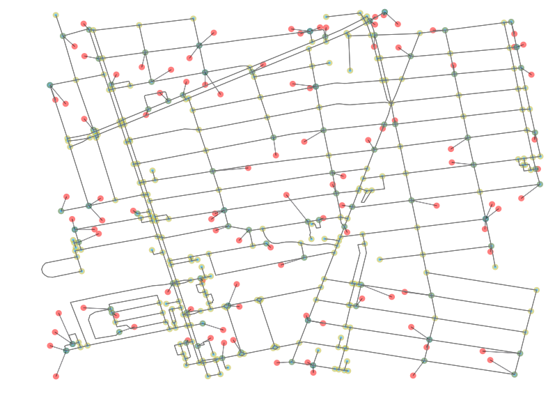
The results of the script are shown in the plot above. We can now see in red the POI and in blue the nearest neighbor node on the network. All other points (nodes) on the network are highlighted in a neutral yellow.
Measuring Accessibility
Now that we have our POI initialized within our network, we can use Pandana’s network API to easily run fast, performant queries against it. Below is a query wherein we ask for the 5 nearest POI for each node in the network:
npi = net.nearest_pois(1000,
                       'pois',
                       num_pois=5,
                       include_poi_ids=True)
In the above query, the first arg represents a max threshold at which we stop crawling the graph. In this situation, we have a small network, so setting it at 1000 means we don’t worry about exceeding the threshold and expensively crawling an expensive graph. In a walk analysis, one might want to set the threshold at, say, 60 minutes.
The second argument is the name of the added POI layer to the network. In this case, we have just named that layer pois, rather un-creatively. The third argument simply let’s us set how many nearest nodes we want to check. Most often, we just want 1. The final argument is to choose whether or not to get the POI id returned as well.
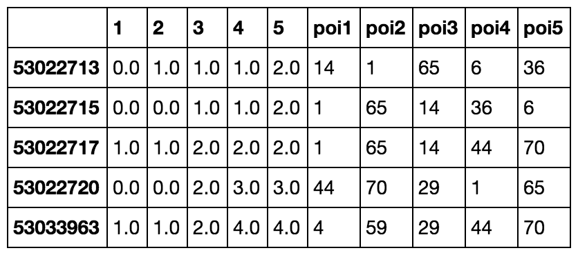
As we can see in the above output, we get the cost to each nearest POI from each node and the id that each pairs with in the rightmost column. Below is a quick one-liner that takes the response we got and pulls the “most popular” POI. This is the node that has the most nearby neighbors.
most_popular = npi.groupby('poi1').apply(lambda x: len(x)).to_frame().sort(0, ascending=False).head(1) # returns node id 93For fun, let’s take a look at what that looks like. The below image includes all the associated nearby nodes whose first nearest POI is that returned to most_popular (in my case, id 93).
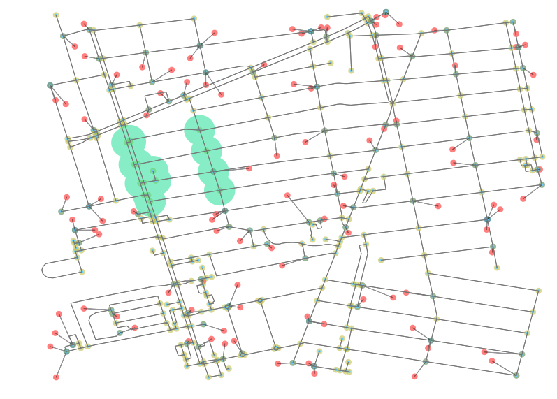
This image is rendered by selecting the related nodes and creating a unary_union of their buffers. What we can see from these results is that there is some weirdness in what is deemed nearest because the weight of every edges is equal (all were set to 1). There a lesson here: Plotting results like this is helpful for sanity checking network analyses to make sure that results being shown are passing a sanity test. From here, you should be equipped to run wild with Pandana and perform your own accessibility analyses. Enjoy!