Introduction
I recently went to a talk at UC Berkeley by the GraphXD group. Their site is here. The presenter of the first seminar, Tselil Schramm gave a great talk on cluster methods on graphs. Specifically, she discussed spectral clustering and the utilization of the Laplacian matrix to represent graphs on a plane.
This was of great interest to me as clustering is not an area I had prior focused much on. From this talk, I became interested in introducing weights to the Laplacian matrix so that I could consume OpenStreetMap network data and perform the same clustering methods.
Motivation
I wanted to do this to see what would happen if I performed a k-means clustering algorithm on the graph of the Laplacian. From this data, would networks themselves reveal neighborhoods? The below notes outline some of the exploration I performed.
Getting the road network data
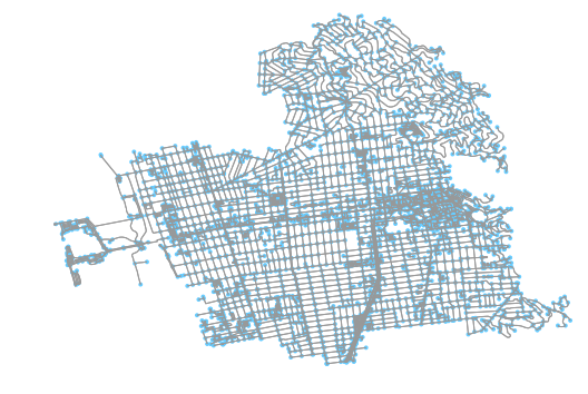
The first step in any of these workflows is to pull down the data and convert it to a network graph. OSMnx is great at doing this; it converts OSM data first into two Pandas data frames (nodes and edges) and then converts that information into a weighted, directional network graph. It’s extra valuable for this work because it cleans nodes to only preserve the intersection nodes. This is valuable if we want to model the road network of a neighborhood in a way that makes only intersections visible (which I do).
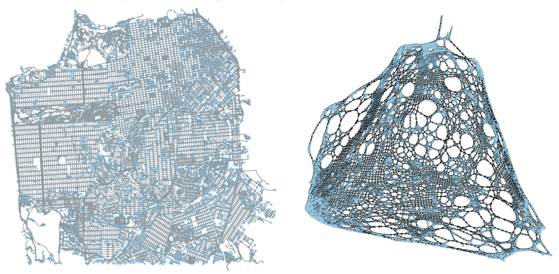
You can quickly get the image above and the NetworkX graph of that OSM data for the walk network in Berkeley, California, like so:
G = ox.graph_from_place('Berkeley, California, USA', network_type='walk')
G = ox.add_edge_lengths(G)
fig, ax = ox.plot_graph(G)
Understanding the proposed process
What we want to do is calculate the Laplacian matrix from the road network graph. The Laplacian is defined as the degree matrix minus the adjacency matrix of the graph.
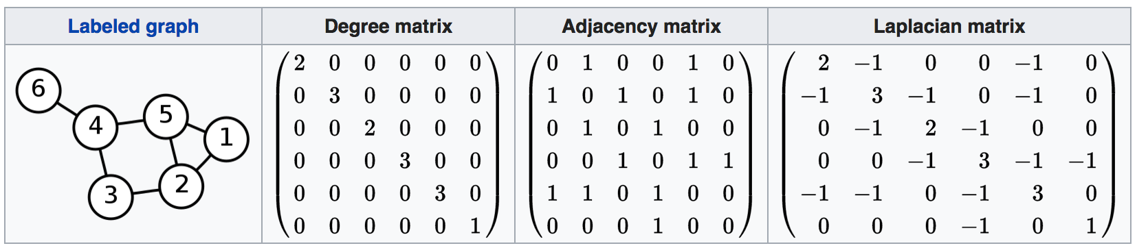
The operation is easily understood when viewed. Above is an example from Wikipedia that illustrates the operation. With the resulting eigenvector matrix, we can extract the second and third eigenvectors and assign them to their respective node ids. Doing so allows us to assign new x/y values to each node id and, as a result, plot a variation of the original network graph that visually associates nodes more closely to other nodes that it has stronger connections with.
Once we have this “transformed” network graph plotted, it’s just a matter of applying a clustering operation to identify similar nodes. Once we have the cluster assignment for each node, we can then re-associate the nodes in the original OSM network graph and visually represent in a “traditional” projection what parts of the region those areas cover.
Once the operation has been performed, we have a real symmetric matrix L that is returned. With L, because it is a symmetric (n by n), we can solve for the eigenvalues and eigenvectors of said matrix.
Laplacian on a simple graph
With the road network data converted into a NetworkX graph, we can now implement the matrix conversions of the graph to perform the calculation needed. First, let’s work with a simple graph. For now, let’s ignore all directionality (we are going to be considering neighborhoods as a product of walking, anyways, and you can walk either way on a sidewalk) and distance for now.
We can easily convert the OSMnx directed graph into an undirected one in NetworkX in one line:
G.to_undirected()First, we need the adjacency matrix. This matrix is a simple boolean matrix (values of 0 and 1 only), where 1 indicates that two nodes are connected and 0 means there is no edge directly connecting the two. NetworkX has a convenience function that returns this information in one line:
A = nx.adjacency_matrix(G)The degrees matrix is a little more involved. A snippet on how to create it is included below. What is involved is that, for each diagonal on the node matrix, calculated the total number of edges that are attached to that node. This can be done my summing up all values (all ones) that are in each column. The sum is then applied to the diagonal in the matrix and that value is then returned as D, the degree matrix.
a_shape = A.shape
a_diagonals = A.sum(axis=1)
D = scipy.sparse.spdiags(a_diagonals.flatten(),
                         [0],
                         a_shape[0],
                         a_shape[1],
                         format=‘csr')
With the adjacency and degree matrices generated, calculating the Laplacian is pretty straightforward:
L = (D - A)Plotting the laplacian matrix
With the laplacian matrix calculated, we can find the eigenvalues w and eigenvectors v of matrix L. SciPy provides a function that allows us to accomplish this.
# w are the eigenvalues
# v are the eigenvectors
w, v = eigh(L.todense())
Once we have the eigenvalues and eigenvectors, we can take the second and third eigenvectors and assign those to the x and y values of the node list from the original graph.
x = v[:,1]
y = v[:,2]
ns = list(Gu.nodes())
spectral_coordinates = {ns[i] : [x[i], y[i]] for i in range(len(x))}
With these new coordinate values, we can replete the graph and show a contorted variation of the graph.
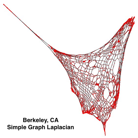
As is easily visible, the left side of the graph is very “disconnected’ from the rest of the graph, relatively. This area is the marina in Berkeley, on the San Francisco Bay. Because there is a complex network there that features many close intersections all relatively disconnected from the rest of the road network, and all edges have been assigned a weight of one, these components of the map are greatly exaggerated. Similarly, the tight network of streets in the center of Berkeley also features as disproportionately large.
Weighting to the Laplacian
We can weight the Laplacian matrix by introduce edge weights to the adjacency matrix. Doing so will enable the adjacency matrix to pass through these weighting to the calculation of the degree matrix. Once the two matrices have been generated, we can continue as we did in the prior section.
Below is the same code from before, but with weight present this time:
# First, get the adjacency matrix
A = nx.adjacency_matrix(G, weight=w)

# Next generate degrees matrix
a_shape = A.shape
a_diagonals = A.sum(axis=1)
D = scipy.sparse.spdiags(a_diagonals.flatten(),
                         [0],
                         a_shape[0],
                         a_shape[1],
                         format='csr')

# Fundamental Laplacian calculation
L = (D - A)
As you can see, simply adding a weight indicator to the Networkx nx.adjacency_matrix method enables one to identify the edge attribute that you desire to use as the weight attribute when computing adjacency.
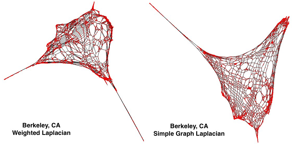
As I included at the top of this blog post, the above images allow us to compare the results of the two. Curiously, in the new, left Laplacian (the weighted one), we can see that a new spurt has appeared on the bottom right. In the next section.
Understanding the contorted graph
So, let’s keep talking about those last two plots I put up in the last section. What is that spurt? I happen to know it is the hills in North Berkeley. Why is it on the south east corner of the plot? It turns out the x and y values were flipped.
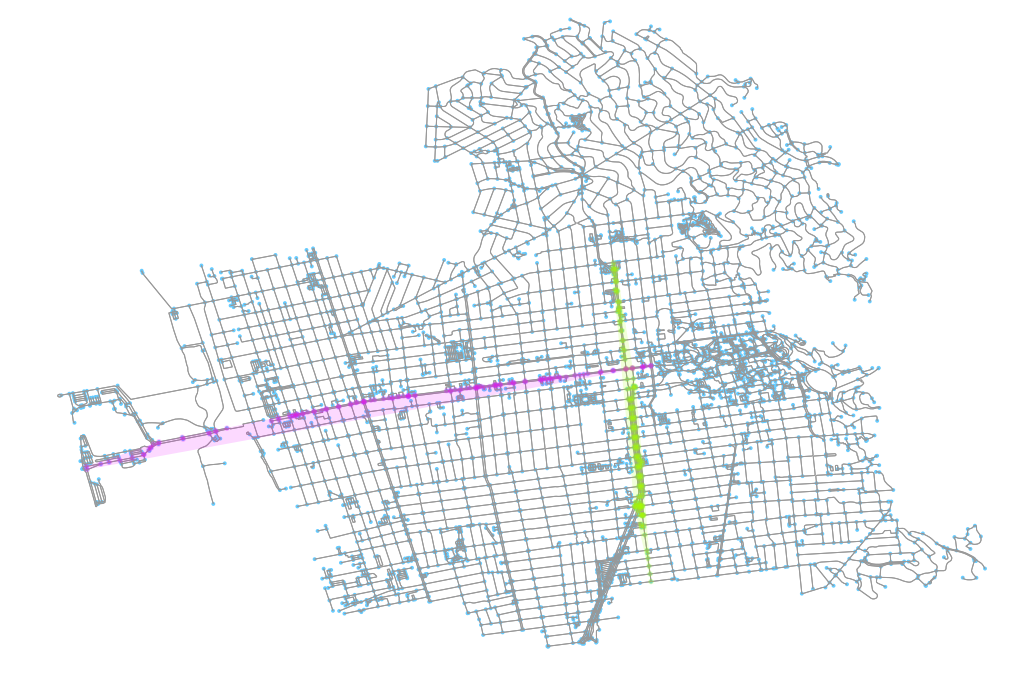
I determined this by identifying two major roads that run through Berkeley and plotting their approximate areas in both. In the above image, we can see those two roads (University Avenue running east-west and Shattuck running north-south). I colored each of their nodes, respectively, and also drew a convex hull around the points so I could see the rough area they cover.
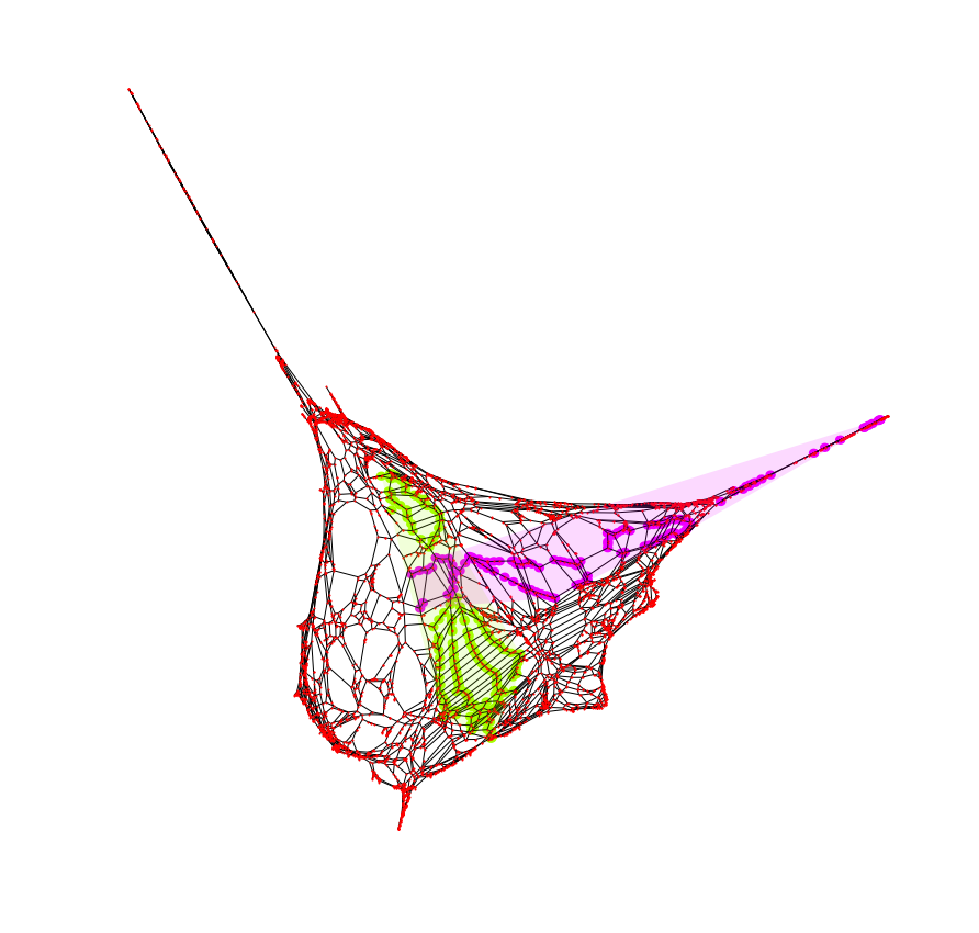
Keeping track of those node ids, I can do the same thing, this time on the weighted graph plotted. As we can see, in this result, the y axis was correct but the x axis was mirrored. This simple tagging helped make keeping visual track of the plots easier for me.
Regardless, these results do not impact the clustering method, which I will discuss next, although not having these additional notations would indeed make tracking progress a bit confusing.
Passing the clustered network through K-means
Once we have the new spectral cluster’s points (in x, y values), getting the K-means cluster is very straightforward. I will use the Kmeans library from sklearn.cluster. Once we extract an array of coordinate locations from the network’s nodes, we simply introduce them to the algorithm:
kmeans = KMeans(n_clusters=12, random_state=0).fit(X)
groupings = kmeans.labels_
With the resulting clusters, we can generate a fit given some number of clusters. The groupings will be integers which can be paired with each node id from each coordinate pair that was passed into the Kmeans module.
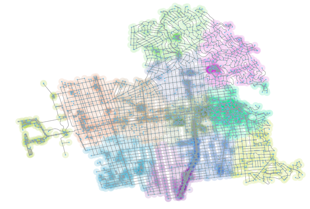
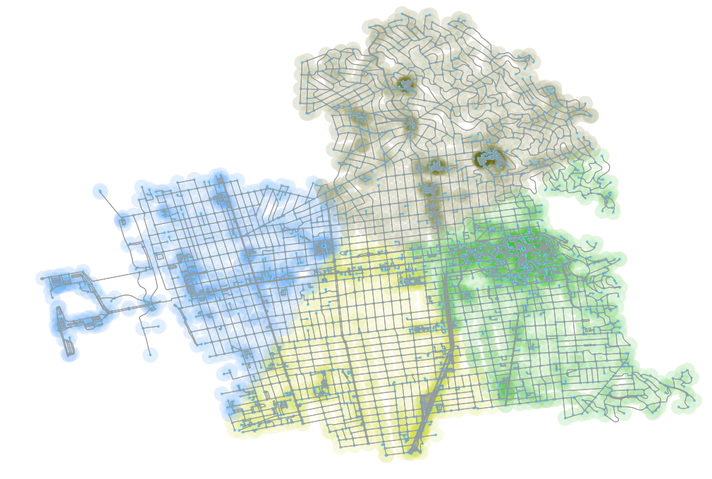
The results of the above operation, with the nodes colored according to their cluster group from the spectral cluster plot and re-associated with the original graph, is above.
Results of utilizing elbow method to determine k cluster count
These results look good, and I was quite pleased when I first reached them, but there remains one last issue - how do I determine the number of clusters to perform? Is there a programmatic way to generate the number of clusters such that an optimal number of clusters might be produced?
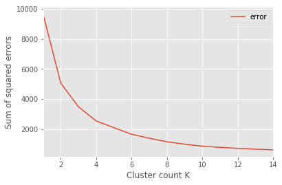
One strategy is to use the elbow method, which is used to return the graph above. Here’s a quick cut and paste of the script I used to generate the y values for each k-means cluster count (discussion after):
sse = {}
for k_val in range(1, 15):
    # Keeps track between groups of error margins
    diff_dists = []

    kmeans_res = KMeans(n_clusters=k_val,
                        random_state=0).fit(X)

    groupings = kmeans_res.labels_
    unique_groups = list(set(groupings))

    # Make a reference GeoDataFrame
    areas_km_test_gdf = gpd.GeoDataFrame({'group': groupings},
                                         geometry=g_vals)

    # Iterate through the groups and deal with each
    # cluster on its own
    for ug in unique_groups:
        # Pull out the subset of the parent composite dataframe
        area_sub = areas_km_test_gdf[areas_km_test_gdf['group'] == ug]

        # Handle when a cluster receives no allocation
        if area_sub.empty:
            print(f'empty cluster on K val {k_val} and cluster {ug}.')
            continue

        points = area_sub.geometry.values

        # Get the mean of each cluster
        x = [p.x for p in points]
        y = [p.y for p in points]

        mean_x = (sum(x) / len(points))
        mean_y = (sum(y) / len(points))
        mean_centroid = (mean_x, mean_y)

        # Add the difference from the mean and each cluster point
        for p in points:
            # Use Pythagorean theorem
            diff_x = (p.x - mean_x)
            diff_y = (p.y - mean_y)
            hypotenuse = math.sqrt((diff_x ** 2) + (diff_y ** 2))

            # Append the Euclidean distance to a running
            # list for cluster count
            diff_dists.append(hypotenuse)

    sse[k_val] = sum(diff_dists)
What we do here is simply get the mean point from each cluster and then, for all other points in that cluster, determine the square of the distance from that point to the cluster mean. Then, we sum the square of all these distances and track that as we increase the number of clusters being fed into the Kmeans method.
The resulting chart (from above) has an “elbow.” This elbow is referenced as the point where there are diminishing returns from additional clusters and thus, this is the ideal point for the number of clusters.
 Unfortunately, if you look at the elbow of the plot, it’s about 4 clusters. Using four plots does produce reasonable results, as we can see in the above, but now where near as “good” as what I saw with 12.
Request for feedback
Hopefully, if you’ve followed me to this point, you might have some ideas on how to best determine the number of clusters. Is my 12 cluster plot of any use? Is there a reason why it both runs accurate to neighborhoods in Berkeley and does appear to return reasonable results? Would there by a way to modify the elbow process to somehow modify the method to return a value more similar to, say, 12? Perhaps additional information could help inform this, such as point of interest (POI) data. If you have ideas or questions, I’d be interested. Feel free to hit me up on Twitter or in the comments below. Thanks for reading!
Updates
Since publishing this I have receive some helpful suggestions. You can read some of them on my Twitter feed, here. In particular, 2 different algorithms were suggested: DBSCAN and HDBSCAN. You can read more about them online with a quick Google search, but I wanted to just include images of the result here for any others interested.
I will include the results of the two methods, embedded below as I tweeted them out in response to the suggestions. The short of it is that these yielded not so exciting results. I’ll need to spend more time to think about the process by which I am approaching the clustering operation. I imagine including a single other dataset will help ensure more consistent results.
DBSCAN results w/2 diff eps thresholds (100 & 400 meters) below. min_samples set to 4 nodes. Results don't seem as compelling on first pass. pic.twitter.com/HuICRuYGG1
— Kuan Butts (@buttsmeister) October 24, 2017
Similarly, here is HDBSCAN with minimum cluster size set at 10 and 25. pic.twitter.com/OVnza9slC3
— Kuan Butts (@buttsmeister) October 24, 2017
Another suggestion that I plan to do soon and report the results of is to get ahold of the actual neighborhoods of Berkeley and to publish those results on this blog, too.