Introduction
In this post, I document how to use OSMnx’s built-in Google Elevation API helper functions to get network grade data and NetworkX’s ego_graph method to observe how grade affects accessibility.
Background/inspiration
San Diego is currently building a new rail line that extends from Old Town, just north of Downtown San Diego to University City, California (UC). This area, UC, is a “boomburg” - a sort of second downtown for San Diego. I happen to have grown up there and have lots of harsh opinions of the place. The transit project connecting downtown San Diego to UC is called the “Mid Coast Trolley” and you can read more about it here.
In thinking about this project, I was particularly thinking about how an important fact of a successfully new transit network is the station placement. The alignment for the new rail route runs along the 5 freeway through the bottom of a canyon. This is stupid for reasons even the most amateur transit planner would be able to reason.
I believe the reason the train was routed down the I-5 corridor was for political expediency, but whatever. That’s not the point of this post (although maybe I’ll take the time one day to sort through how such a disaster of a transit project actually came to fruition).
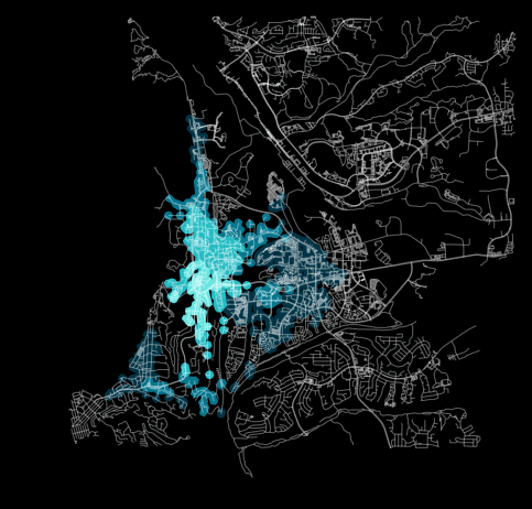
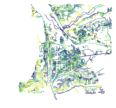
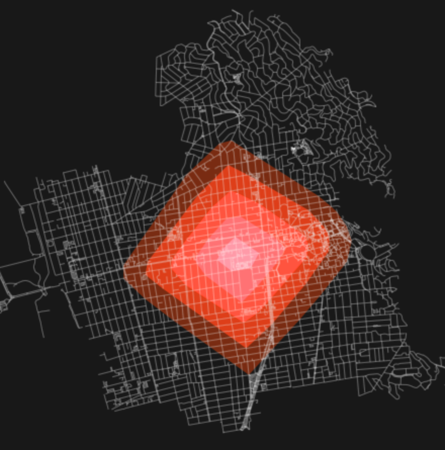
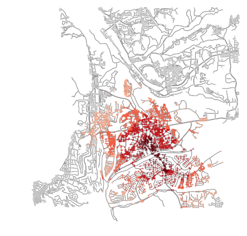
What is the point is that this train is intended to serve neighborhoods in Northern San Diego. San Diego is a sprawling suburban mess as it is, and it gets worse the farther north you go. To compound the problem, San Diego’s topography is defined by a series of mesas.
You can see them in the above image, which plots the grade of each road in San Diego. As you can see, there are flat areas (in purple) cut off by deep valleys/canyons that cut off easy pedestrian access from one neighborhood to the next. This makes it quite hard to get around San Diego, especially on foot.
As a result, station location is critical as you can easily fall into “pockets”, where access to a given location is cut off on many sides.
Introducing target site
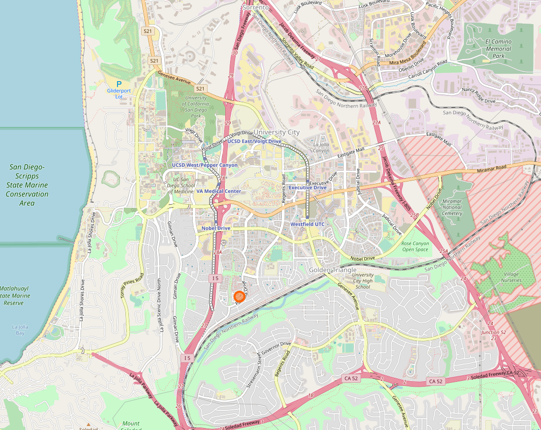
The target site will be where I grew up, and the area around it. Let’s do a 5km radius (3.1 miles). This will roughly encompass the whole of UC, all the way across La Jolla to the ocean just to the west.
uc_geom = ox.gdf_from_place('University City, San Diego, California, USA')
uc = uc_geom.geometry.values[0]
G = ox.graph_from_point((uc.y, uc.x), distance=5000, network_type='walk')
This will generate the below site.
The location goes out east to Mira Mesa and, on the left, you can see the curvature of the coastline.
Here’s that same area in OpenStreetMap (OSM). You should be able to identify the ocean and the freeways more easily now, as well as the canyons that exist on all sides of the “Golden Triangle” (what UC is otherwise known as).
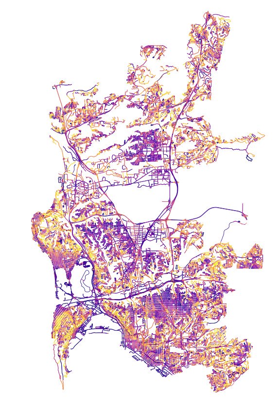
Similarly, here’s the grades of each path in the area. We can see how the triangle floats, in a way, isolated from the rest of the city. The instructions for populating your NetworkX graph with elevation data, via a OSMnx helper function, is available in this blog post.
Observing the base case
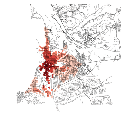
Following the pattern laid out in one of OSMnx’s super helpful example notebooks, it’s easy to generate isochrones of walk access in 15-minute intervals (15, 30, 45, 60) radiating from my childhood home.
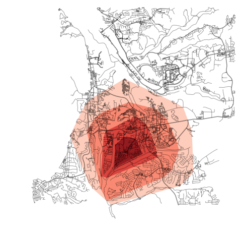
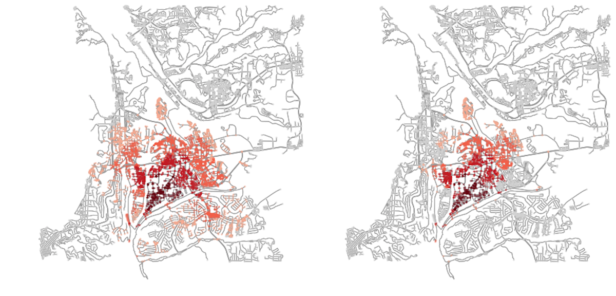
This was generated following the script from the notebook. Unfortunately, this overstates the amount of access a bit much. Because a convex hull is drawn around the point cloud of nodes, it fails to capture the nuance (in and out-ness) of the limited access one has across the canyons and such.
Again, this is those same results, but with just the nodes colored, instead.
Hopefully the distorted nature of that areas accessibility should be clear. With the barriers along what has been highlighted in blue in the annotated image above.
In a typical environment, we would expect results similar to those from the above example (from the OSMnx notebook). That is, from a given point, you can head in all directions about the same amount in a given amount of time.
In the San Diego example, though, this is severely limited simply because there exists few connections due to the significant blockers - the canyons, the freeway, etc.
Adding in elevation
An impedance example function is introduced in the OSMnx elevations example notebook.
# define some edge impedance function here
def impedance(length, grade):
    penalty = grade ** 2
    return length * penalty
I was inspired by this Valhalla PR, in which edge avoidance was introduced by checking if the user had opted to have it removed. This is something that Mapzen (who makes Valhalla) supports through their API. If a user requests for a given edge to be tossed, it is assigned a cost that exceeds all others in the graph. As a result, no routes will be routed across that network edge. In effect, that is what the impedance() function could do, if you wanted it to, from the OSMnx example.
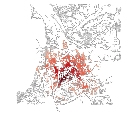
So, what I thought would be interesting to do would be to excessively penalize paths whose slope’s exceeded the ADA’s suggested maximum of a 5% grade for a sidewalk. I was curious how that would further impact the accessibility of UC. Specifically, if you couldn’t be routed to hike through the canyon, how much “worse” would access get along the west side of UC?
The above image shows the results (before on the left, after on the right). Access is even more severely restricted, especially along those two “blue lines” that I highlighted earlier (which correspond to the I-5 freeway on the left, and Rose Canyon on the bottom, to the south).
def impedance(length, grade):
    travel_speed = 4.5
    meters_per_minute = travel_speed * 1000 / 60 #km per hour to m per minute
    ada_sidewalk_grade_max = 0.05

    if grade >= ada_sidewalk_grade_max:
        return 999999
    else:
        return data['length'] / meters_per_minute
Here we can see the sloppy costing function I made to make too steep paths overly expensive. All future analyses in this post will use the costs calculated from the above impedance calculation when determining accessibility.
Comparing to elsewhere in UC
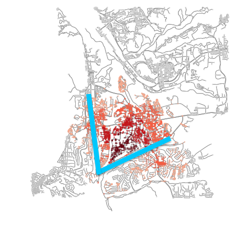
I’ve always thought it was absurd that the train was running along the freeway and through a canyon. Especially when it essentially runs parallel (but about 1.5 miles west) of a really significant urban corridor through San Diego, along Genessee Avenue. This road runs straight from the middle of UC south to the heart of Mission Valley (a suburban nightmare, but still quite dense), which itself feeds south and west into downtown San Diego.
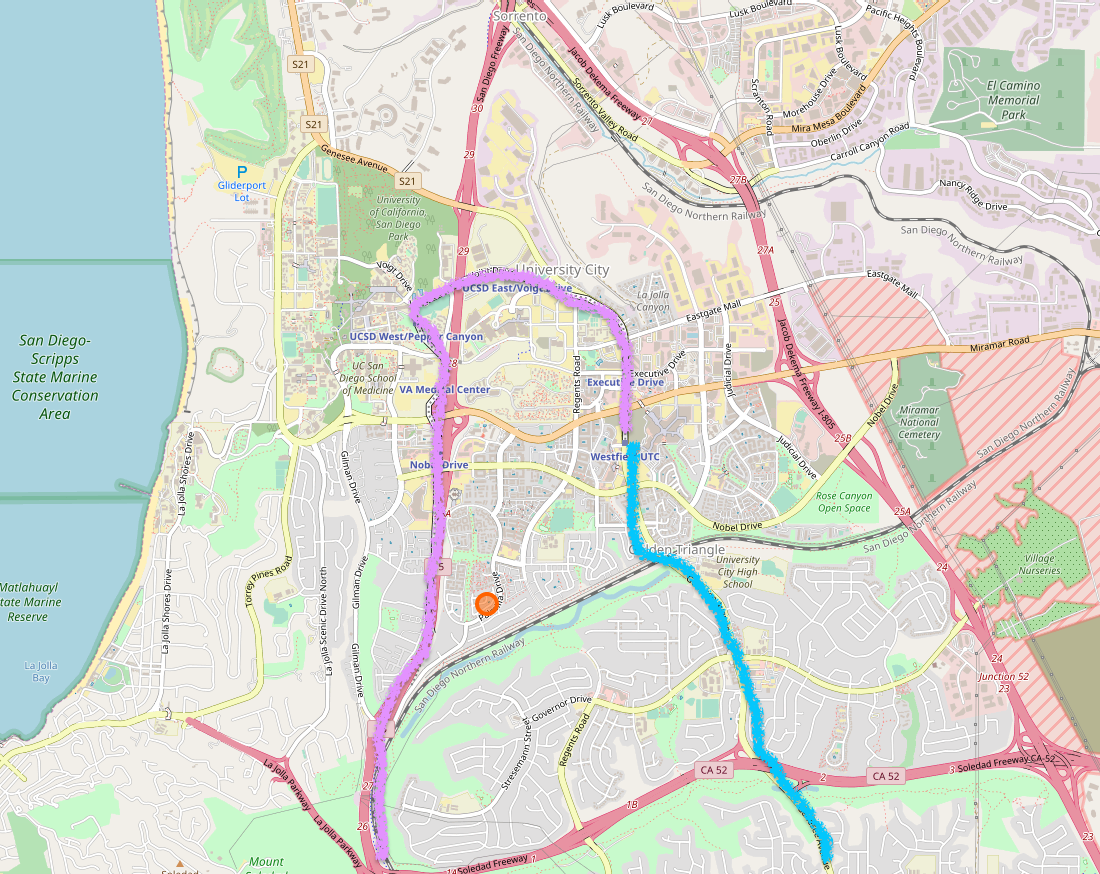
I highlighted this path in blue in the above image (sorry for the ridiculous sketch, just being fast and sloppy here!). In pink is the current (under construction) path. There are significant points (VA hospital, UCSD) at the top of that pink “arc.” Those are important and could theoretically be connected by just extending the blue version farther north along that portion of the curve “in reverse” of the current development.
The part that makes non sense is the rest of that pink line, that runs along the freeway and through a canyon all the way back down to Downtown San Diego, completely inaccessible for miles.
I want to see what touch points along that blue route might look like if they had stations. Would they exhibit the same limitations (pockets?) or would they be better situated to capture “more” of the Golden Triangle. This, of course, ignores the fact that the entire urban area south of Golden Triangle to Mission Valley could now be effective serviced.
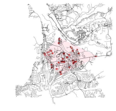
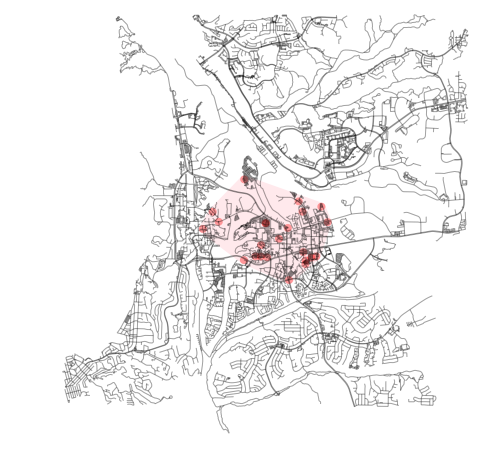
In these examples I am continuing that aforementioned costing strategy of tossing all edges that are deemed “too steep” by that 5% grade threshold.
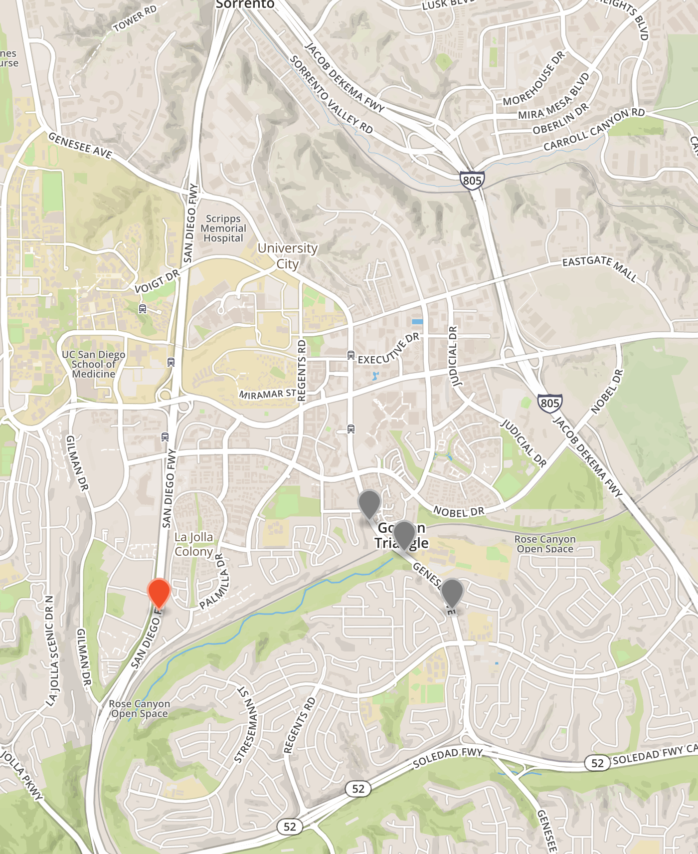
The three points I want to look at are in the middle of UC, all around the high school (UCHS). The red flag to the left is where the alignment is currently, along the 5 freeway. You can see how Genesee (the road the grey markers are on), forms a spine for UC (as it does for all neighborhoods to the south, too).
Combining those three points, we do see a better distribution around the Golden Triangle. It would be important to improve lateral (east-west) transit service, though.
Reviewing all sites
I decided to then write a script to just randomly pick sites in the area to see where high levels of accessibility naturally existed (this was faster than running it once for every node in the network).
A snippet of the process is captured in the above GIF.
The process for running through the network nodes randomly and measuring the results of each is roughly:
for i in range(400):
    # Generate
    l = list(G.nodes())
    center_node = l[round(random.random() * len(l))]

    isochrone_polys = []
    for trip_time in sorted(trip_times, reverse=True):
        subgraph = nx.ego_graph(G, center_node, radius=trip_time, distance='time_2')
        node_points = [Point((data['x'], data['y'])) for node, data in subgraph.nodes(data=True)]
        bounding_poly = gpd.GeoSeries(node_points).buffer(100).unary_union.simplify(25)
        isochrone_polys.append(bounding_poly)

        # Also note how many nodes this thing caught
        sg_nodes = len(list(subgraph.nodes()))
        well_connected.append((center_node, sg_nodes))
There are 7789 nodes in the network, so 400 is about 5% of all the nodes in the network.
From these results, we can easily plot the locations of ideal transit stations and see where they end up. See the plots below for a visual of the results. From these results we can see that points tend to cluster along both Genessee and La Jolla Village Drive (as well as just north, where UCSD is). This is actually where that northern “hook” of the current rail line is being built, so that’s a good thing. But what is also clear from these results, is that there’s clearly no accessibility to be had along the western side of UC, where the 5 freeway and Rose Canyon are. So, that whole current alignment for the northbound segment to get to the middle of University City does not provide any opportunities for touch points (stations) that could provide the opportunity to easily capture additional high accessibility areas (as opposed to Genessee).
Greater than the 2nd standard deviation (more than 95% of all the results):
Greater than the 3rd standard deviation (more than 99.7% of all the results):
Script to produce the above results:
a = np.array([x[1] for x in well_connected])
mask = (a > (a.std() * 3))

b = np.array([x[0] for x in well_connected])
plot_nodes = b[mask]

node_points = []
for pn in plot_nodes:
    data = G.node[pn]
    node_point = Point((data['x'], data['y']))
    node_points.append(node_point)

isochrone_polys = gpd.GeoSeries(node_points).buffer(100).geometry.values

fig, ax = ox.plot_graph(G, fig_height=8, show=False, close=False, edge_color='k', edge_alpha=0.2, node_color='none')
for polygon in isochrone_polys:
    patch = PolygonPatch(polygon, fc='red', ec='none', alpha=0.35, zorder=-1)
    ax.add_patch(patch)

ar = gpd.GeoSeries(isochrone_polys).unary_union.convex_hull
ax.add_patch(PolygonPatch(ar, fc='pink', ec='none', alpha=0.35, zorder=-2))

plt.show()
Conclusion
Basically, the intent of this post was to just document some playing around with accessibility when sidewalk slope is taking into account. The site in San Diego was used to observe how tough it is to achieve high accessibility station placement in Northern San Diego because of the topography and the presence of freeways crisscrossing the landscape with limited pedestrian interventions. I believe I covered this sufficiently. What would be interesting is to run that random accessibility test along the current alignment and the alternate one along Genesee and simply see how much of the city is reachable from each alignment. Even without demographic data, one could generate a number (be it in terms of walk area, or intersection count) to assess the missed opportunity of the MidCoast Trolley.