
Introduction
The purpose of this post is to provide a brief walkthrough of how to use Peartree, a library I have been working on, to perform network graph analytics operations on GTFS data. Hopefully, in the near future, I’ll finalize the tool and pair it with a nice post to describe it fully on its release.
In this post, I’ll cover everything from getting the GTFS data to running the a betweenness centrality algorithm to compute the shortest-path betweenness centrality for nodes, where each node is a single bus stop from the GTFS feed.
Inspiration
This post is in response to a Twitter user’s expressed interest in seeing how this would work. The user specified the NYC Brooklyn bus network in particular, so I’ll be using that service’s feed in this example.
Getting started
Here’s all the libraries we will be using to execute this:
import os
import requests
import tempfile

import geopandas as gpd
import networkx as nx
import osmnx as ox
import numpy as np
import peartree as pt
from shapely.geometry import Point
Please note that peartree is included in this list. It is available to be pip installed, already, just like any other standard Python library.
Process
First, we need to check the Transit.Land API and query it for any and all operators that service Brooklyn. I draw a small rectangle in Brooklyn and pull the bounds from it. I use this to query the API. If you would like to know more about Transit.Land’s API, I happen to have written a visual walkthrough a short while ago for their blog, here.
tl_query = 'https://transit.land/api/v1/feeds?bbox=-73.97339,40.649778,-73.946532,40.670353'

resp = requests.get(tl_query)
rj = resp.json()
We can easily iterate through the results and pull out the zip location of the original GTFS:
zip_url = None
for f in rj['feeds']:
    if 'brooklyn' in f['onestop_id']:
        zip_url = f['url']
This will return us the following zip location (at time of this being written): ’http://web.mta.info/developers/data/nyct/bus/google_transit_brooklyn.zip'.
Once we have that address, let’s download that file to a local temporary directory:
td = tempfile.mkdtemp()
path = os.path.join(td, 'mta_bk.zip')

resp = requests.get(zip_url)
open(path, 'wb').write(resp.content)
Once we have the file downloaded, we can literally cut and paste the steps from the README in my Peartree repository:
# Automatically identify the busiest day and
# read that in as a Partidge feed
feed = pt.get_representative_feed(path)

# Set a target time period to
# use to summarize impedance
start = 7*60*60  # 7:00 AM
end = 10*60*60  # 10:00 AM

# Converts feed subset into a directed
# network multigraph
G = pt.load_feed_as_graph(feed, start, end)
The above step may take some time. I am still in the process of making this operation more performant. This step, with the Brooklyn dataset, should take a few minutes with the current version of the Peartree library.
pt.generate_plot(G)The above operation will produce the following plot:
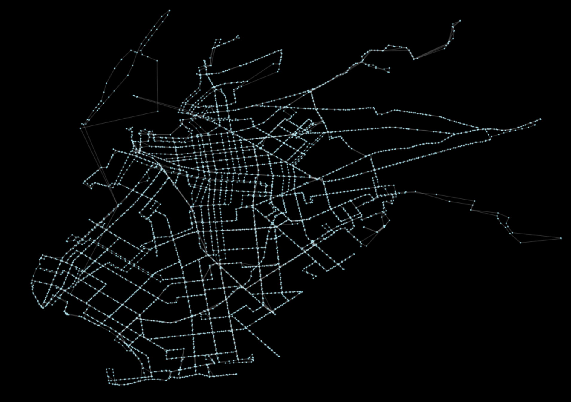
The output should look roughly like the main streets of Brooklyn. Now, because our graph object G is formatted as an instantiated NetworkX graph, we can actually perform all typical network algorithms that have been built out into the NetworkX ecosystem. The requested method was a betweenness centrality computation (documentation here). This can be performed in one line!
nodes = nx.betweenness_centrality(G)Again, please be patient. NetworkX is vanilla Python so it’s not the most performant library out there. For this type of work, though, it should be sufficient. Want to work with this data in a vectorized format? You can easily export the network to a sparse matrix, which can be consumed by SciPy and thus opens up the entire SciPy/sk-learn Python data science world with a simple export operation, outlined in NetworkX’s documentation, here.
Plotting results
Now that we have the results of the nx.betweenness_centrality operation, we can visualize it. Let’s plot each node based on its resulting value. First, let’s extract all values acquired (note, this is written for simplicity and legibility - these following steps could be refactored to be far more performant).
nids = []
vals = []
for k in nodes.keys():
    nids.append(k)
    vals.append(nodes[k])

min(vals), np.array(vals).mean(), max(vals)
# prints (0.0, 0.0057453979174797599, 0.11406771048983973)
Once we have the values, we can set a ratio of each value against the max value. With this ratio, we can factor in the max buffer size we want and scale results accordingly.
vals_adj = []
m = max(vals)
for v in vals:
if v == 0:
vals_adj.append(0)
else:
r = (v/m)
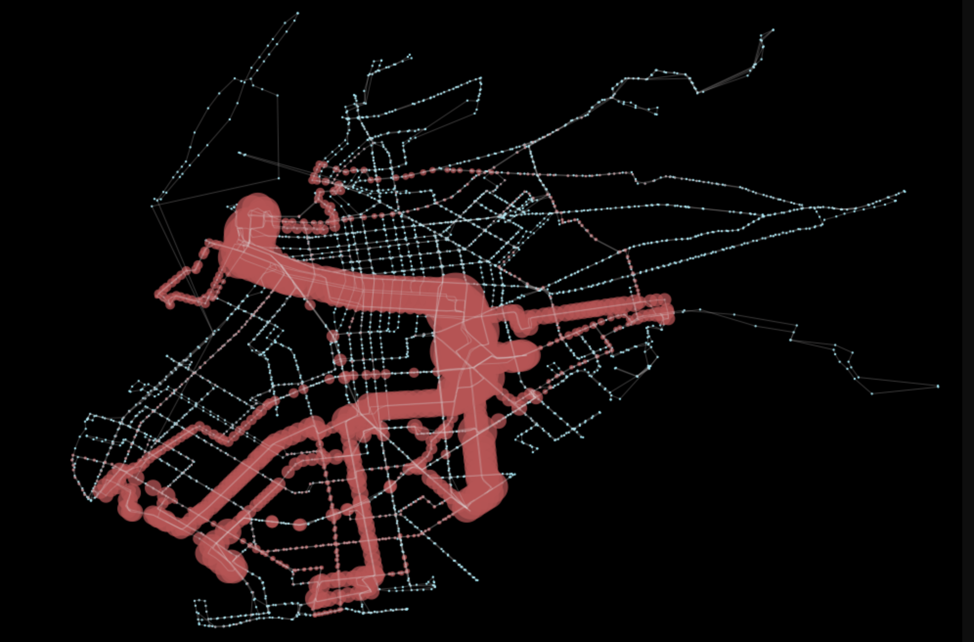
vals_adj.append(r * 0.01)In the above case, 0.01 was selected as our max buffer size. Now, in order to add those buffered nodes onto the original plot, all we need to do is grab the ax object returned from the plot function and path on additional buffered Shapely points as polygons.
fig, ax = pt.generate_plot(G)

ps = []
for nid, buff_dist in zip(nids, vals_adj):
    n = G.node[nid]
    if buff_dist > 0:
        p = Point(n['x'], n['y']).buffer(buff_dist)
        ps.append(p)

gpd.GeoSeries(ps).plot(ax=ax, color='r', alpha=0.75)
The final line will result in the below plot, which clearly highlights which sections of Brooklyn are most connected with this bus transit service.
Closing Statement
Looking ahead, subsequent work could be done to bring in other parts of the MTA bus network, as well as to correlate it with the subway data and vehicular traffic volume information.