Above: Short animation of proposed dropdown menu. You can view a compiled version of the page, here.
Introduction
This is a short post intended to just demonstrate a potential format for hosting a dynamic list of analytical modules in a drop down menu. The goal was to just roughly mock something out in React, and, hackiness aside, just demonstrate a possible data schema that would allow for navigable, nested module lists.
Inspiration was me noticing that a component of the frontend on the app I work on at my job could be better sorted into a menu of some sort. I played around with some ideas here, and took notes since nested lists do not appear to be a common component when looking around at published React components.
This is a very straightforward static page with just a few components developed to represent the different parts of the drop down menu. To see the whole related files to create this page, I’ve placed the content in this repo on Github.
Data model
I propose a structure such as the following for passing through a dynamic nested list (in this case a list where there are a set of modules you can choose from). Each is grouped under a category, and each category gets some custom styling themes.
[
  {
    key: 'environment',
    color: '#305b2d',
    'icon': 'fa-tree',
    modules: [
      {key: 'greenhouse gas'},
      {key: 'protected species'}]
  }, {
    key: 'mobility',
    color: '#066da0',
    'icon': 'fa-bus',
    modules: [
      {key: 'walk accessibility'},
      {key: 'transit accessibility'},
      {key: 'travel patterns'}]
  }, {
    key: 'resiliency',
    color: '#772016',
    'icon': 'fa-fire',
    modules: [
      {key: 'flood'},
      {key: 'fire'},
      {key: 'earthquake'}]
  }
]
Components
Each nested array element will be handled in this top level component, ModuleGroupSelector, which creates drop downs for each group. Then, within each group, the list of modules is passed through.
class ModuleGroupSelector extends React.Component {
constructor(props) {
super(props);
this.toggleHidden = this.toggleHidden.bind(this);
this.state = {
isVisible: false
}
}
toggleHidden () {
this.setState({
isVisible: !this.state.isVisible
})
}
render() {
const moduleGroups = this.props.moduleGroups;
return (
<div className='analytics' onMouseEnter={this.toggleHidden} onMouseLeave={this.toggleHidden}>
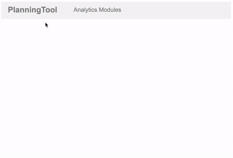
<div className='topButton'>
Analytics Modules
</div>
<div className={`analyticsDropDown ${this.state.isVisible ? 'visible': ''}`}>
{moduleGroups.map(group => <ModuleGroup key={group.key} id={group.key} color={group.color} icon={group.icon} modules={group.modules} />)}
</div>
</div>
)
}
}Note that toggle bindings are made for each element. This will be the case for both the menu item here that shows the groups, as well as the group components that house each of their subset of modules.
So, when a user hovers over the menu component to show the groups, it triggers the rendering of the list of groups as components:
class ModuleGroup extends React.Component {
  constructor(props) {
    super(props);
    this.toggleHidden = this.toggleHidden.bind(this);
    this.state = {
      isVisible: false
    }
  }

  toggleHidden () {
    this.setState({
      isVisible: !this.state.isVisible
    })
  }

  render() {
    const lightBackgroundColor = ColorLuminance(this.props.color, 1.5);

    // Only make bg color if on hover
    const bgStyle = {
    }
    if (this.state.isVisible) {
      bgStyle['backgroundColor'] = lightBackgroundColor;
      bgStyle['borderLeft'] = `5px solid ${this.props.color}`;
    }

    return (
      <div className='moduleGroup'
           onMouseEnter={this.toggleHidden}
           onMouseLeave={this.toggleHidden}
           style={bgStyle}>
        <i className={`fa ${this.props.icon}`} style=></i>
        {this.props.id}

        <div className={`modulesSet ${this.state.isVisible ? 'visible': ''}`}>
          {this.props.modules.map(module => <Module
              key={module.key}
              id={module.key}
              lightColor={lightBackgroundColor}
              color={this.props.color}
            />)}
        </div>
      </div>
    )
  }
}
Each group div above is designed to by styled slightly based on that groups meta attributes. Those styles are also passed down to the element’s child components, which in this case are the modules themselves:
class Module extends React.Component {
  constructor(props) {
    super(props);
    this.toggleHidden = this.toggleHidden.bind(this);
    this.state = {
      isHovered: false
    }
  }

  toggleHidden () {
    this.setState({
      isHovered: !this.state.isHovered
    })
  }


  render() {
    const styles = {
      'backgroundColor': this.props.lightColor,
    }
    if (this.state.isHovered) {
      styles['backgroundColor'] = this.props.color;
      styles['color'] = 'white';
    }

    return (
      <div className='singleModule'
           onMouseEnter={this.toggleHidden}
           onMouseLeave={this.toggleHidden}
           style={styles}>
        {this.props.id}
      </div>
    )
  }
}
That gets us consistent group styles paired through to the subcomponents of a group of modules.
Conclusion
Note that the styling (if you view the CSS) is pretty hacky (also apologies for not using Scss or Sass). The location of the div for the group elements is hard set with absolute positioning. But, I think the design pattern for the modules themselves works, wherein relative positioning based on the location of the parent group selector is used. This gets the rightward-cascading menu pattern that allows for a more legible, nested drop down list.