
Above: Highlighted segment of scraped route 20 segment performance, with elapsed time on x axis and distance on y axis.
Introduction
The purpose of this blog post is to document some very initial analysis of a data dump based on bus performance data accessed through the Swiftly API for date 06/08/2018 to 09/30/2018. This data was requested from the VTA in the second week of August, in 2018.
This post represents notes from an initial exploration into the data dump that I acquired, which was performed during a flight from Chicago to Oakland, sans internet. So all observations are without any double checking against VTA or other online resources.
Discussion of VTA bus performance data
As far as I understand it, the VTA has been engaged in a prolonged early development process of the Swiftly platform. Swiftly (again, as far as I understand) consumed published GTFS-RT data from an operator and helps them roll that data up and perform summary statistics on that information. Part of the returned product is an API endpoint from which you can query various bus feeds.
I do not think the bus feed is available to the general public (though I think this should be something that public transit operators should ensure when engaging in future contracts with such service providers). I believe this API should be available to citizens so that the public can both help the transit operators via a civic engagement process (hackathons and the like), and also so that the public has the same tools and data with which to evaluate the already publicly available GTFS and GTFS-RT data as the city procures (given that it is primarily just an ingested and processed dataset based on the city-published GTFS-RT data).
Given that Swiftly publishes this data in a consumable format to the VTA through an API, I imagine increasing the availability to VTA riders who request and API key would not be an unreasonable addition. I do want to note that I am assuming the reason this is not yet available is likely due to the early nature of this platform and product.
That said, I do just want to highlight this as something that operators should keep and eye out for and ensure when engaging in contracts with Swiftly (or comparable services) in the future. For example, I am aware that Boston MBTA has selected Swiftly to report bus locations in the future. If they also gain access to the same APIs that the VTA is currently using, it would be valuable to ensure that this information can be accessed by the public via the same APIs.
Data model
The data dump I was provided was a composite file full of csvs, one for each day of the roughly 3 month period. For each day, bus data was held for performance (elapsed time in seconds) between each stop pair for each route for each unique trip.
Each csv contained the following columns:
['block_id',
 'trip_id',
 'route_id',
 'route_short_name',
 'direction_id',
 'stop_id',
 'vehicle_id',
 'driver_id',
 'sched_adherence_secs',
 'scheduled_date',
 'scheduled_time',
 'actual_date',
 'actual_time',
 'dwell_time_secs',
 'travel_time_secs',
 'is_departure',
 'stop_path_length_meters']
On disk, this information sits just shy of 950MB. As a result, the size of the data was small enough that I could quickly play with the data in Python via pandas with little concern for efficiency (e.g. this was a license for me to write sloppy, quick, exploratory code :)).
I was quickly able to identify the busiest as #22. Since I live up in Oakland I am not super familiar with VTA routes. I will leave it to a reader to comment with more details about the route.
df.groupby('route_id').apply(lambda x: len(x))For each unique trip associated with that route id over the target analysis period, I extracted the cumulative time elapsed for the trip and the distance along the route for each segment of each route. I include the code only for reference as it is annotated. I acknowledge it is sloppy - it was a quick script written during a flight to merely explore the data.
# Note we will use these reference data points later
ref_stop_ids = None
ref_stop_distances = None

results_array = []
for target_trip in unique_tripids:
    print(f'Analyzing for route {target_trip}')
    # Get just a single trip id from the subset of DF
    mask = df.trip_id == target_trip
    tt_sub = df[mask].copy().sort_values(by=['stop_id', 'actual_time'], ascending=True)
    tt_sub = tt_sub.reset_index(drop=True)

    # Pull out the travel time values
    time_passed = tt_sub['travel_time_secs'].copy()

    # Find out where travel time is null
    tt_is_null_mask = tt_sub['travel_time_secs'].isnull()

    # Add the dwell time to that area
    dwell_vals = tt_sub['dwell_time_secs'][tt_is_null_mask]

    # Then place those in the time passed new series
    time_passed[tt_is_null_mask] = dwell_vals

    # Wherever there are still nulls go ahead and replace w/ zeroes
    time_passed[time_passed.isnull()] = 0

    # Now what we want is the running total over time
    time_passed = time_passed.cumsum()

    # Do the same to determine cumulative trip distance over time:
    stop_path_length_meters = tt_sub.stop_path_length_meters.copy()
    stop_path_length_meters = stop_path_length_meters.reset_index(drop=True)
    stop_p_len_init_val = stop_path_length_meters.values[0]

    for i, val in enumerate(stop_path_length_meters.head(2) - stop_p_len_init_val):
        stop_path_length_meters[i] = val

    distance_covered = stop_path_length_meters.cumsum()

    # Update the total results reference
    results_array.append((time_passed, distance_covered))

    # Keep the highest resolution reference dataset we can
    if ref_stop_ids is None or len(ref_stop_ids) < len(tt_sub):
        ref_stop_ids = tt_sub['stop_id'].values.tolist()
        ref_stop_distances = distance_covered.values.tolist()
Examining initial results
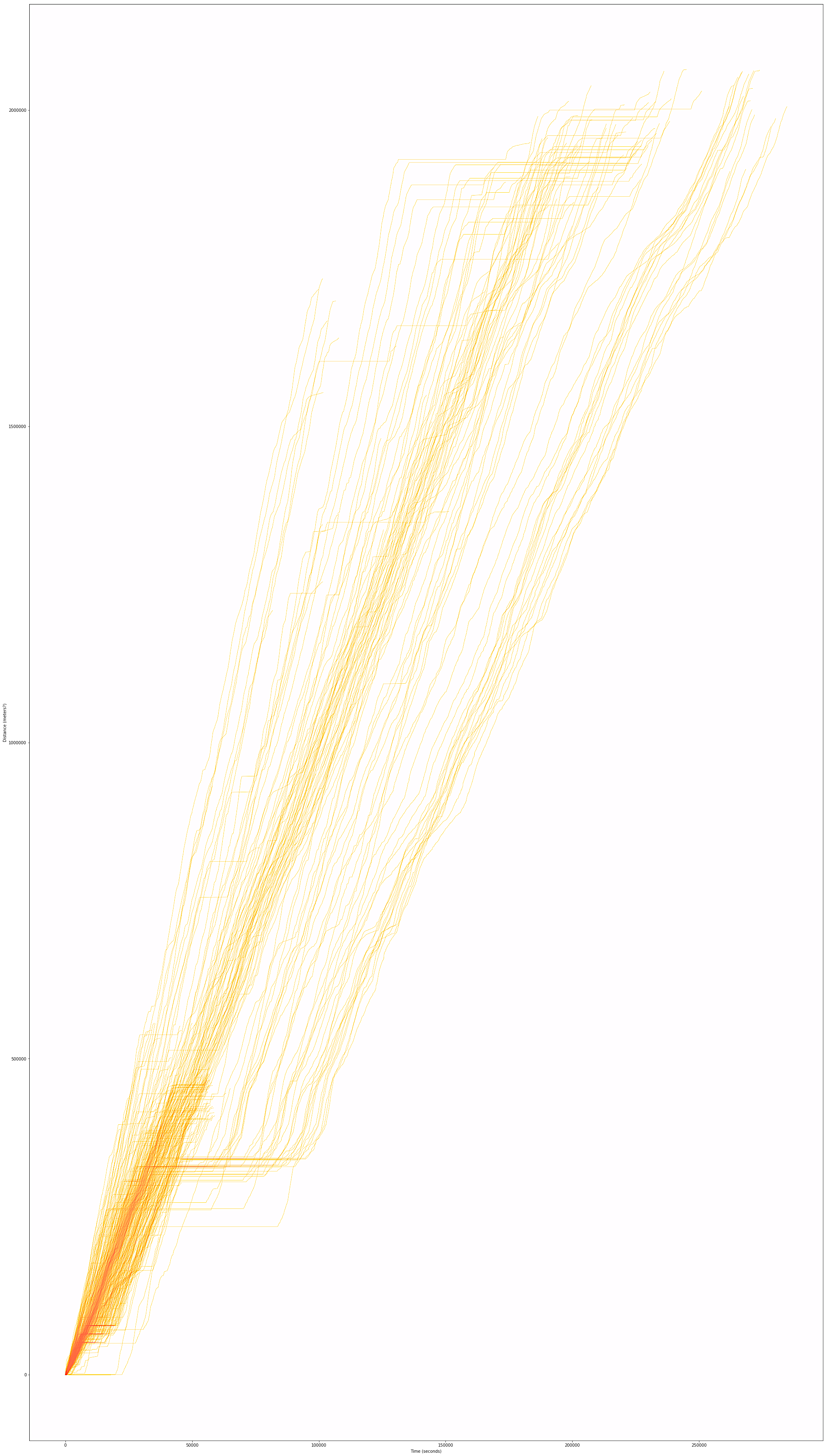
Note about above image: Right click to open in own window to zoom in/view enhanced image.
Once I had that information, I was able to plot the results, with the above output. The x axis represents time while the y axis represents distance (in meters I believe) along the route. In general it appears that there are 2 types of 22 routes - one that goes about 1/4 of the total distance that the other does. We can see this because there appear to be more recorded trips (thus more lines) in the bottom left that terminate about a quarter of the distance along the y axis.
Note that because all times of day are considered, there appear to be two clear patterns in the upper right, this is related to the two different route directions.
I was able to parse that out and just look at one direction by adding this additional filter when calculating a dataframe subset:
    # Skip if there are no trips in this direction
    tt_sub = tt_sub[tt_sub.direction_id == 0].copy()
    if len(tt_sub) == 0:
        continue
It’s also noticeable that variation and thus performance spread vastly increases the more time and distance passes. This makes sense as the bus is more susceptible to environmental impacts that longer it is en route (and the farther it goes, if that also means it is encountering more uncontrollable traffic occurrences in a single trip).
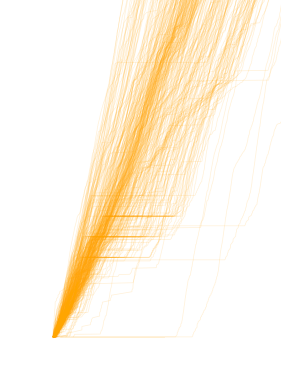
Above: We can see the subset of trips that perform this shorter route, as well as the relatively greater consistency in bus performance.
Adding stop context
I thought this chart was very helpful - in particular, I believe these types of charts can help a transportation planner identify issue points (where the slope flattens) along the route that appear to contribute to delays.
Because we have so many routes traced, we can see where this happens more often than not. These “hot spots” can then be correlated with intersection information. We can pull this in from the GTFS and look at the stop ids and their associated names (which relate to the intersections or locations where the stops are in this case).
import partridge as ptg
feed = ptg.get_representative_feed('vta_gtfs.zip')

ref_sids = pd.DataFrame(
    {'sids': ref_stop_ids,
     'dists': ref_stop_distances}
).groupby('sids').apply(
    lambda x: round(x['dists'].mean(), 2))

sids = list(ref_sids.index)
sid_dists = list(ref_sids.values)
sid_names = []

for sid in sids:
    fs_sub = feed.stops[feed.stops['stop_id'] == str(sid)]
    nombre = fs_sub.squeeze()['stop_name']
    sid_names.append(nombre)

# Now we have a reference data frame of all the stop ids as well as
# how far along in the trip each of them occur at
sid_ref = pd.DataFrame({'sids': sids, 'dists': sid_dists, 'names': sid_names})
We can now plot the results with the stop names associated and highlighted at each part of the route:
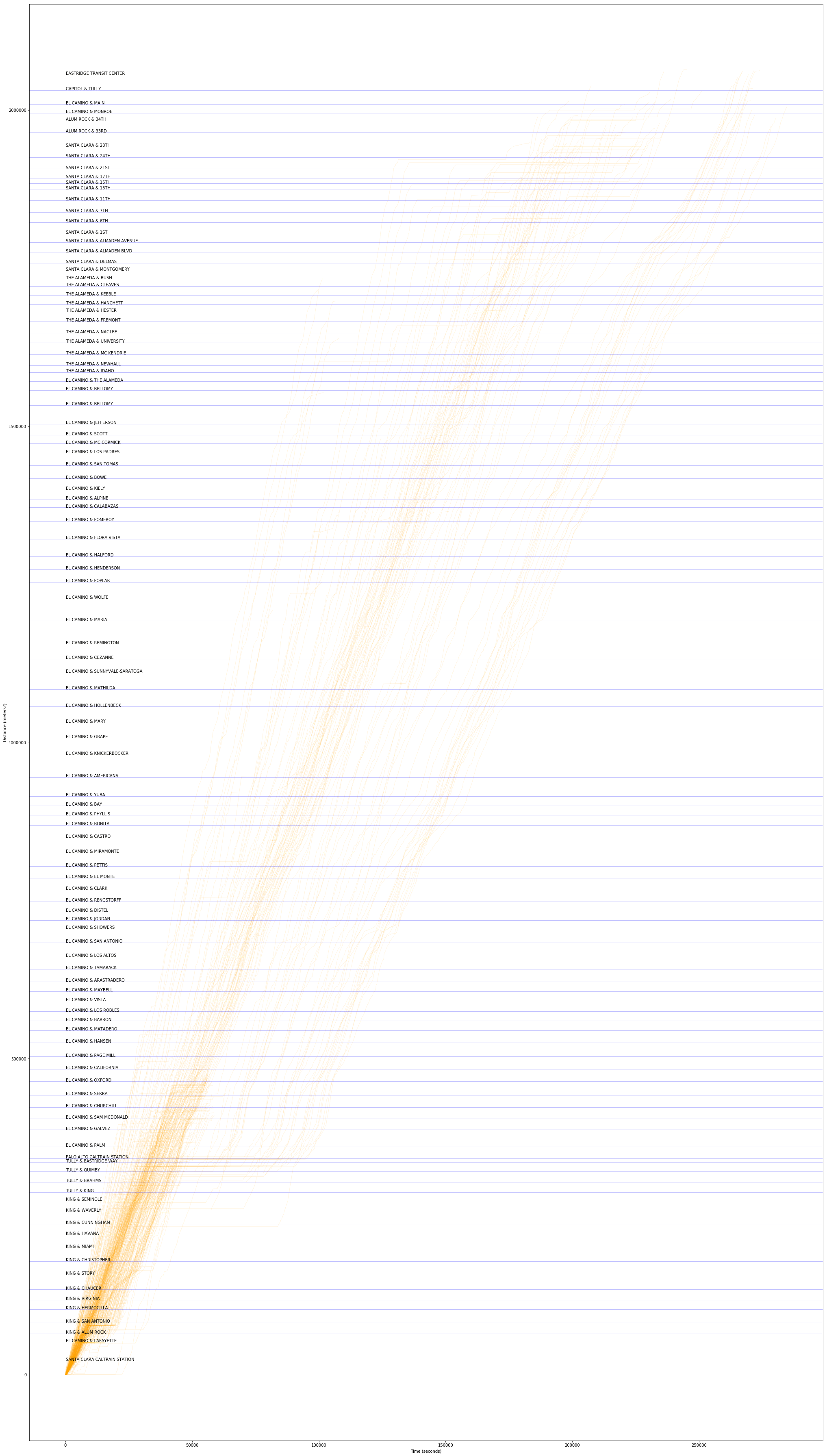
Note about above image: Right click to open in own window to zoom in/view enhanced image.
With this result, we can explore what stops are contributing to “break points” or bottlenecks in the network. We can also look at stop names to see if certain streets contribute to performance degradation or where breakdown of schedule adherence or consistency really starts to happen along the corridor.
Looking closely at results
The following will just a be a quick demonstration of what how someone might evaluate this schedule data, now that they have it pulled down. I have selected 5 portions of the plot to examine closely and made quick observations related to each. They are presented here, in the below:
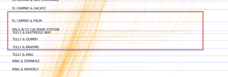
The largest “flat line” in trip progress appears to be at Palo Alto Caltrain station. The length of the wait and the fact that there appears to be a drop off of buses at this point seems to suggest that this might be a transfer point and a terminus where a portion of the 22 buses stop their route. In general, I suspect that this bus is designed as a feeder for the Caltrain stop. If not, I feel bad for riders that need to wait for this bus to proceed pass this transfer point.
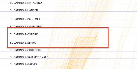
El Camino and Oxford appears to be particularly rough with delays. Is there a hospital nearby? A senior citizens home? Perhaps the light here could be optimized to ensure buses are not held at along light.
Towards the “top” of the plot, we can see that bus performance is highly dispersed. By the end fo this route, bus arrivals vary widely (well overall runtime does). If this bus is intended to be providing consistent service or service at reliable intervals, it may be falling far short of that given its present performance. Drilling down deeper by time of day would provide ore insight related to this. The fact that there is not even a clear consolidation of arrival times, though, does not bode well for performance even by subset of target times.
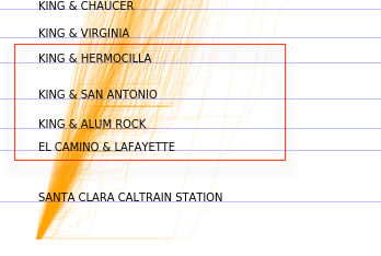
On the bottom of the plot meanwhile, we see that bus performance is more consistent. This is to be expected as this is earlier on in the route. That said, there may be an issue with a stop or intersection between the King/Alum Rock and King/San Antonio stops.
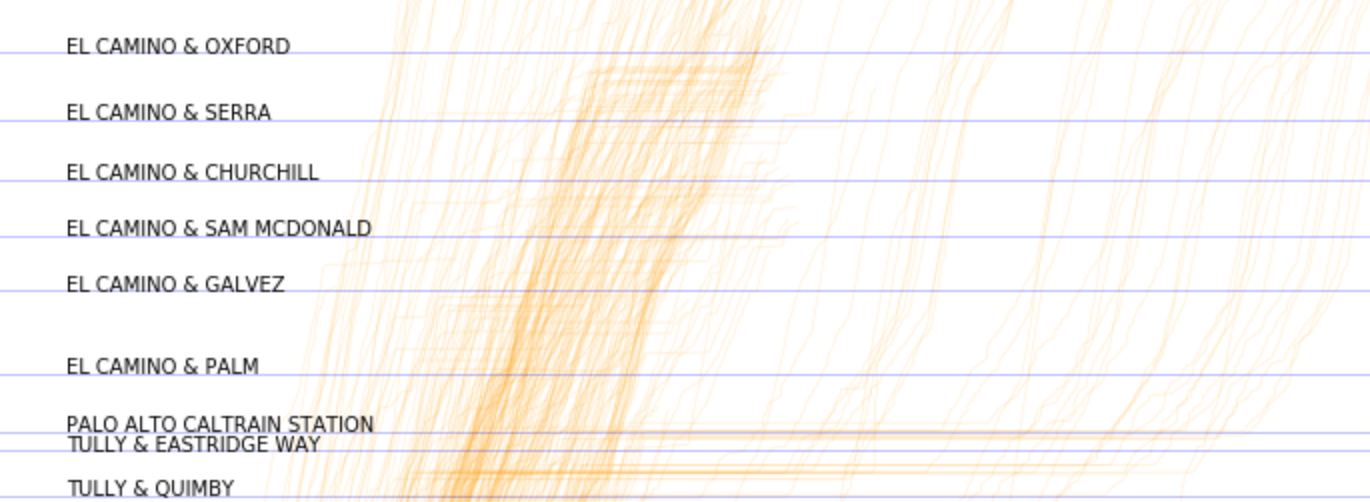
My last hot take is that performance on El Camino seems to be fraught in general. It looks like the moment the bus heads out onto El Camino, we see a dispersion of bus performance. Part of this is due to the Palo Alto train stop, but the fact that slope varies so widely throughout the remainder of the trip indicates that there is a great deal of uncertainty related to bus performance along this corridor.
Seeing this reminded me that I believe/think there may be a proposed BRT for El Camino. This initial overview of the 22 bus suggests that signal priority and a dedicate lane may be useful tools in addressing this significant performance variability observed.
Conclusion
Hope this helps inspire ideas for how to utilize VTA and Swiftly bus performance metrics for your own work. In general the quality of the Swiftly segment performance rollups is high, and I found the data effective for performing quick analyses without needing to wrestly messy GTFS-RT location data, for example.