Introduction
At some point recently, the Bureau of Transportation Statistics (BTS), released updates to the 2017 National Household Transportation Survey. They’ve got a (pretty rickety) site running over here that has been incrementally updated (by a madman with the address of a Bootstrap CDN). Recently, it indicated that the Local Area Transportation Characteristics for Households Data (LATCH, for short) had been made available.
This data can be accessed here. Per the timestamp on this page as of January 23, 2019, it appears that this was published right before the holidays last year, on Thursday, December 13, 2018.
I decided to pull down both the 2009 LATCH data and 2017 LATCH data. I wanted to compare the two and observe how comparable they are. I also wanted to quickly run an example exploration and take notes, to see what fun immediate insights could be drawn from this data.
Comparing the two datasets
I am not naive. Having worked with government data for years, I had no illusions that this data was going to be perfectly compatible. There are two data dictionaries, one for each dataset. There are 38 like columns. 33 columns are unique to the 2009 data. 82 columns are unique to the 2017 data.
One column is different (but effective the same) for both. In the 09 data, the FIPS code is called the geoid. In the 17 data, it is called geocode. I renamed both to geoid, so that the two could be joined and interacted with.
Both columns use 2010 Census Tracts. This is very valuable as it allows for comparison between the two to be performed easily with just a geoid lookup.
The important data is (thankfully) named the same in both datasets. This data is:
Cluster: Which urban cluster type the value is in (urban, suburban, rural, etc.)pmiles_*: person miles, broken out in various ways, based on demographicsptrp_*: person trips, broken out in various ways, based on demographicsvmiles_*: vehicle miles, broken out in various ways, based on demographicsvtrips_*: vehicle trips, broken out in various ways, based on demographics
The 2017 data includes some welcome additions like total population and household count, and statistical summary data around these values. Unfortunately, the 09 data does not have this information, so getting it into the 09 data so that one can compare the 17 data with the 09 data will be a little bit of a chore.
Exploring one question
I was curious to see if rising incomes/gentrification in urban areas might have led to an increase in vehicle miles in “hipster” areas. I figured ground zero for a test bed for this would be Brooklyn. Part of the thinking behind this is that I am aware of a number of friends of mine (yes, they are the gentrifiers and I am a middle/upper-middle class individual living in Oakland with friends in all the usual neighborhoods across our coastal cities) have recently bought cars and live in these places.
I wondered if these “cool” areas that people didn’t just move to, but have been living in for awhile, have begun to accumulate high income families with cars. I am aware that there are confounding variables like the presence of Lyft and Uber and that these services increase traffic and VMT for households without being captured by datasets such as this one published via the NHTS research.
The results were a wash. What I ended up finding was that change in Brooklyn neighborhoods went up and down without a clear pattern - or at least not one that immediately paired with the path of gentrification in Brooklyn.
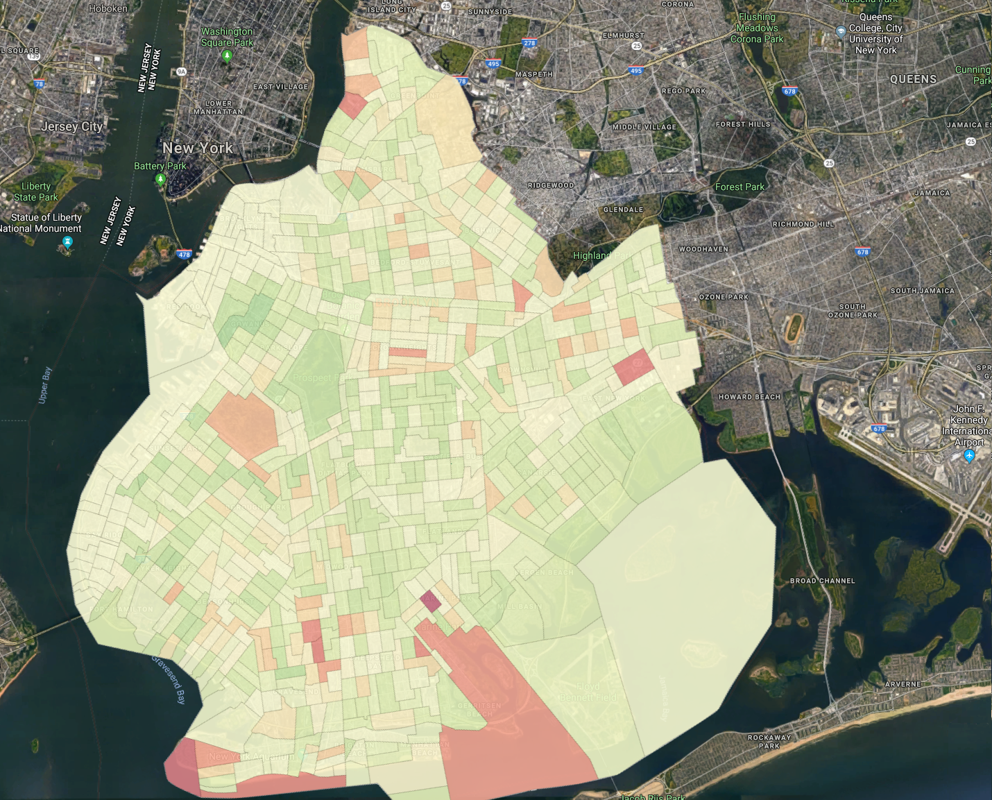
Shown above: A plot of the results (red is increase in vehicle miles travelled, green is a decrease in vehicle miles travelled). Data was quickly pasted on a Google Maps background screen capture for context. A raw version without that backdrop is below in the results section.
Nonetheless, I am sharing the process, below, as it may provide an example of how the NHTS data makes such questions easy to explore.
Comparing estimated vehicle miles travelled by tract
Both datasets are not unwieldily and can easily be pulled into memory.
import pandas as pd
df09 = pd.read_sas('nhts/latch_09.sas7bdat')
df17 = pd.read_csv('nhts/latch_17.csv')

# the 09 data
df09['geoid'] = [str(g.decode("utf-8")) for g in df09['geoid']]
df09.head()

# the 17 data
df17 = df17.rename(columns={'geocode': 'geoid'})
df17['geoid'] = df17['geoid'].astype(str)
df17.head()
For now, we can just work with the Brooklyn subset of each dataset.
in_bk_09 = df09.geoid.str.startswith('36047')
in_bk_17 = df17.geoid.str.startswith('36047')
Using the geoid column, we can sort by that, which will help make comparisons 1:1.
sub09 = df09[in_bk_09].sort_values(by='geoid').reset_index(drop=True)
sub17 = df17[in_bk_17].sort_values(by='geoid').reset_index(drop=True)
assert len(sub09) == len(sub17)
# The number of tracts being reviewed: 761
Here’s a script to plot just the whole values for the miles changed on the sorted geodes from 09 to 17:
est09 = sub09['est_vmiles2007_11']
est17 = sub17['est_vmiles']
d = est17 - est09
d1 = d[~d.isnull()].copy()
d2 = [np.nan for i in range(len(d[d.isnull()]))]
d2.extend(d1)
est_diff = pd.DataFrame({'miles change (09 to 17)': d, 'geoid': sub09['geoid']})
est_diff = est_diff.set_index('geoid')
ax = est_diff.plot(figsize=(20,12), lw=0.5, color='green')
est_sorted = pd.DataFrame({'sorted distribution': sorted(d2)})
est_sorted.plot(ax=ax, color='red', lw=0.5, alpha=0.75, xticks=[])
ax.set_xticks(indices)
ax.set_xticklabels(est_diff.index.values[indices], rotation=90)
ax.axhline(0, color='black', alpha=0.5)
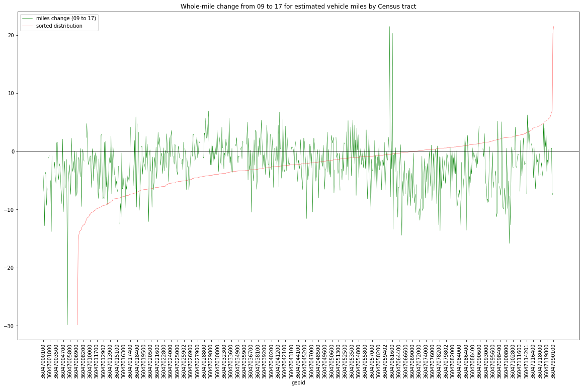
ax.set_title('Whole-mile change from 09 to 17 for estimated vehicle miles by Census tract')Note that to avoid plotting hundreds of geodes, I made a subset of them for the index. The indices list of that subset was created like so:
inc = round(len(sub09) / 75)
indices = []
c = 0
while c < len(sub09):
    indices.append(c)
    c = c + inc
Results
In the following image, I plot the amount of vehicle miles travelled by census tract. The data dictionary describes this variable as: Estimated from model using 2012-2016 American Community Survey 5-year estimate tract data.” It is unclear if this is per household. For now, I will just assume it is.
This estimated vehicle miles data is in green. The y axis is in miles. Negative mile mean that the vehicle miles estimated for that census tract went down from 09 to 17. In that case, we might assume this could be a positive (people are using other means instead of a single occupancy vehicle).
In red in the below image is the sorted distribution (so you can see where the 0-mile y-axis intersection is (far to the right) meaning most sites saw a reduction. Again, just eyeballing the red line it looks like most saw a reduction of under 10 miles. I
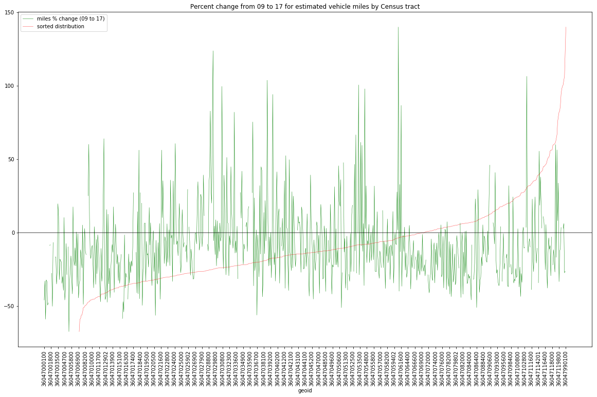
Next, I did the same plot, but this time with percent change as I wanted to see relative impacts. The spread did appear to increase somewhat (that is there were slightly more dramatic shifts. But, ultimately, the general pattern across geoid’s appears to be consistent between the whole-value plot and the percentage plot. Again the red is the sorted values instead of by geoid and again we see the 0-value y-intercept is shifted far to the right.
Now there are strong tails on both ends of that distribution. That is, there are some that experience > 50% changes. I wanted to see where those were and see if there was a trend. In the first plot below I plot tracts with over 50% increase in red and over 50% decrease in green.
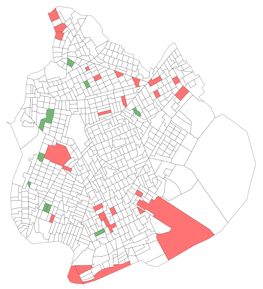
Above: Tracts over 50% increase in vehicle miles in red, and over 50% decrease in vehicle miles in green.
These sites seem fairly scatted (at the 50% threshold), so I tried again at the 25% threshold to see if it would illustrate a bit more. Unfortunately, the results were also fairly scattered. I did not see a clear pattern (particularly for the increases) across the census tracts. There were some up in Greenpoint (an area of intense gentrification) but also plenty out to the south and towards the airport. As a result, I could not identify a clear pattern to latch onto and explore more.
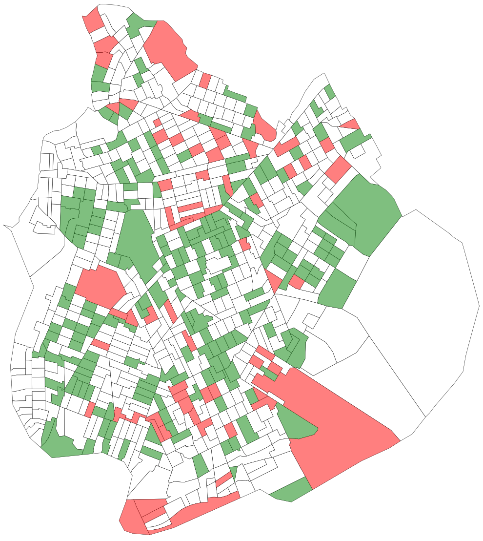
Above: Tracts over 25% increase in vehicle miles in red, and over 25% decrease in vehicle miles in green.
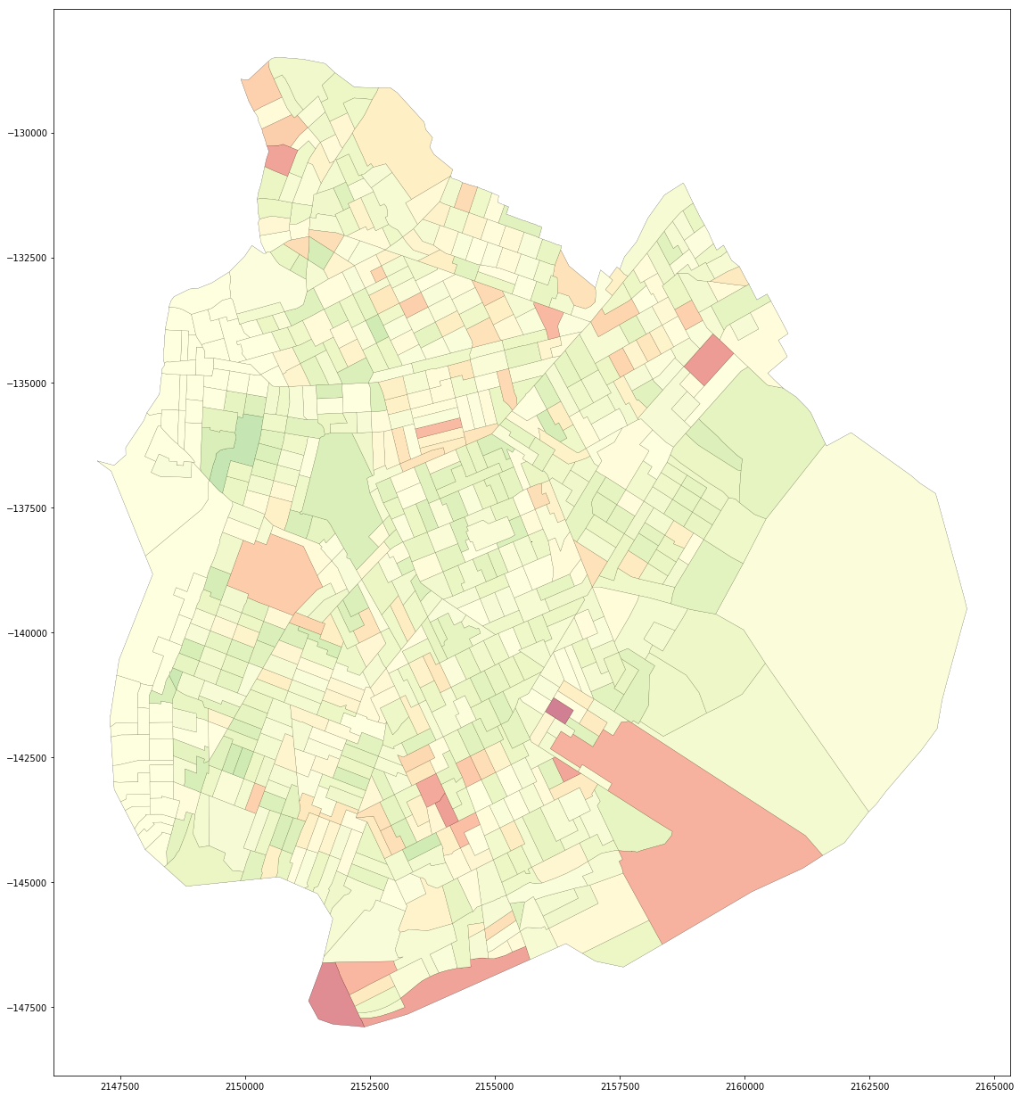
Finally, I plotted a choropleth with a color distribution from Red to Yellow to Green. This choropleth was useful in showing the overall distribution of change across Brooklyn. In general, what is clear is a few sharp increases scattered about (as we saw in our previous plots) and a general lessening overall of vehicle miles (all light green and yellow colors).
Hope this was of interest. I look forward to diving into the NHTS data in more detail soon!