
Introduction
Intent of this post is to explore the performance of Leaflet in handling a large number of circles on the screen at once. I recently encountered a use case that involved mapping transit data that relied on Leaflet marker or circles in lieu of Mapbox GL. I was intrigued since my first reaction was to wonder why GL was not used (given performance concerns, etc.). Upon raising that, I was informed that the performance concerns were, in fact, not significant and most operators’ vehicle locations could be rendered on a map without much of a performance burden.
I was curious about where the performance thresholds might exist and, generally, wanted to compare Leaflet with Mapbox GL since it has been awhile since I have gone back and fiddled with Leaflet. If Leaflet was indeed sufficient for the job, it be a good example of a situation where “if it ain’t broke, don’t fix it” is true.
Setting up Leaflet example
I went ahead and used the Leaflet tutorial example on the Leaflet organization site and just copied that HTML over since it is straightforward enough. I removed all the example pop up and polygon addition logic and, instead, replaced it with some logic to continually add a new circle on each cycle. A setInterval was established, and a small amount of time was used to wait in between cycles (5 milliseconds).
Some quick and hacky code was written to just give each node a general trajectory and speed on that was unique to each agent (circle, in this case). I also made sure to reset the location of all the circles if they went off the bounds of the map so as to make sure that the map did indeed become saturated with points.
The point of this was to create a situation where I could observe the performance of the map as more and more locations (circles in this case) were being added to the map, all while simulating a “live update.”
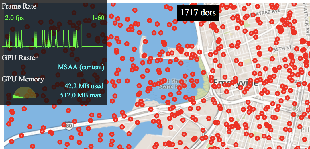
A snippet of the code is included below for reference. Just quickly written to get the behavior I was looking for. Note that I also included a small display on the page to indicate the number of dots on the screen at any moment that were simulating fleet movement.
  const allCircles = [];

  // Let's add or update all circles on map every N seconds
  const circlesUpdater = setInterval(() => {

    allCircles.forEach(circleMeta => {
      const ll = circleMeta.circle.getLatLng();

      const radEarth = 6378;  // km
      const dy = 0.01 * circleMeta.theta;
      const dx = 0.01 * circleMeta.theta;
      const degFactor = circleMeta.theta * 180;
      const newLat = ll.lat  + (dy / radEarth) * (degFactor / Math.PI);
      const newLng = ll.lng + (dx / radEarth) * (degFactor / Math.PI) / Math.cos(ll.lat * Math.PI/degFactor);

      const newPos = new L.LatLng(newLat, newLng);
      if (map.getBounds().contains(newPos)) {
        circleMeta.circle.setLatLng(newPos);
      } else {
        circleMeta.circle.setLatLng(getRandomLatLng(map));
      }

    });

    document.getElementById('count').textContent = `${allCircles.length} dots`;
    if (allCircles.length > 2000) {
      clearInterval(circlesUpdater);
    }

    const newCircle = L.circle(getRandomLatLng(map), 50, {
      color: 'red',
      fillColor: '#f03',
      fillOpacity: 0.5
    }).addTo(map);

    allCircles.push({
      circle: newCircle,
      theta: (Math.random() * 2) - 1,
    });

  }, 5);
Observing Leaflet Performance
Before discussing performance, note that I am running a higher-end 2018 15-inch MacBook Pro. I would imagine performance pain points would be reached much earlier on lower end machines, though I did not take the time to try that out.
In the beginning, performance was “okay” at about 45 frames per second. That quickly drops, as you can see in the video, down to the 30s by the time 300 dots are added. FPS enters the single digits in the 700s. Watch the video to see this happen in “real time.”
Single digits FPS was reached in the 1000s of points on the screen. Now, you can imagine if there was additional data being rendered beyond just the locations of the vehicles, that scaled in the same way, you could think of these numbers as a scale. For example, if the DOM held 4 nodes representing various data points for each live tracked vehicle in a fleet being visualized and performance dipped unacceptably at, say, 400 nodes, then only 100 vehicles could be mapped at a time, safely.
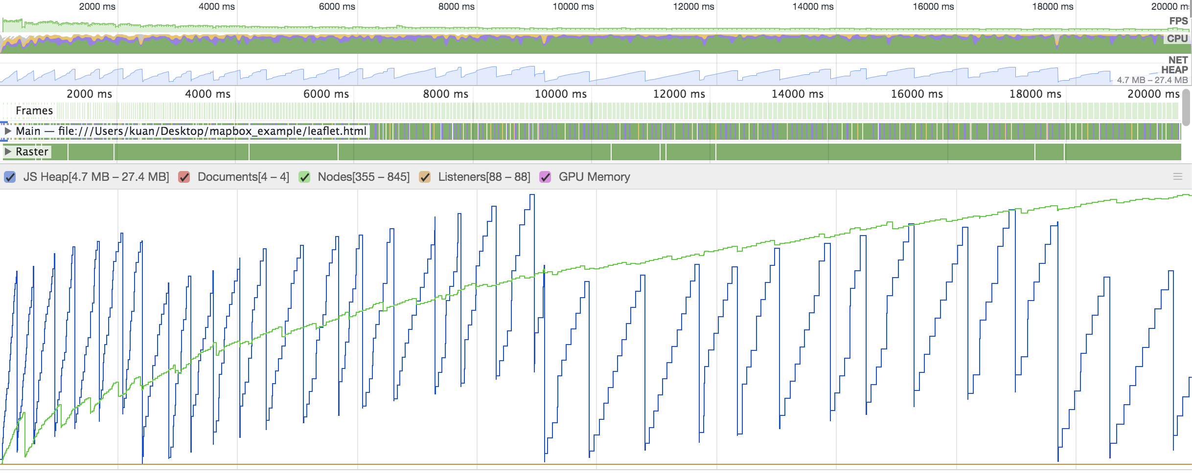
We can see how, while DOM nodes (in this case the circles only) were intended to be added at a linear rate (5 ms apart), the rate of increase tracked in Chrome was non-linear. This reflects performance limitations when a larger count of nodes are added to the web page being rendered with Leaflet.
Setting up Mapbox GL
A similar logic flow was sketched out for a map running Mapbox GL. In the name of efficiency, I just copy and pasted the code from this example on the Mapbox site and replaced some of the logic in the script tag.
Essentially, the setInterval is kicked off on map load and a source GeoJSON dataset is established that is updated on each iteration of the loop with the new coordinate locations which are held as a single MultiPoint GeoJSON Feature. I am adding the logic below if a reference point is desired. Again, this is just quickly written to allow for comparison to the Leaflet version. The same random trajectory behavior for each agent circle is established as before.
  map.on('load', function () {

    map.addSource('circlesSet', { type: 'geojson', data: refData });

    map.addLayer({
        "id": "circlesSet",
        "type": "circle",
        "source": 'circlesSet'
    });

    // Let's add or update all circles on map every N seconds
    const circlesUpdater = setInterval(() => {

      for (let i=0; i<thetas.length; i++) {
        let ll = refData.features[0].geometry.coordinates[i];
        let theta = thetas[i];

        const radEarth = 6378;  // km
        const dy = 0.01 * theta;
        const dx = 0.01 * theta;
        const degFactor = theta * 180;
        const newLng = ll[0]  + (dy / radEarth) * (degFactor / Math.PI);
        const newLat = ll[1] + (dx / radEarth) * (degFactor / Math.PI) / Math.cos(ll[0] * Math.PI/degFactor);

        const newPos = [newLat, newLng];
        if (inBounds(map, newPos)) {
          refData.features[0].geometry.coordinates[i] = newPos;
        } else {
          refData.features[0].geometry.coordinates[i] = getRandomLatLng(map);
        }
      }

      document.getElementById('count').textContent = `${thetas.length} dots`;
      if (thetas.length > 2000) {
        clearInterval(circlesUpdater);
      }

      // Add another circle with random direction
      thetas.push(Math.random());
      refData.features[0].geometry.coordinates.push(getRandomLatLng(map));

      // Update the map
      map.getSource('circlesSet').setData(refData);

    }, 5);

  });
Observing Mapbox GL Performance
As expected, a large number of nodes does not have a significant performance cost.
There was a slight frame rate hiccup when initializing the page, but the browser held 60 FPS essentially the whole time the script continued to add and update all nodes, up to 2000.
Discussion of Results
Mapbox GL is clearly superior when managing large amounts of geometries being rendered. Leaflet does have a canvas library or canvas support. It achieves this, of course, through leveraging the canvas element to offload rendering of these shapes from being DOM elements. Now, Leaflet has canvas support as well. In fact, it is quite easy to set that up, by updating just slightly how the map is initialized to flag that the canvas should be used as the renderer.
const map = L.map('mapid', { zoomControl:false, renderer: L.canvas() }).setView(center, 13);When this is done, there are indeed some slight performance gains. See the below video to watch the Leaflet logic run in a canvas.
In this case, the frontend held around 30 FPS until hitting the 1000s of circles, then it dropped to about 20. In the high 1000s, it nosedived into the single digits.
If we apply the same factor from before (4 items per vehicle in fleet rendered in the map), we might imagine that the number of vehicles that could be rendered could be double perhaps (or even trippled) to 2-300 vehicles. Again, that is very back of the napkin, but a useful heuristic to frame this evaluation with, perhaps.
Ultimately, Mapbox GL has had far more time and effort invested in it to allow for the performance gains observed just through this short exercise. Modification of the code does involve more effort, so moving to a canvas might be a faster path to short term wins. That said, there are a number of Leaflet libraries that do not play nicely with the canvas renderer and porting the Leaflet code over, depending on the complexity of the logic already built out, might be of equivalent effort to porting to Mapbox, but without the same gains.
Real World Reference Points
I then wondered to myself: “Well, how many systems actually have a few hundred vehicles per hour in them that are being monitored? When and where would this be a real problem?”
I quickly wrote an extraction script to just evaluate the schedule of a given GTFS feed and see how many buses were supposed to be running at each hour of the day. I based this count of unique trip ids and separated based on stop times scheduled for each hour of the day. I filtered for just the busiest days schedule so as to generate a representative example of a “busy day” for a given operator.
I could have run this on more feeds, but I think the 4 I did were sufficient: AC Transit, NYC subways, LA Metro’s buses, and Miami Dade’s network. The results are included as images below.
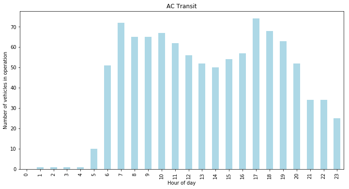
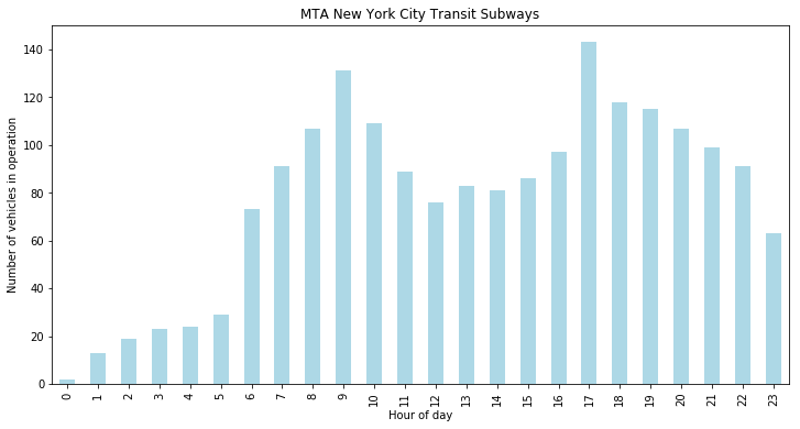
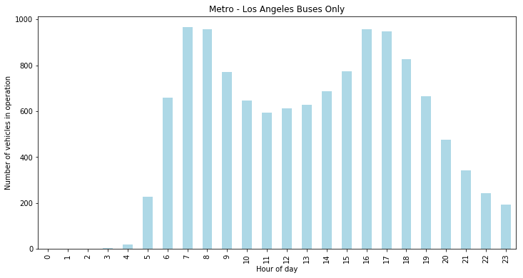
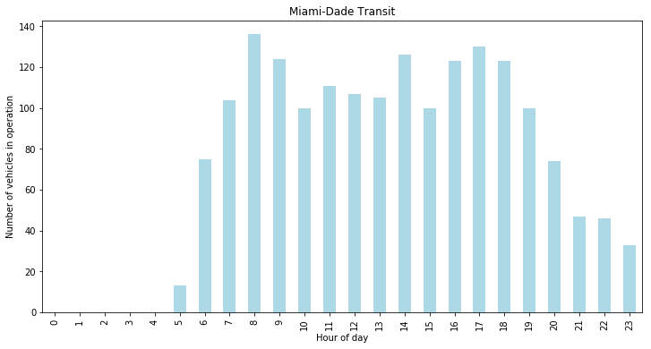
As we can see, most mid-sized cities should be fine with Leaflet (or perhaps just on the edge of fine). As I suspected, larger operators will be very cumbersome, especially on machines with more limited hardware. For example, LA’s bus network might prove to be too much information to be rendering through the “traditional” Leaflet method and moving to Mapbox GL might be necessary if visualizing that amount of information at once, smoothly, is required.
Here is the script to pull out the stats that I plotted above.
import pandas as pd
import partridge as ptg

def get_feed(path: str):
    trip_counts_by_date = ptg.read_trip_counts_by_date(path)
    target_service_date, target_service_date_count = max(trip_counts_by_date.items(), key=lambda p: p[1])
    service_ids_by_date = ptg.read_service_ids_by_date(path)
    busiest_day_service_ids = service_ids_by_date[target_service_date]

    feed_query = {'trips.txt': {'service_id': busiest_day_service_ids}}
    feed = ptg.load_feed(path, view = feed_query)
    return feed

def make_trips_ct(feed):
    trips_hrly = []
    for hr in range(24):
        time_start = hr * 3600
        time_end = hr * 3600

        m1 = feed.stop_times.arrival_time >= time_start
        m2 = feed.stop_times.arrival_time <= time_end

        st_sub = feed.stop_times[m1 & m2]
        t_ct = len(st_sub.trip_id.unique())
        trips_hrly.append(t_ct)

    return trips_hrly