Above: Coalesce operation, a new feature in peartree, running on the AC Transit GTFS network
Introduction
Late last year, I played with converting processed OpenStreetMap graph data to a network graph that allowed for the running of spectral clustering algorithms to see if I could use network component analyses to impute discrete neighborhoods. You can read about the results of my tooling around with these concepts here. In this post, I will discuss how I achieved performant spectral clustering by leveraging raster like graph clustering with some new functions available in v0.3.0 of the peartree library.
Update (01/23/2019)
Warning! Coalesce operations are risky. Coalescing transit networks can cause significant loss of fidelity to transit network graphs. For example, costly transfers could become coalesced in such a way that the edge no longer exists, allow a connection to exist or become cheap where there prior was not such a connection. Use coalesce with caution. On the other hand, coalesce may be far safer on simpler networks, such as walk networks. For issue tracking related to risks of this method associated with transit networks in peartree, see this issue in peartree’s Github repo.
Motivation
Naturally, as I have been working a good deal on peartree in my spare time, I wanted to develop methods to do the same sorts of network analysis I have previously performed on OSM network data on transit network data, as well. This post covers the work I have done to make these sorts of analyses on transit data far more performant. Primarily, this post covers two new significant features in peartree (released April 1, 2018 with version 0.3.0): (1) the introduction of multiprocessing to make reading in GTFS feed data faster )when possible), and (2) the development of a coalesce() operation that enables for a raster-like summary of a complex network representing a complete parsing of a target transit service feed period into a summary directed network graph.
The first improvement is largely just so that you don’t have to wait as long (depending on your environment) for networks to be built. For more complex systems, the delay can take minutes, and I’ve been actively trying to reduce this for the past few months. There is an issue tracking these efforts on the repo, here.
This second improvement is capable of delivering a roughly 50x improvement in performance (depending on coalesce parameters, accuracy desired) over the original spectral clustering calculating cost (in terms of time). This is primarily the result of the reduction in cost in calculation of the Laplacian as the number of nodes and edges has been significantly reduced.
Getting started
All we will be using to perform these operations are built in peartrees functions. As a result all you’ll need to install is that library:
import peartree as ptNext, we need to load in the network as a Peartree directed graph. Let’s work with the San Francisco MTA’s GTFS latest feed:
path = 'data/sfmta.zip'
feed = pt.get_representative_feed(path)
start = 7*60*60 # 7:00 AM
end = 10*60*60 # 10:00 AM
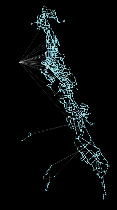
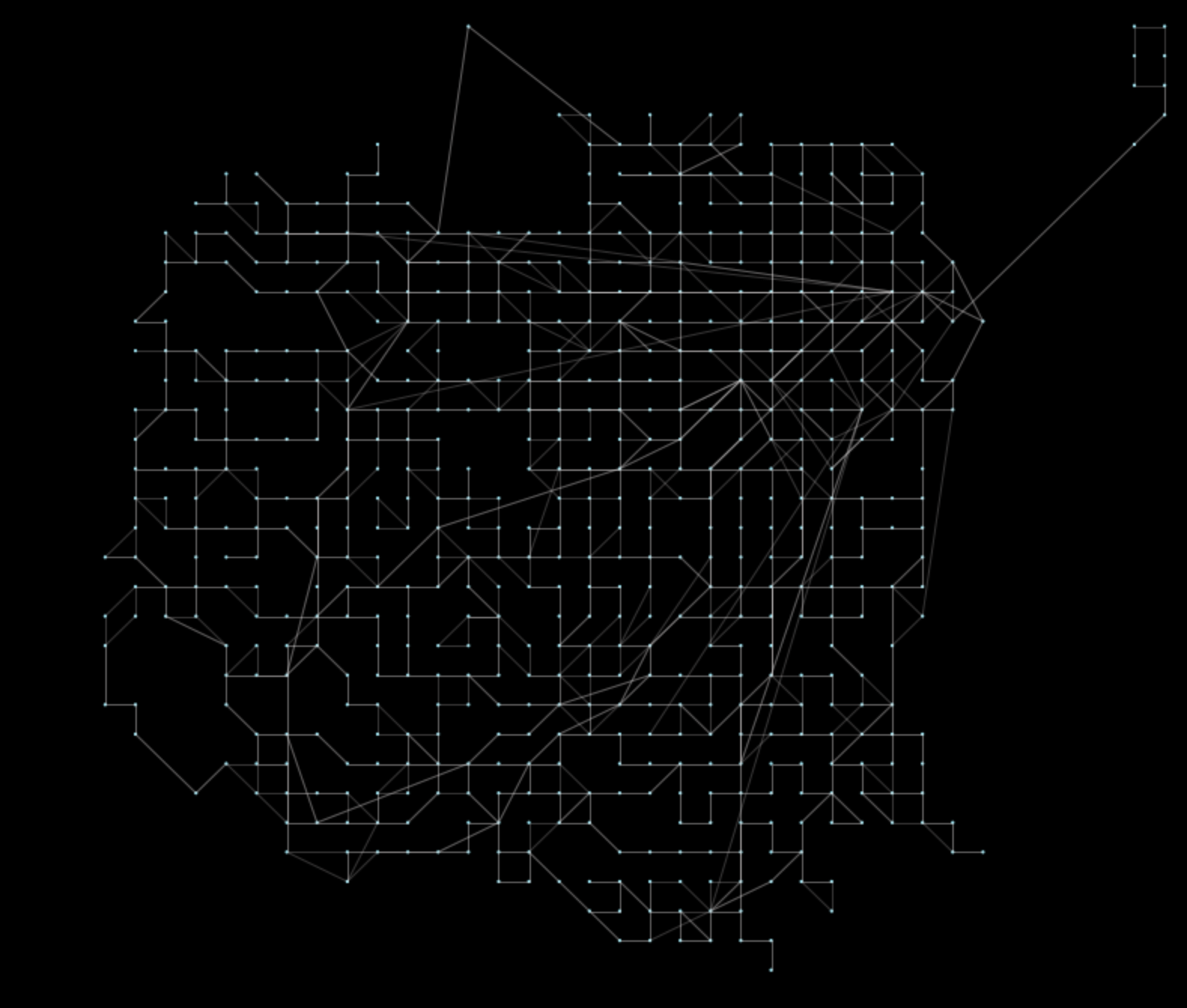
G = pt.load_feed_as_graph(feed, start, end, interpolate_times=False)Let’s plot the resulting processed graph:
pt.generate_plot(G)The result will look like:
There is nothing particularly interesting here, this is just the representation of the network in EPSG 4326 projection. Edges have the necessary calculated information to perform network analysis.
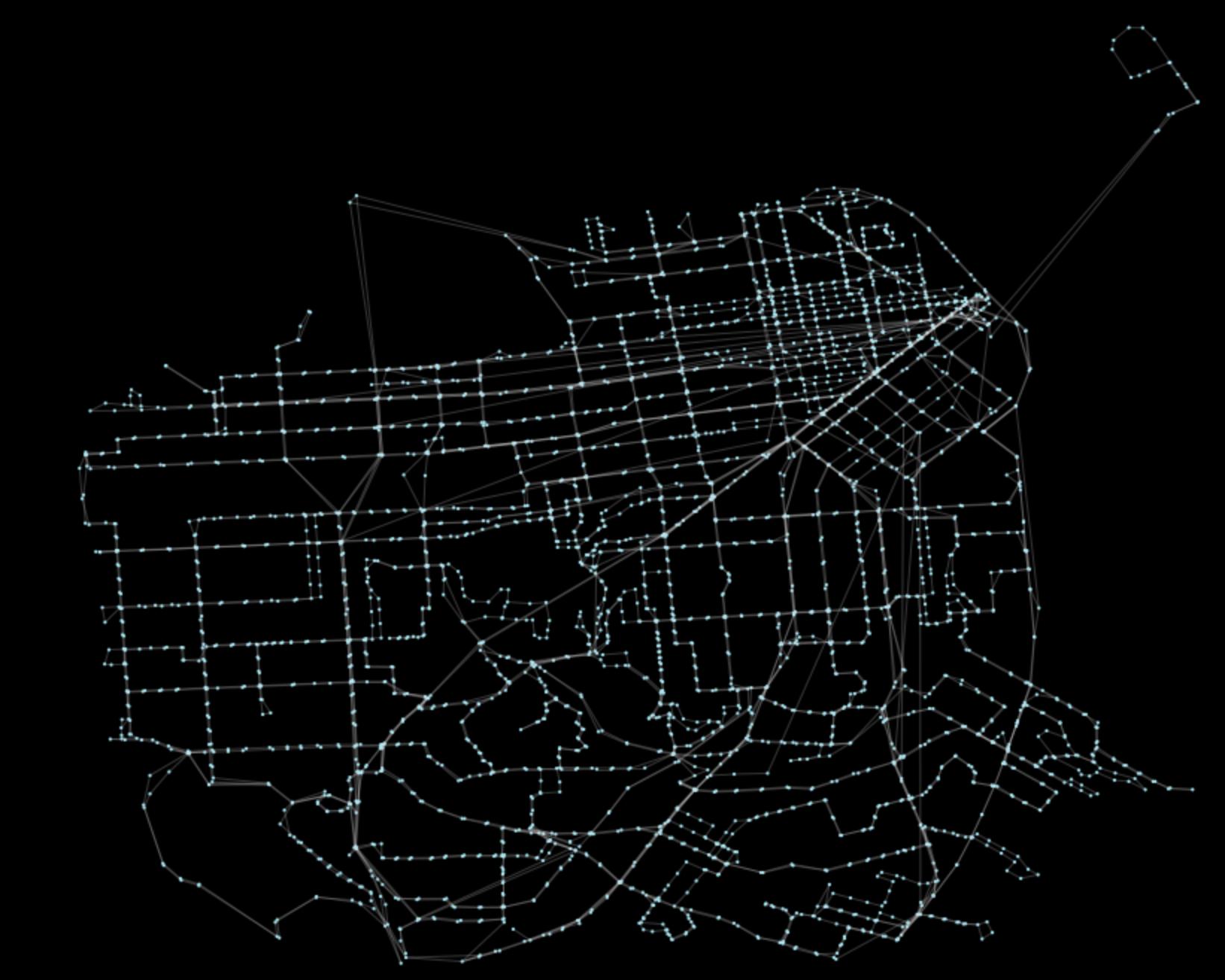
Just to work with a nicer looking graph, let’s project in equal area projection (EPSG 2163):
Gp = pt.reproject(G)
pt.generate_plot(Gp)
The result looks like this:
Performing spectral clustering on the transit network
At this point, we can run a spectral clustering operation akin to what was done with the OpenStreetMap data in the previous post on this subject.
First we make a copy of the projected graph:
Gt = Gp.copy()Next, we clean out the extraneous edges and disconnected nodes and make sure we are looking/examining the largest contiguous components of the network. For all other components, for now, I simply toss them. For better transit analysis, one might want to identify ways to better connect the network.
strong_nws = nx.strongly_connected_component_subgraphs(Gt)
largest = sorted([n for n in strong_nws], key=lambda x: x.number_of_nodes())[-1]
# Include this operation if you would like to perform an unweighted analysis
Gt = largest.to_undirected()
# Otherwise just get the largest strongly connected network
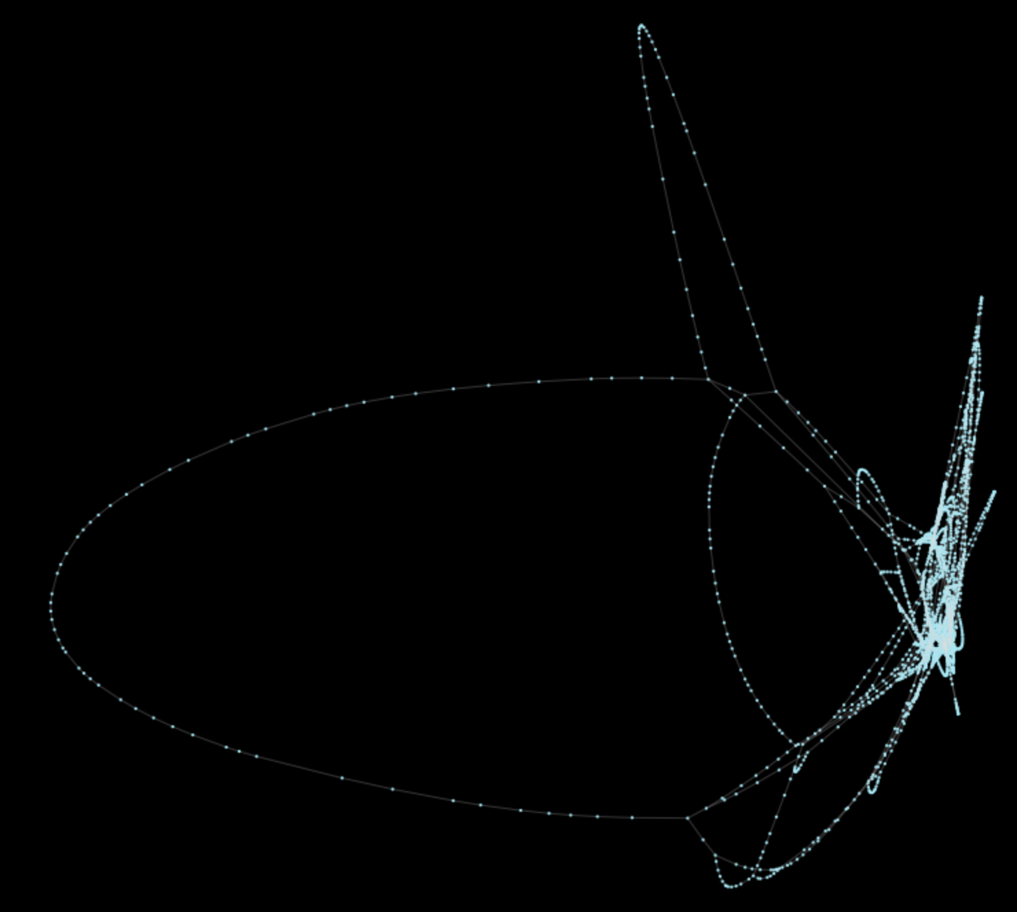
Gt = largestIf we do not do this, we will not be able to calculate useful network relationships and all connected nodes will essentially be clustered completely together, relative to disconnected nodes. Here’s an example of this happening in a plot of the resulting spectral cluster:
Calculating the Laplacian, eigenvalues, and eigenvectors
The calculation of the laplacian matrix is straightforward. It’s the same method outlined in the previous related post:
A = nx.adjacency_matrix(Gt, weight=weight)

# Create dimensionality matrix
a_shape = A.shape
a_diagonals = A.sum(axis=1)
D = scipy.sparse.spdiags(a_diagonals.flatten(),
                         [0],
                         a_shape[0],
                         a_shape[1],
                         format='csr')

# Diff dimensionality and adjacency
# to produce the laplacian
L = (D - A)
From this matrix, we can plot the Laplacian by first calculating the eigenvalues and eigenvectors. These are the expensive processes that we are seeking to reduce in cost.
# w are the eigenvalues
# v are the eigenvectors
w, v = eigh(L.todense())

# Pull out 2nd and 3rd eigenvectors
x = v[:,1]
y = v[:,2]
Now we are free to assign these vectors to the x and y coordinates on the graph nodes, and re-plot the distorted graph:
ns = list(Gt.nodes())
spectral_coordinates = {ns[i] : [x[i], y[i]] for i in range(len(x))}
node_ref = list(Gt.nodes(data=True))
for i, node in node_ref:
sc = spectral_coordinates[i]
Gt.nodes[i]['x'] = sc[0]
Gt.nodes[i]['y'] = sc[1]
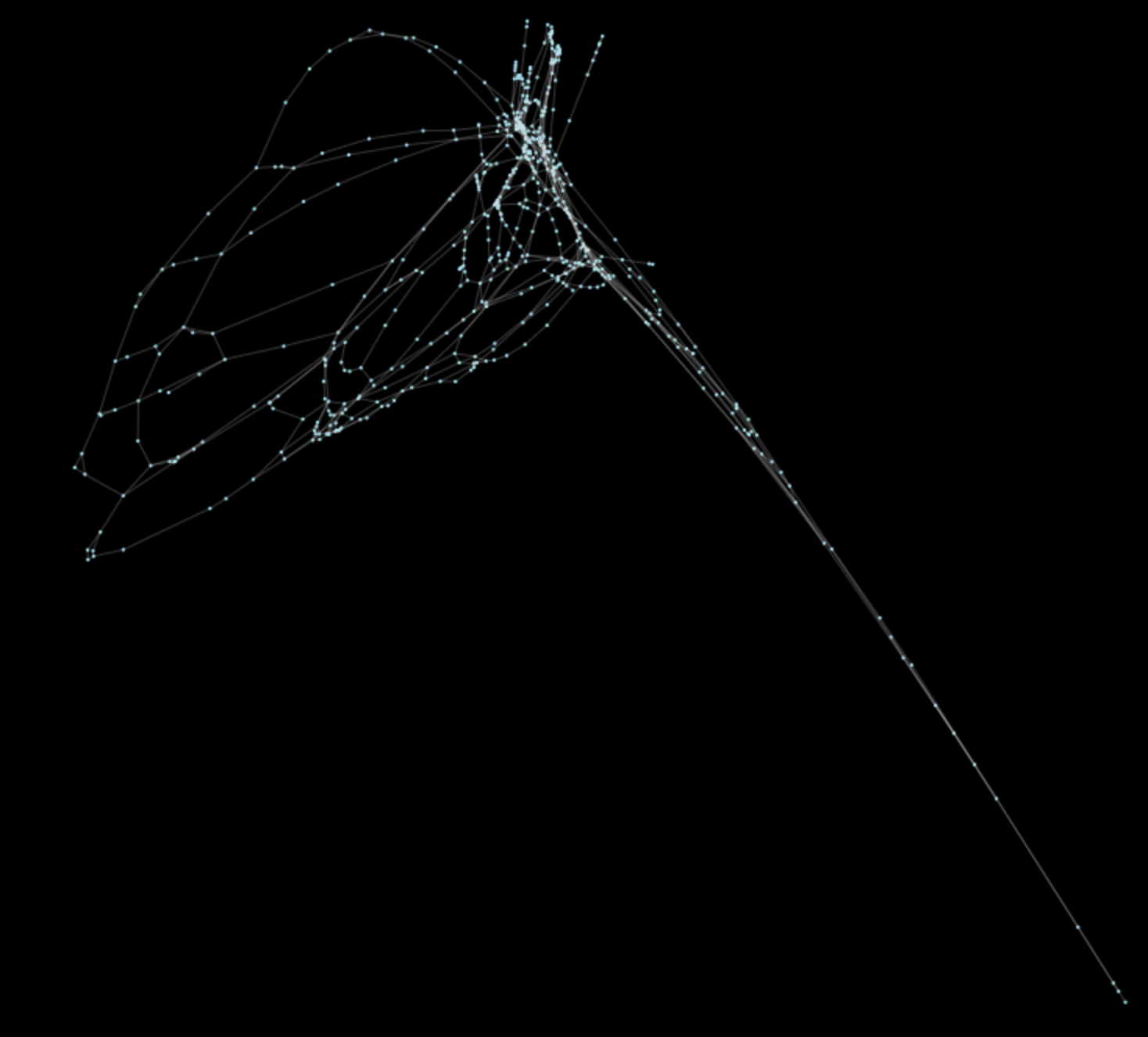
pt.generate_plot(Gt)The result of this operation is the following plot (unweighted):
Original performance
Calculation of the full network, with the discontiguous portions, took, on average, 1 minute 15 seconds. Removing the extraneous edges and nodes reduces runtime down to 18 seconds. This isn’t bad, but, again, San Francisco is a relatively small system compared to, say, New York or Los Angeles. In addition, cost increases nonlinearly, so simply pruning the network is itself not a suitable solution. # Coalesce
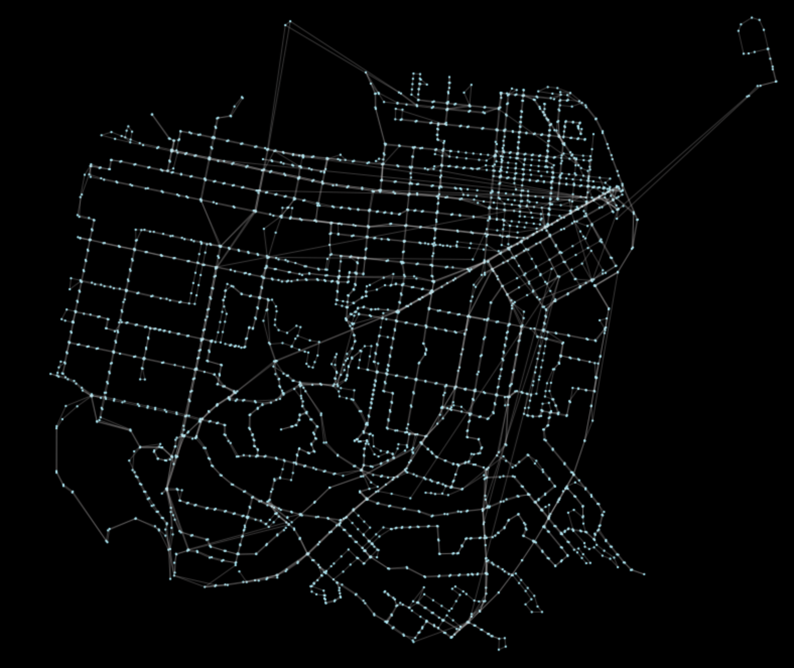
This performance limitation is where coalesce comes in handy. With coalesce, you can set, via the second argument after the graph object, the threshold for grouping nodes on the network. The parameter is unit agnostic and uses whatever the current projection is that the network is in. In this case, the network is in EPSG 2163 equal area projection, which is meters. So, we can summarize the San Francisco system by a roughly 1/4 mile raster (400 meters):
Gc = pt.toolkit.coalesce(Gp, 400)The resulting network looks like:
That’s all that is needed! With this result, we can perform the same spectral clustering operations much faster (about 50x at this summary level).
The expensive calculation of eigenvalues and eigenvectors:
# w are the eigenvalues
# v are the eigenvectors
w, v = eigh(L.todense())
Now runs in about 350 milliseconds on the San Francisco network. Results look like this:
What’s most important is that, the network complexity is now tied to its size of coverage. Thus, vector calculation more closely tracks a linearly increasing cost. This means that more complex networks like Los Angeles will compute in a similar amount of time, instead of minutes or worse.
Conclusion
Naturally, the network product of coalesce is not limited in use to the previous clustering analysis. This was intended to show just one example of how this operation improves analysis speed and the capacity for peartrees to be used as an iterative network analysis tool.