Introduction
This post includes notes on exploratory work to create patterns for grouping GTFS-RT route trace data to compare route performance (actual, recorded) against scheduled performance.
Please note code is quite messy and included only to illustrate design intent - that is, I just wrote it all during a recent series of plane flights.
Background
A few months ago I started scraping all AC Transit location via their GTFS-RT feed and storing it on Google Cloud Storage in parsed JSON format. I wrote a post in which I did a segment analysis, comparing the 18 and 6 lines in terms of segment completion between the downtown Berkeley and MacArthur Bart station portions of each of their routes.
Please read that post for more information on the data being used here. Seeing as I’ve been sitting on a series of planes, and too cheap to use the internet connection, I figured I would take this same ~4 days of route data and, instead of doing an analysis of just the segment between Berkeley and MacArthur, I could compare the average scheduled performance with the observed performance.
High-level results
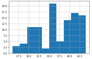
Some interesting high level operations takeaways include the fact that the 6 (which I decided to focus on for this post) has a clear distribution peak for runtimes between 50-60 minutes.
Above: Histogram of scheduled route runs’ total run time.
Meanwhile, the published GTFS schedule has a far more optimistic take on runtime, seeming to indicate less of a clustering around the hour mark, and instead having multiple “peaks” in terms of scheduled runtime (largely based on time of day for the route). Most amusing is that all these times fall quite short of the observed 50-60 minute runtime.
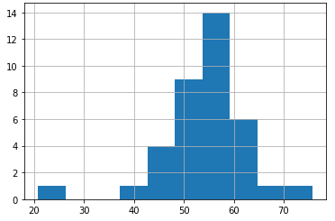
Above: Histogram of observed route runs’ total run time.
If we were to even accept just the higher runtime cluster average of ~41 minutes, that comes in at about 75% of the observed 55 minute average.
We can quickly imagine why this would be an important measure - if you are running an accessibility analysis on real data versus scheduled vehicle performance, this data suggests you could produce results that are about a quarter lower - which is quite significant when, say, regionally evaluating comparative mode choice performance (e.g. car versus bus).
Weekday ride performance
Noting the disparate results from the total run times, I wanted to utilize the same methods developed in the aforementioned previous post and generate a simple visualization to show how performance “stacked up” against a typical route run. This resulted in the following plot:
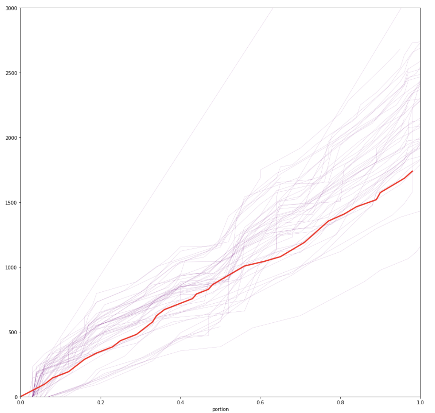
Above: Observed run times against portion of the total route completed, where y-axis is total time elapsed in seconds and x-axis is the portion of the trip (0-1) that has been completed. Light purple is observed routes and thick red line is an example typical daytime trip (GTFS trip id 6017095, an ~8AM weekday peak run schedule).
From the resulting plot (above), it’s clear that typical distribution of runtimes (which do include both peak and off peak times) do trend to be noticeably slower than a typical weekday scheduled runtime.
Next Steps
Again, this is just an initial effort, but I could imagine revisiting the visualization methods popularized in such example sites as MBTA Viz to show how intended distributions diverge from real/observed patterns.