Introduction
Alon Levy recently published the this blog post on Eric Goldwyn and Alon Levy’s proposed Brooklyn bus system redesign. The two authors are both prominent researchers in public transit. I particularly enjoy Alon Levy’s blog’s series on tracking how much more urban public transit infrastructure development costs in the US versus everywhere else in the world. You can find that body of work, here.
This post will be notes on taking the proposed network they outlined and converting to a graph representation. With this representation, it will be easy to perform comparative analyses on it compared to, say, the current transit network in Brooklyn and see how it increases of decreases transit accessibility.
The bus redesign
I would suggest reading the blog post for details but, in summary, the system redesign drops most routes, makes new lines that are “evenly spaced” through the system, and increases frequency on each of those lines. You can see a KML of the proposed map, here.
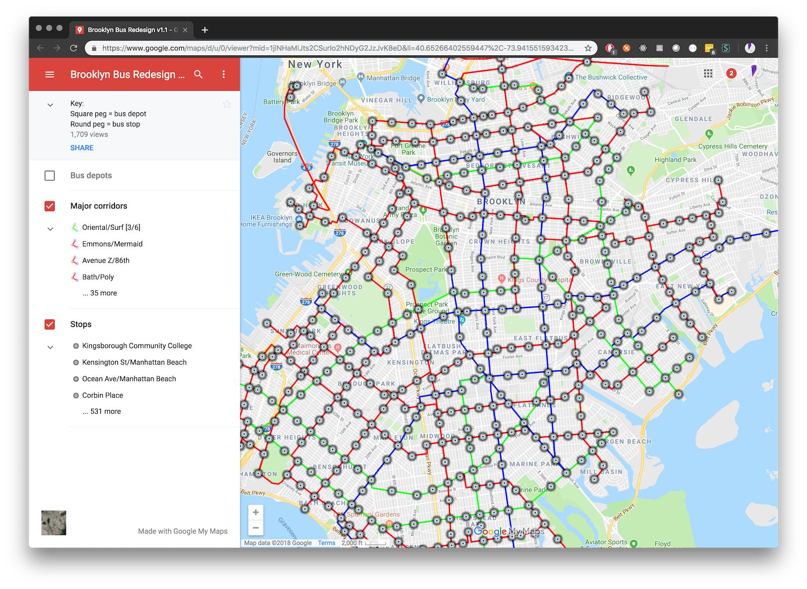
Above: Screen capture of the proposed network.
Conversion overview
The goal is to convert this outlined network into a TransitJSON for consumption by peartree. You can read more about peartree at its Github repository. You can read more about how the TransitJSON works in this pull request on that repository.
Essentially, TransitJSON is a GeoJSON FeatureCollection with a set of required parameters under each Feature’s properties key.
To do this, we first convert the KML to a GeoJSON. Mapbox has created a library to do this already, to toGeoJSON. In this case, I just used their static site hosted on that repository and cut and pasted the KML in since it was really small.
Transform operation (part 1)
We need to do the following:
- Read in the JSON of the KML
- Convert it to a tabular structure
- Parse the headway for the name if available (held in brackets)
- Drop lines that are Queens lines (Manhattan and Grand lines)
- Cast in EPSG 4326 project (default degrees) and then convert to equal area
import geopandas as gpd
import json
import numpy as np
import pandas as pd
from shapely.geometry import shape, LineString, Point
from shapely.ops import linemerge, split

with open('bk_bus.geojson') as f:
    data = json.load(f)

def find_override(name: str):
    try:
        bracket_sub = name[name.find('[')+1:name.find(']')]
        splitted = bracket_sub.split('/')
        if len(splitted) == 2:
            splitted = map(lambda x: float(x), splitted)
            return list(splitted)[0]
    except Exception as e:
        return None

def convert_to_row(feature):
    geom = shape(feature['geometry'])

    # Get route name
    name = feature['properties']['name']

    # Let's drop the two Queens lines for clean comparison
    if name == 'Metropolitan' or name == 'Grand':
        return None

    # Pull out frequency if possible
    freq = find_override(name)

    is_route = isinstance(geom, LineString)
    if is_route:
        # Cast as a clean, not 3-d linestring
        geom = LineString([x[0:2] for x in list(geom.coords)])

        # Get the color of the route
        color = feature['properties']['stroke']

        # Determine frequency based on notes from blog post
        if freq is None:
            freq = 6  # in minutes
    else:
        geom = geom.buffer(1).centroid
        color = np.nan
        frequency = np.nan

    return {
        'geometry': geom,
        'name': name,
        'is_route': is_route,
        'color': color,
        'frequency': freq
    }

potential_rows = []
for f in data['features']:
    row = convert_to_row(f)
    if row is not None:
        potential_rows.append(row)
all_df = pd.DataFrame(potential_rows)
all_gdf = gpd.GeoDataFrame(all_df, geometry=all_df.geometry)
all_gdf.crs = {'init': 'epsg:4326'}

# Reproject to equal area
all_gdf = all_gdf.to_crs(epsg=2163)
The resulting Geopandas GeoDataFrame will be able to plot the following line:
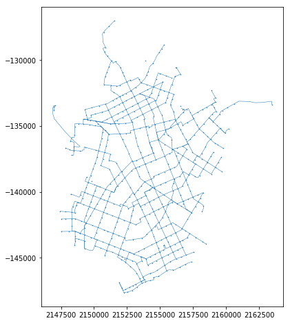
Above image simply plotted with the following:
%matplotlib inline
all_gdf.plot(figsize=(8,8), linewidth=0.5, markersize=1)
Transform operation (part 2)
Because the stops were not tagged in the KML or grouped with a specific line, we need to impute this. We can do this through a quick spatial operation, by joining all route-adjacent stops that are within a certain threshold of the line.
All we need to do is:
- Make sure that the stops and lines are in the same projection
- Tag the stops as related to that route
- Buffer the stops and intersect with the line to break the line into segments
- Use the resulting segments to get the stop order (so that we know which stops comes after the next)
- Submit the sorted and ordered stops into a tabular DataFrame
This work can be accomplished like so:
stops_temp = all_gdf[~all_gdf.is_route].reset_index(drop=True)
routes_temp = all_gdf[all_gdf.is_route].reset_index(drop=True)

# Use the buffered stops spatial index as a quick lookup
stops_buffered = stops_temp.buffer(25)
stops_spatial_index = stops_buffered.sindex

all_stops_rows = []
for route_i, route in routes_temp.iterrows():
    line = route.geometry

    possibles = list(stops_spatial_index.intersection(line.bounds))
    stops_sub = stops_buffered.iloc[possibles]
    intersecting_stops = stops_sub[stops_sub.intersects(line)]
    split_line = split(line, intersecting_stops.unary_union)

    # Get the first and last points from the line
    # which will be added to the stops
    joints = [Point(x, y) for x, y in zip(*line.xy)]
    first_stop = joints[0]
    last_stop = joints[-1]

    stop_points = [first_stop]
    for line_sub in split_line:
        if line_sub.length < 51:
            stop_points.append(line_sub.centroid)
    stop_points.append(last_stop)

    for i, pt in enumerate(stop_points):
        all_stops_rows.append({
            'stop_order': i,
            'geometry': pt,
            'route_name': route['name'],
        })

stops_df = pd.DataFrame(all_stops_rows)
stops_gdf = gpd.GeoDataFrame(stops_df, geometry=stops_df.geometry)
stops_gdf.crs = {'init': 'epsg:2163'}
stops_gdf = stops_gdf.to_crs(epsg=4326)
stops_gdf['stop_lat'] = stops_gdf.geometry.centroid.y
stops_gdf['stop_lon'] = stops_gdf.geometry.centroid.x
Assembly of transformed components
We now have a routes and stops table. From these two, we can work through the routes and assembly the related stops (ordered, now) for each route, converting the data into a TransitJSON format:
transitjson = {
    'type': 'FeatureCollection',
    'features': []
}

routes_reproj = routes_temp.to_crs(epsg=4326)
for i, row in routes_reproj.iterrows():
    # Calculate stops for this route, ordered
    stops_sub = stops_gdf[stops_gdf.route_name == row['name']]
    stops_sub = stops_sub.sort_values(by='stop_order')
    stops = [[x, y] for x, y in zip(stops_sub.stop_lon, stops_sub.stop_lat)]
    transitjson['features'].append({
        'geometry': {
            'coordinates': [[x, y] for x, y in zip(*row.geometry.xy)],
            'type': 'LineString'},
        'properties': {
            'average_speed': 15, # mph
            'headway': row.frequency * 60,  # in seconds
            'stops': stops,
            'bidirectional': True}
    })
Loading into a graph
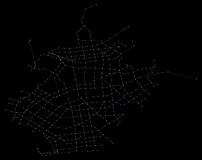
From here on out, we can just use peartree utilities. We can load the TransitJSON into peartree easily - and it will identify the segments and convert the summary TransitJSON data into a NetworkX graph in one line:
import peartree as pt
G = pt.load_synthetic_network_as_graph(transitjson)
Once we have that object, we can plot it, perform accessibility analyses with it, whatever we want.
Here is what the network looks like, plotted (akin to our previous plot):
Betweenness centrality
In a previous post I computed the betweenness centrality (BC) of the current Brooklyn bus network. I am just going to repeat that same calculation method here and visualize what the old and new BC results look like (including code to generate below for reference):
Old system, from previous post:
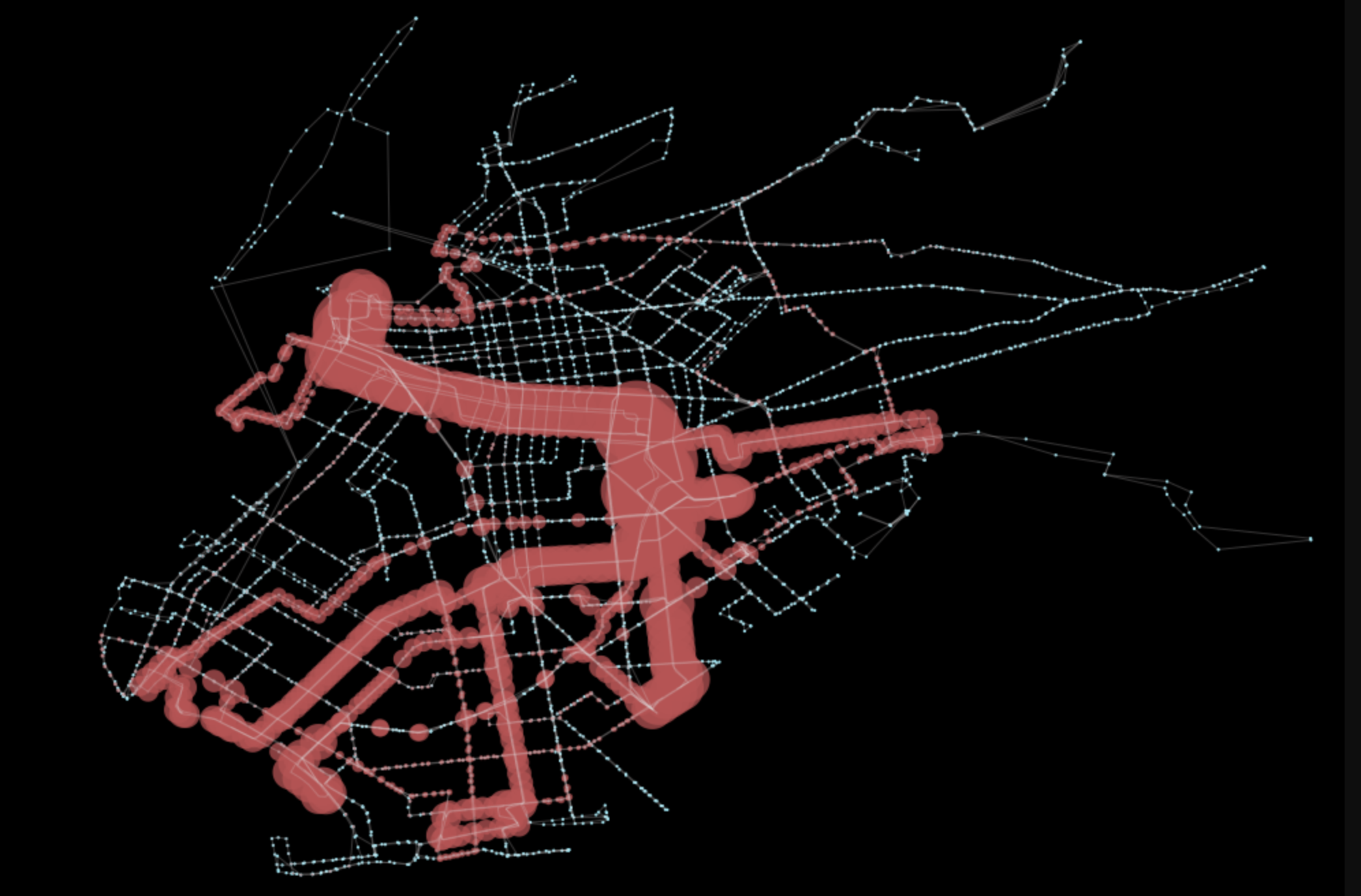
New proposed system:
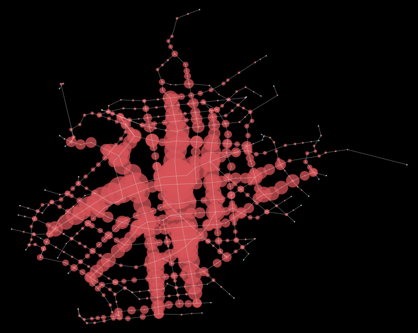
What is immediately visible is that the system is significantly more balanced overall. As a result, the network features a much more balanced level of centrality along its graph nodes. In part, that is also achieved through more sparse network connections. Higher frequencies along all routes, though, reduced segment impedance and thus contributes greatly to less reliance on single thoroughfares (such as Flatbush).
Code to generate:
import networkx as nx

nodes = nx.betweenness_centrality(G)

nids = []
vals = []
for k in nodes.keys():
    nids.append(k)
    vals.append(nodes[k])

vals_adj = []
m = max(vals)
for v in vals:
    if v == 0:
        vals_adj.append(0)
    else:
        r = (v/m)
        vals_adj.append(r * 0.01)

fig, ax = pt.generate_plot(G)

ps = []
for nid, buff_dist in zip(nids, vals_adj):
    n = G.node[nid]
    if buff_dist > 0:
        p = Point(n['x'], n['y']).buffer(buff_dist)
        ps.append(p)

gpd.GeoSeries(ps).plot(ax=ax, color='r', alpha=0.75)
Next steps
A quick win would be to get some employment and housing data (the company I work for, UrbanFootprint happens to have a highly accurate canvas of this for the whole country, and calculate network accessibility on the current system and the future system (actually quite easy to do in UrbanFootprint, so maybe could do the rest of this work in an existing application…).