Visiting this post from the Flocktracker blog post? Make sure to also check out the follow up posts where I dive in deeper to the Flocktracker Bogota output data:
- Cleaning and Analysis of Bogota Flocktracker Data
- Programmatic Geometry Manipulation to Auto-generate Route Splines
- Tethering Schedules to Routes via Trace Data
- Synthesizing Multiple Route Trace Point Clouds
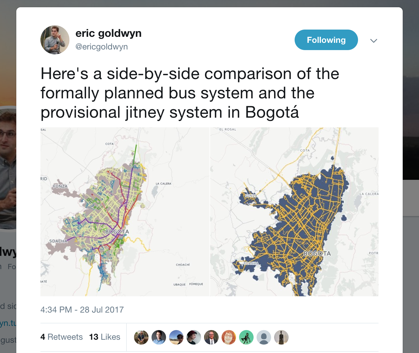
I recently got my hands on some pretty exciting data from a researcher in New York who’s been working on mapping informal transit in Bogota, Colombia. I discovered this tweet which had some neat images of the transit mapping results plotted in GIS. I’ve also included a snippet of the Twitter post below.
Brief Background on Flocktracker
One thing that had been a huge problem for me back when I was working on Flocktracker in around 2012-13 was the quality of the data being uploaded. Location accuracy has been a focus of improvements to Flocktracker (and smartphones in general) over the past few years, and I was excited to take a look at what looked like a concerted transit mapping effort.
The contents of this blog post will focus on an examination of the data and its quality, as well as some observations about processes that could be applied to extract additional utility from the base data set.
If you’d like to know more about Flocktracker, check out its current site. Basically, it’s a tool that combines surveying with vehicle fleet tracking. This is particularly useful because you can generate social insights and combine them with spatial and mobility remote sensing values to get insight that you would not via standard survey methods.
Examining Data Temporally
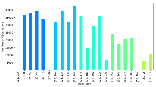
Plotting by daily counts showed that more unique crumbs (coordinate points captured at intervals along a trip) were gathered earlier on in the process, with volume dropping off most significantly in the last week.
That said, we do have 4 weeks worth of data, which is quite the effort! We can see that, for each week, there tended to be 4 dominant days of effort - pretty impressively consistent, as well, for such a project!
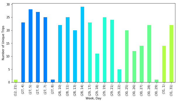
For a number of technical reasons, crumbs may not be a complete indicator of the number of unique trips taken, but fortunately there is a Trip ID column, which allowed me to plot by that as well. As you can see in the above plot, the results are commensurate with what we saw in the coordinate count data, which is good. These means the technology performed consistently at least in terms of quantity of data points uploaded. The higher counts compared to the coordinate plot on the last few weeks does indicate that a number of smaller or shorter trips were taken compared to the weeks prior.
Trip and User Level Observations
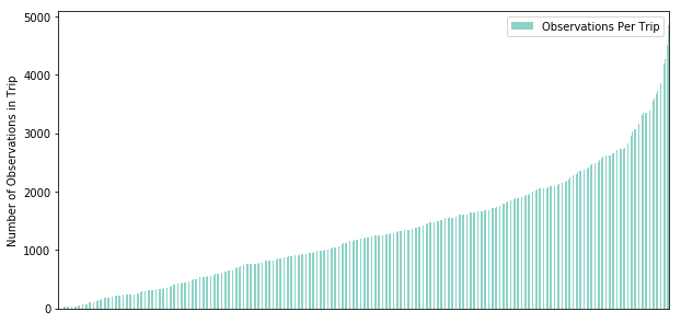
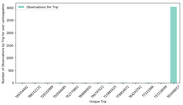
The difference between coordinate count and trip count indicated that trips varied in length. “By how much?” I wondered. The results from this query demonstrate that there is a pretty significant distribution of trip length, as measured by number of unique coordinates per trip. TO further answer this question, I would need to push this question to them, and ask how the trip riding by the surveyors was designed. I would have expected a strong middle with a steeper pick up and drop off at the extremities, so this was an interesting and unexpected observation.
The code to render the above graph, which is sorted by trip unique row count length, is below:
# find the number of observations in each trip - is it consistent?
vals = (bdf.groupby(bdf['trip_id'])
                .apply(lambda x: len(x))
                .to_frame()
                .rename(columns={0: 'Observations Per Trip'})
                .sort_values(by='Observations Per Trip'))

# turns out it isn’t at all!
ax = vals.plot.bar(cmap='Set3', xticks=[], figsize=(10,5))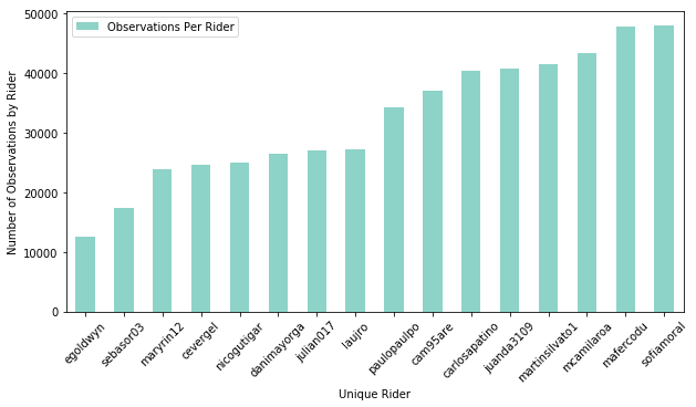
These results lead me to want to see the results distributed by user. Did one user dominate the trips? How did the Flocktracker surveying by user impact trip length results? There are 391 unique trip ids, and 16 unique users. Did one or two users represent a majority of the data collected?
The above plot demonstrates that there was no single rider that outperformed other riders. This is good in that results were not overly represented by a single rider or two.
The method for making this query is as such:
vals = (bdf.groupby(bdf['username'])
                .apply(lambda x: len(x))
                .to_frame()
                .rename(columns={0: 'Observations Per Rider'})
                .sort_values(by='Observations Per Rider'))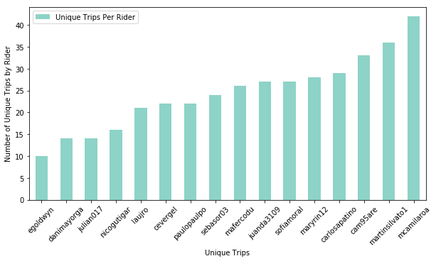
Checking trip count by user, we see that it pairs similarly with total data generated by each, so we can be comfortable considering that no single user was behaving significantly differently that others.
Parsing out Bad Data
Null values were observed for some locational data in the results. Of the 510,680 data points acquired, 6,408 were paired with null latitudes or longitudes. That’s 1.25% of the data, which is an acceptable error margin for this type of work and defensibly dropped from the overall dataset, which is what I did.
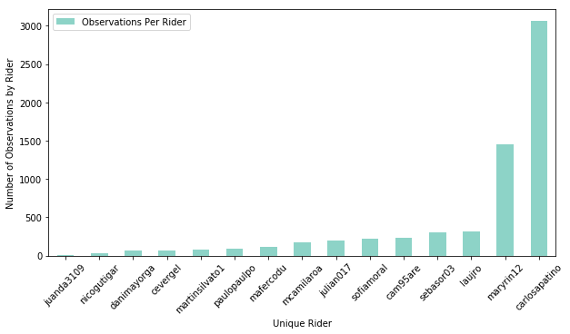
I did want to see if that data was paired with a particular rider or trip. I noticed that most of the trips that had bad data were paired with a single user. You can see this in the above data. There may have been an issue with this users phone. Data like this can be useful in helping an analyst intelligently parse through which data source might be comparatively less reliable, and thus one could defensibly drop all data from that user, if that was deemed a necessary action in performing some analyses.
Looking specifically at this user, we can see that a single trip was the issue, so in this case I simply dump that trip and the related null data points and consider that good enough for this step of the data cleaning process.
Looking at the resulting data after the null coordinate cleaning, I identified 27 bad points via the following method:
# a generous bounding box for bogota
bogota_bbox = (-74.421387,4.4,-73.773193,4.957563)

too_high = bdfc['lat'] > bogota_bbox[3]
too_low = bdfc['lat'] < bogota_bbox[1]
too_west = bdfc['lon'] < bogota_bbox[0]
too_east = bdfc['lon'] > bogota_bbox[2]

print('{} out of bounds data points.'.format(len(bdfc[(too_high | too_low | too_west | too_east)])))

# so we need to drop those from the cleaned data set as well
bdfc = bdfc[~(too_high | too_low | too_west | too_east)]
Using those generous bounds for the Bogota region, I identified bad points that were registered on null island and elsewhere around the world. Such errors in GPS data are common and dropping them helps me toss irrelevant points for the dataset to help clear out noise from the trip paths traces. 27 bad points is not bad at all, considering we are working with over a half-million data points.
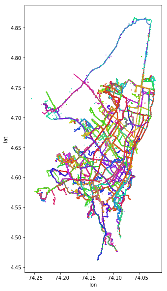
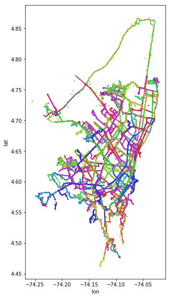
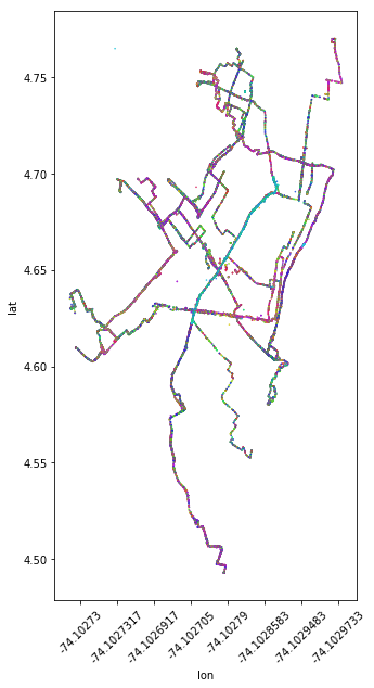
Plotting by Trip and User Data Spatially
At this point, I want to validate my data spatially. The below plots show that we are working with a sane data set, and we can see how trips and user data is reasonably clustered.
In the above image, we see each unique trip plotted as a different.
In the above image, we see users trace data plotted as unique colors.
Understanding the spatial sorting will help me down the road in determining strategies for how to tease out unique routes from these point clouds.
The method used to tease out color for unique trip and user values is recorded below. It’s a quick and dirty method just to get the job done, but may be of use to anyone else working with this data.
# set colors according to trip ids
import colorsys

def get_N_HexCol(N):
    HSV_tuples = [(x*1.0/N, 0.85, 0.85) for x in range(N)]
    RGB_tuples = map(lambda x: colorsys.hsv_to_rgb(*x), HSV_tuples)
    RGB_tuples = map(lambda rgb: list(map(lambda x: int(round(256 * x, 0)), rgb)), RGB_tuples)

    return list(RGB_tuples)

trip_id_vals = list(set(bdfc['trip_id'].values))
bdf_colors = get_N_HexCol(N=len(trip_id_vals)) # N=388

temp_pair = pd.DataFrame({'trip_id': trip_id_vals})
temp_pair['color_trip'] = bdf_colors
temp_pair['color_trip'] = temp_pair['color_trip'].apply(lambda x: '#%02x%02x%02x' % (x[0], x[1], x[2]))

with_colors = pd.merge(bdfc, temp_pair, how='left', on='trip_id')

bdfc['color_trip'] = with_colors['color_trip'].values

# now do it again, but this time with user id
user_id_vals = list(set(bdfc['username'].values))
bdf_colors = get_N_HexCol(N=len(user_id_vals)) # N=388

temp_pair = pd.DataFrame({'username': user_id_vals})
temp_pair['color_user'] = bdf_colors
temp_pair['color_user'] = temp_pair['color_user'].apply(lambda x: '#%02x%02x%02x' % (x[0], x[1], x[2]))

with_colors = pd.merge(bdfc, temp_pair, how='left', on='username')

bdfc['color_user'] = with_colors['color_user'].values
Creating an Exploratory Subset
At this point, I want to begin playing with designing algorithms to extract paths from the routes. Working with the full dataset is a tad unwieldy. Given my observations about the patterns observed by time, trip, and user; I can make an informed decision on selecting a representative week-day combination from the overall dataset like so:
day_subset = bdfc[(bdfc['date'].dt.week == 27) & (bdfc['date'].dt.day == 5)]With this day_subset dataframe, I now have a dataset under 40,000 rows which will allow me to convert this data to Shapely geometries and begin to perform spatial operations to tease out a defensible method for identifying discreet routes from the overall Flocktracker point cloud dataset.
The method for converting the cleaned data to a GeoDataFrame is as follows:
from shapely.geometry import Point

day_points = []
for coords in zip(day_subset.lon, day_subset.lat):
    day_points.append(Point(*coords))

day_gdf = gpd.GeoDataFrame(day_subset, geometry=day_points, crs={'init': 'epsg:4326'})
Looking Ahead
Now that I have cleaned the data, I can proceed with the exploratory process of devising a dependable method for inferring discreet transit routes from recorded point cloud data. I hope to report back soon on those efforts, in the next few days!
Some things I would like to try, now that the data is cleaned:
- k-means clustering to identify routes via pure cloud clusters
- discreet segment performance based on multiple trip observations
- point buffer overlays to identify route area-of-service and route spline flexibility/convergence
A notebook of my work so far is available here: Gist.
Make sure to also check out the follow up posts where I dive in deeper to the Flocktracker Bogota output data:
- Cleaning and Analysis of Bogota Flocktracker Data
- Programmatic Geometry Manipulation to Auto-generate Route Splines
- Tethering Schedules to Routes via Trace Data
- Synthesizing Multiple Route Trace Point Clouds
Some Updates From the Exploration Post-Data Cleaning
Got an hr in playing w/ inferring route splines. Wrote a snap to #OSM method but it's meh. Will want to compare w/ @mapzen Flex/Meili res. pic.twitter.com/vIrVV2SDjC
— Kuan Butts (@buttsmeister) August 13, 2017
So @mapzen Flex returns same results as my method; I assume their method is prob not too different (haversine proximity measure). Oh, well 😛 pic.twitter.com/1x4nxRoDO7
— Kuan Butts (@buttsmeister) August 13, 2017